Here’s the good stuff for July.
Here’s the good stuff for July.
Researchers asked 10,000 participants to list ten things that recently made them happy. I counted and connected the dots.
Joshua Barbeau fed an AI chatbot with old texts from his fiancee who had died years before, so that he could talk to her again. Jason Fagone for the San Francisco Chronicle wrote about Barbeau’s experience:
As Joshua continued to experiment, he realized there was no rule preventing him from simulating real people. What would happen, he wondered, if he tried to create a chatbot version of his dead fiancee?
There was nothing strange, he thought, about wanting to reconnect with the dead: People do it all the time, in prayers and in dreams. In the last year and a half, more than 600,000 people in the U.S. and Canada have died of COVID-19, often suddenly, without closure for their loved ones, leaving a raw landscape of grief. How many survivors would gladly experiment with a technology that lets them pretend, for a moment, that their dead loved one is alive again — and able to text?
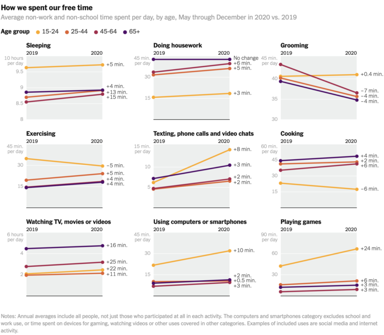
Ben Casselman and Ella Koeze for The New York Times compared time use in 2020 against time use in 2019, among different demographic groups.
As we know, the pandemic affected everyone differently. The slope charts show overall averages, so it would be an interesting next step to look at more granular variations. I suspect you’d see more pronounced shifts.
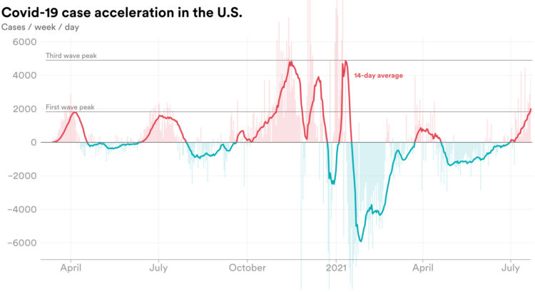
We’re all familiar with the Covid-19 line charts that show cases over time, which highlights absolute counts. There are peaks. There are some valleys. Emory Parker for STAT shifted the focus to how quickly the rate is changing, or acceleration, to emphasize which direction rates are headed.
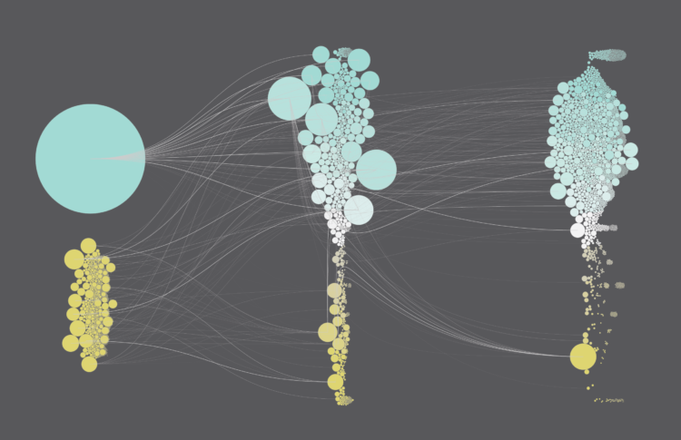
The Bloomberg medal tracker is fun to look at. I think the graphics desk was instructed to use as many new-ish chart types as they could without alienating readers: the streamgraph, force-directed clusters, an international map grid, line-based isotype, and plenty of bubbles. I’m into it.
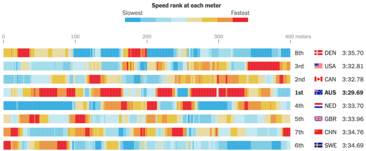
The New York Times charted speed ranks during the women’s 4×100 freestyle relay. My favorite part is how they got the data, which wasn’t available, so they estimated through photos and timestamps:
The Times annotated a sequence of several hundred photographs to determine the speed of each athlete throughout the race. Speeds were calculated by combining the positions of the athletes with timestamp information from the images.
If the data you’re looking for isn’t readily available, it might just be a few steps away.

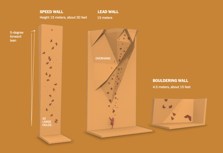
The 2020 Summer Olympics are here, so ’tis the season for experimental visual explainers. The Washington Post uses a combination of illustration, video, and augmented reality to show off three new Olympic sports: skateboarding, surfing, and sport climbing.
The skateboarding piece with Heimana Reynolds uses a left-right hover to move back and forth through a time-lapse. It lets you see each part of the trick, which can be a challenge to see in real-time. The climbing piece with Brooke Raboutou employs AR so that you can place a 3-D model of the 50-foot wall and Raboutou in your living room for scale. Neat.
Weather Strip is a new weather app by visualization researcher Robin Stewart. It shows the week’s forecast as a time series chart, aiming to show you details at a glance. The temperature shows as a line chart, and a stacked area chart that represents weather conditions serves as background.
You’d think it’d hit all the right notes for me, but I’m more of a bare minimum type when it comes to weather forecasts. Just a table of highs, lows, and chance of rain is all I need. People seem to be into this view though, so maybe you’ll enjoy this more than me.
Learn about new visualization things, but also get actual work done.
With the Olympics starting on Friday, The New York Times started their coverage of events and athletes to watch. Their visual explainers are always very good in that the topic is entertaining and the results feel like a creative break, which a lot of us could probably use right about now. Check out what NYT has so far for climbing, gymnastics, hurdles, and swimming.
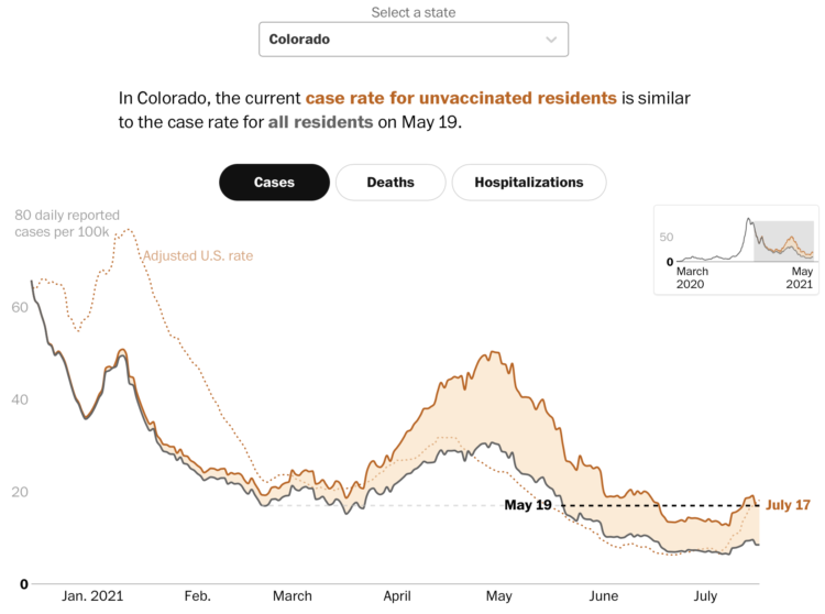
Covid-19 cases in the United States were down, but they’re moving up again, mostly among the unvaccinated. Dan Keating and Leslie Shapiro for The Washington Post break down the comparisons by state.
A difference chart for each state shows the overall rate compared against an adjusted rate for the unvaccinated population. As you might expect, the rate for the latter is always higher.
There are three more points of reference. A dotted line shows the adjusted national rate, a black dashed line shows how the current rate is a step back to a previous time, and a smaller, zoomed out version of the chart in the top right provides context back to March 2020. You can see it for cases, deaths, and hospitalizations.
Getting vaccinated strongly appears to be the way to go any way you cut it.
Sebastian Raschka made 170 videos on deep learning, and you can watch all of the lessons now:
I just sat down this morning and organized all deep learning related videos I recorded in 2021. I am sure this will be a useful reference for my future self, but I am also hoping it might be useful for one or the other person out there.
It’s split into 19 lessons over five parts: introduction, mathematical foundations, neural networks, deep learning for computer vision, and generative models. Might be useful, even if you just want to learn more about machine learning is.
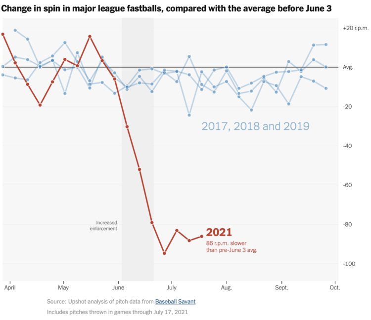
NYT’s The Upshot analyzed spin rate on pitches before and after enforcing a ban on sticky substances that provide more grip on the ball. The rule has been in place for decades but wasn’t enforced. However, there’s been more strikeouts than usual, which makes for less exciting sports, which means less people watch, and therefore, the league makes less money. So, bye sticky stuff.
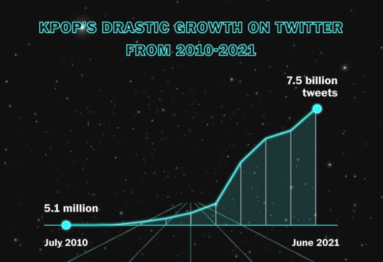
K-pop seems to be inescapable these days, which really confuses me. Marian Liu, Youjin Shin, and Shelly Tan for The Washington Post explored the rise in popularity and what makes the songs and artists so popular.
James O’Donoghue made this straightforward animation that shows how long it takes for a ball to drop one kilometer on different planets:
It might be surprising to see large planets have a pull comparable to smaller ones at the surface, for example Uranus pulls the ball down slower than at Earth! Why? Because the low average density of Uranus puts the surface far away from the majority of the mass. Similarly, Mars is nearly twice the mass of Mercury, but you can see the surface gravity is actually the same… this indicates that Mercury is much denser than Mars.
Okay, sure, but what’s heavier on Mars: a ton of feathers or a ton of bricks? [via kottke]

Use basic statistical methods to move you towards fancier things.
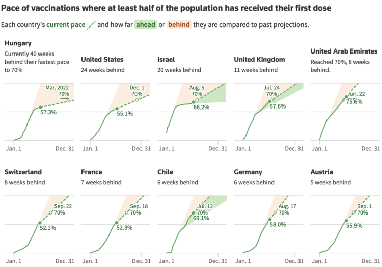
When countries gained access to vaccines, there was an initial burst of vaccinations, but the rate leveled off in most places. Then a variant arrives, and an incentive or another push for vaccinations increases the rate. Reuters looks at the rate shift in different countries, in the context of trying to reach 70 percent vaccinated.
The set of difference charts took me a minute to digest, but then seems straightforward after. More orange fill means much slower than the initial vaccination rate, and more green fill means a bigger bump after a lull.
[arve url=”https://www.youtube.com/watch?v=DC1KHAxE7mo” loop=”no” muted=”no” /]
Noah Kalina has been taking a picture of himself every day since January 11, 2000. He posted time-lapse videos in 2007, 2012, and 2020. Last year was the 20th of the project.
Usually Kalina’s videos are a straight up time-lapse using every photo. But in this collaboration with Michael Notter, 7,777 Days shows a smoother passage of time. Notter used machine learning to align the face pictures, and then each frame shows a 60-day average, which focuses on an aging face instead of everything else in the background.
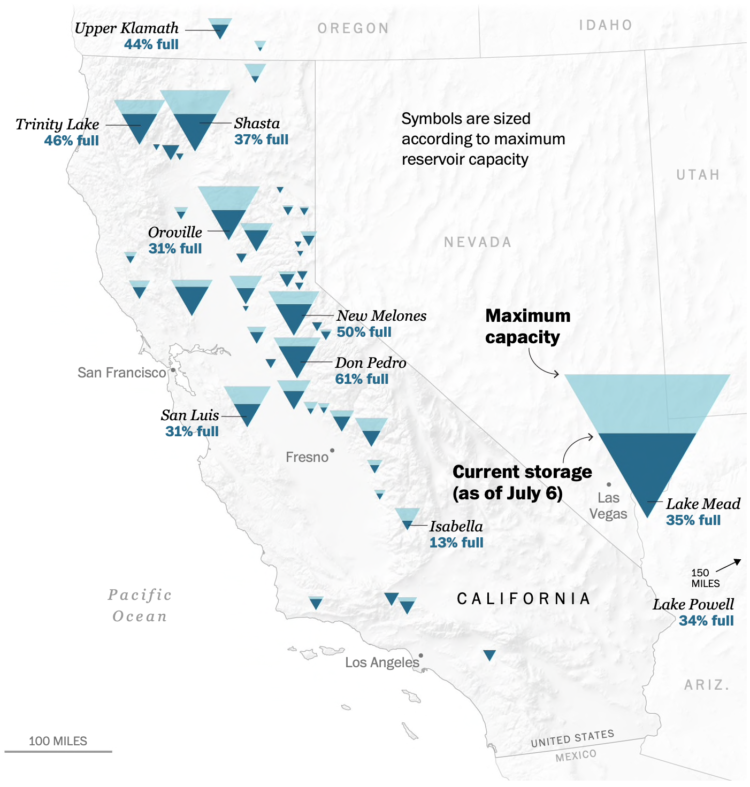
To show water levels in California’s drying reservoirs, The Washington Post used upside down triangles to represent each reservoir.
I like the idea to use an encoding that kind of looks like a reservoir, but my brain can’t help but read the fill level through height instead of area. Maybe the tradeoff isn’t worth it in this case? Compare this against a circle representation from 2015.


 Visualize This: The FlowingData Guide to Design, Visualization, and Statistics
Available now.