Debates about which is best are useless. Go with what works for you, and never mind the rest.
Python
-
Members Only
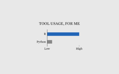
Why I Use R More than Python
-
Members Only
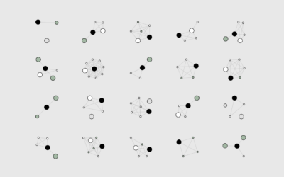
How I Made That: Network Diagrams of All the Household Types
Process the data into a usable format, which makes the visualization part more straightforward.
-
Python is coming to Excel
Excel is getting a bump in capabilities with Python integration. From Microsoft:
Excel… -
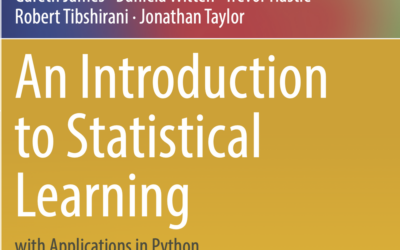
Introduction to statistical learning, with Python examples
An Introduction to Statistical Learning, with Applications in R by Gareth James, Daniela…
-
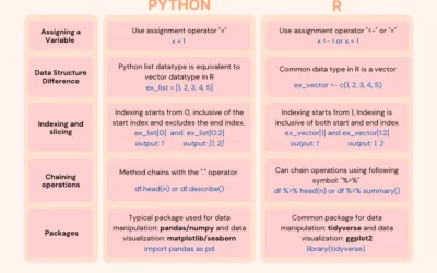
Switching from Python to R
If you’re looking to switch or just want to expand your skills, this…
-
Introduction to Deep Learning
Sebastian Raschka made 170 videos on deep learning, and you can watch all…
-
Spatula, a Python library for maintainable web scraping
This looks promising:
While it is often easy, and tempting, to write a… -
Generate a color analysis by uploading an image
Mel Dollison and Liza Daly made a fun interactive that lets you upload…
-
Members Only
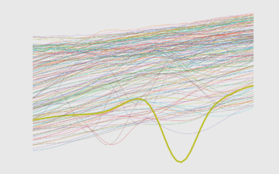
How to Make Line Charts in Python, with Pandas and Matplotlib
The chart type can be used to show patterns over time and relationships between variables. This is a comprehensive introduction to making them using two common libraries.
-
Altair for visualization in Python
Vega-Lite is a grammar for interactive graphics primarily used for analysis. Altair is…
-
Link
R or Python? →
Big community and lots of tools for both.
-
Link
Seaborn →
A Python library for visualization. Surprised I just heard of it.
-
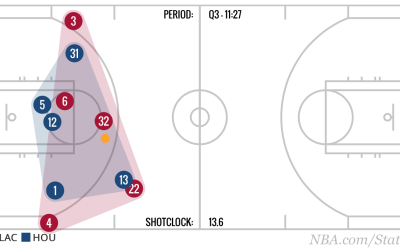
Extracting NBA player movement data
There’s no direct download, but there is an API.
-
Link
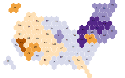
Make grid maps in Python →
A quick script for squares and hexagons that outputs to SVG.
-
Ditch Excel and format your data with csvkit
I thought I linked to csvkit a while ago, but apparently not. If…
-
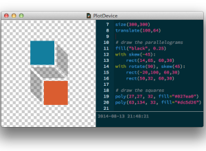
PlotDevice: Draw with Python
You’ve been able to visualize data with Python for a while, but Mac…
-

Downloading Your Email Metadata
Email provides a window into who we interact with and what we do. This tutorial describes how to get that data in the format you want.
-
Bokeh, a Python library for interactive visualization
Bokeh, a Python library by Continuum Analytics, helps you visualize your data on…
-
Databases for lazy people, a Python library
Friedrich Lindenberg and Gregor Aisch recently released dataset, a Python library to take…
-
R plotting package ggplot2 ported to Python
Those who use the ggplot2 package in R and do everything else in…
Recently for Members
Second Edition
 Visualize This: The FlowingData Guide to Design, Visualization, and Statistics (2nd Edition)
 Visualize This: The FlowingData Guide to Design, Visualization, and Statistics (2nd Edition)
New tools, refined process.
Browse by Chart Type See All →


