This week is about animating data to better show insights and to keep randos engaged on the internets.
animation
-
Members Only
Animating data for fun and interest
-
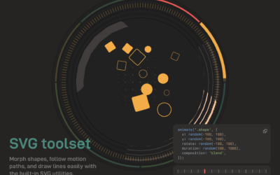
Anime.js, a JavaScript animation engine
New to me, Anime.js by Julian Garnier seems like a fun library to…
-
Members Only
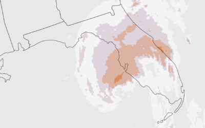
Make the Chart: Precipitation Map as Animated GIF
Weather. Data. Map. Animation. They go well together to show sudden changes over time.
-
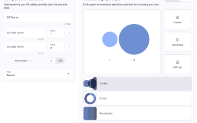
Data GIF Maker lets you make animated GIFs with data
The Data GIF Maker is a fun tool from Google that lets you…
-

Disney’s innovations in animation
As Disney and its stock price struggles with streaming, Reuters looks at how…
-
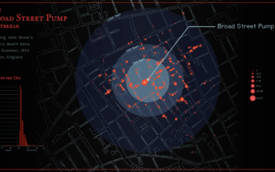
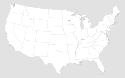
John Snow’s cholera map, an animated version
Sarah Bell made an animated version of John Snow’s classic map from 1854.…
-
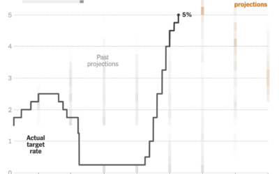
Changing Fed projections
This clever chart by Lazaro Gamio shows changing interest rates set by the…
-
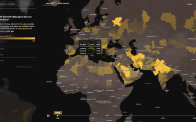
World water gap
We tend to use more water than is available in the world, which…
-
Members Only
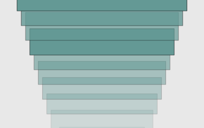
Making Old Charts Move
Same old chart, but make it move for another dimension.
-
Members Only
How to Make a Smoother Animated Growth Map in R
Show change over time and geography with smooth transitions.
-
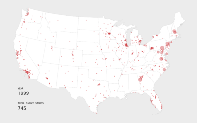
Growth of Target, an Animated Map
Watch the growth strategy behind Target stores, starting with the first location in 1962 in Minnesota.
-
Members Only
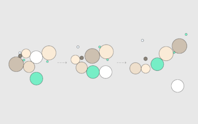
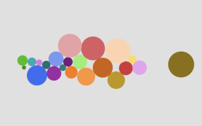
How to Animate Packed Circles in R
Pack circles, figure out the transitions between time segments, and then generate frames to string together.
-

History of wars and power in Europe, animated from 1500 to present
Agar.io is a multiplayer game where people control cells in a Petri dish-type…
-
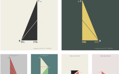
Animated charts to show sports results
Krisztina Szűcs likes to make animated charts to show sports results, from fencing,…
-
Members Only

How to Make an Animated Donut Chart in R
There are “better” ways to show proportions over time, but sometimes you just want an animated donut.
-
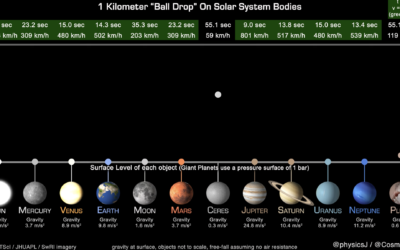
How long it takes a ball to drop on various Solar System bodies
James O’Donoghue made this straightforward animation that shows how long it takes for…
-
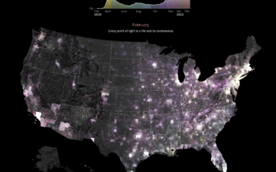
Pandemic timeline as animated dot density map
As a lead-in and backdrop to a timeline of the past year by…
-
Members Only
How to Make an Animated Beeswarm Chart
Beeswarm charts are useful to highlight individual categories or entities. Animating them can help highlight change over time.
-

Waves of distraction
I’ve been distracted lately, so instead of making regular charts, I’ve been making…
-
Two.js for two-dimensional drawing and animation in modern web browsers
“Two.js is deeply inspired by flat motion graphics. As a result, two.js aims…
Recently for Members
Second Edition
 Visualize This: The FlowingData Guide to Design, Visualization, and Statistics (2nd Edition)
 Visualize This: The FlowingData Guide to Design, Visualization, and Statistics (2nd Edition)
New tools, refined process.
Browse by Chart Type See All →


