Regions scale based on data instead of preserving geographic area.
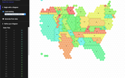
There are packages to make cartograms, but in some cases you might need a more flexible solution.
While the reshaped geography doesn't work all the time, the use of size to show data can be more intuitive in some cases.
Sometimes these cartograms can distort areas beyond recognition, but they can also provide a better visual representation for a region with a wide range of subregions. At the least, they're fun to look at.
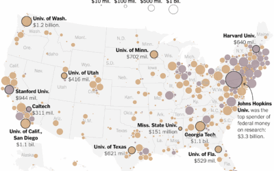
From Lazaro Gamio, Tony Romm, and Agnes Chang for the New York Times,…
Big universities more often make the news, but the freeze in federal funding…
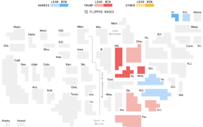
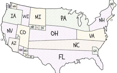
The major news outlets all have electoral vote cartograms, but I appreciate Bloomberg’s…
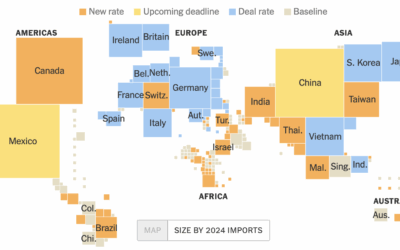
For Bloomberg, Elena Mejía and Shawn Donnan use a transitioning cartogram to show…
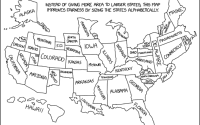
A deeply insightful map from xkcd. See also: 19 maps that will blow…
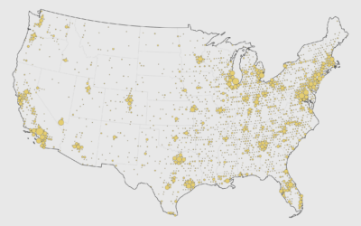
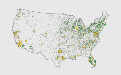
There are thousands of McDonald's locations, but there are still more golf courses in the United States. This seems surprising, but some maps make it clear.
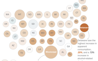
Alcohol consumption, based on ethanol volume estimates, has been rising over the past…
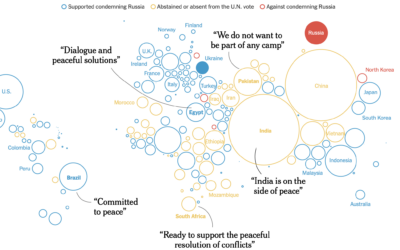
The New York Times shows how the west tried to isolate Russia and…
To estimate public interest in the many political issues across the United States,…
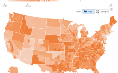
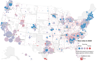
For The New York Times, Ford Fessenden, Lazaro Gamio and Rich Harris go…
There’s going to be a lot more voting by mail this year. The…
As discussed previously, the “impeach this” map has some issues. Mainly, it equates…
Presidential candidates campaign harder in some states more than others. National Popular Vote…
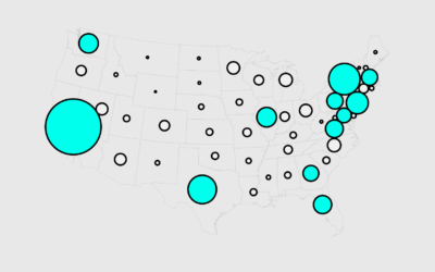
A challenge of using geographic maps to show data is that larger regions…
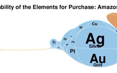
Along the same lines as the scaled Periodic Table, Elemental Cartograms by chemistry…
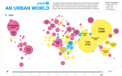
In this simple interactive animation by Periscopic, in partnership with UNICEF, we see…