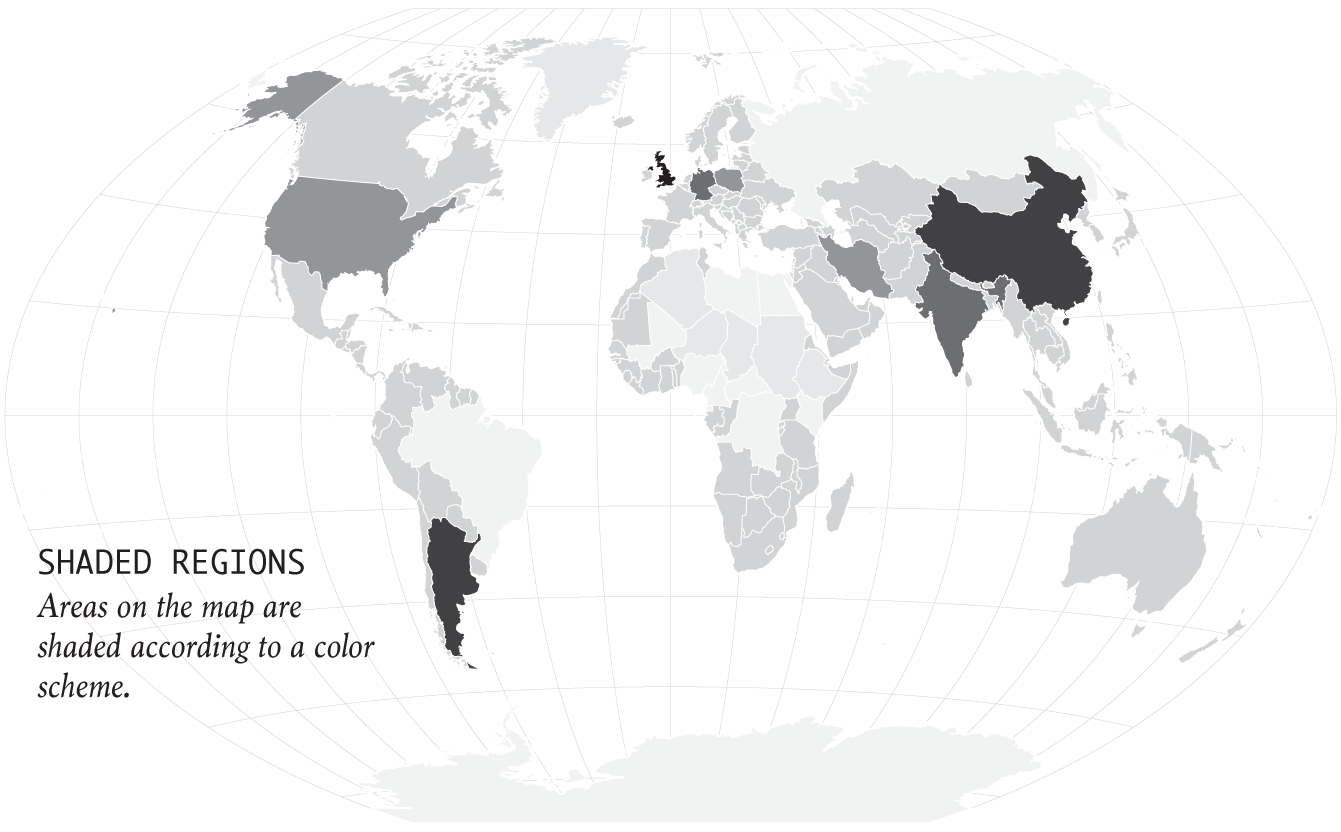
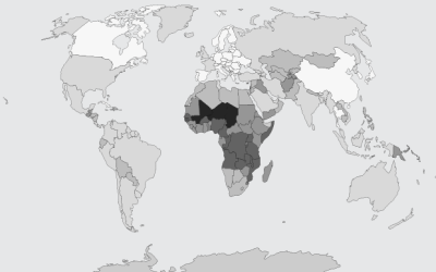
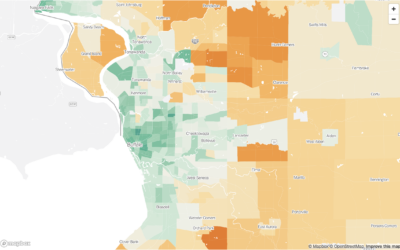
Regions are colored by a variable. Be careful with your color choices, as they can quickly change what the map shows.
This week I'm describing my process behind a quick map. You can download the code at the end of this issue.
Many charts don't tell the truth. This is a simple guide to spotting them.
Let readers focus on the regions they care about to make their own comparisons and conclusions.
Fill those empty polygons with color, based on shapefile or external data.
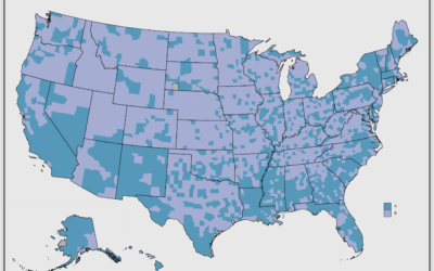
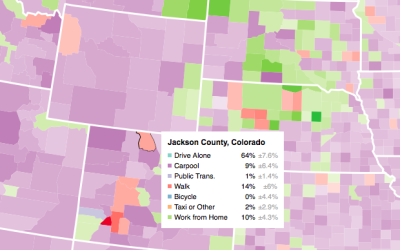
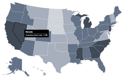
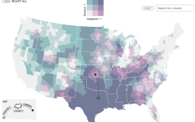
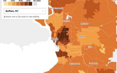
When presented with a static graphic, it can be useful to see specific values after you see overall patterns. This tutorial shows you how to add simple interactions to a choropleth map so you can get specifics for regions.
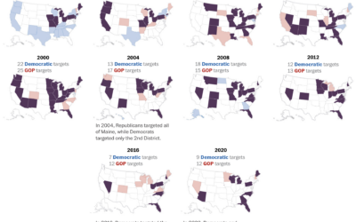
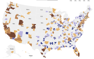
We mostly hear about a handful of swing states these days, as presidential…
Based on data from the USDA Census of Agriculture, this map by John…
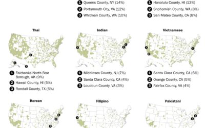
You can find Asian restaurants in most places in the United States, but…
States aren't uniformly young and old. Well, other than Maine. This is the breakdown by age group and regions.
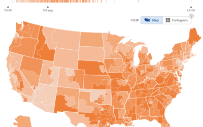
Based on migration data recently released by the IRS, Nami Sumida for the…
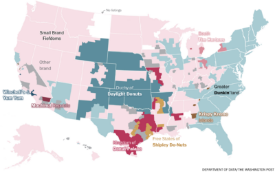
In a fun one by Alyssa Fowers, for The Washington Post’s Department of…
Based on analysis by economics professor Caitlin Myers, FiveThirtyEight provides a hypothetical map…
For The Washington Post, Emmanuel Martinez, Kevin Schaul and Hamza Shaban mapped the…
Bringing it down the Census tract level, Nadja Popovich, Mira Rojanasakul and Brad…
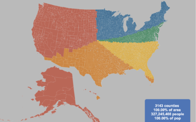
By Engaging Data, this interactive map shows various splits of the United States…
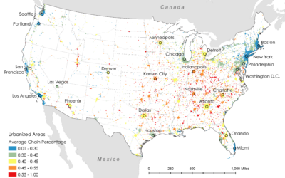
Researchers Xiaofan Liang and Clio Andris estimated the percentage of restaurants that are…
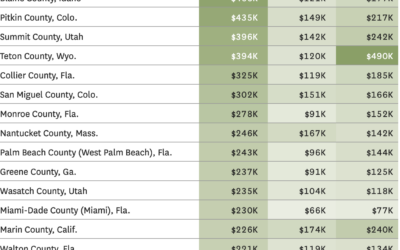
Emily Badger and Eve Washington for NYT’s The Upshot show how the housing…
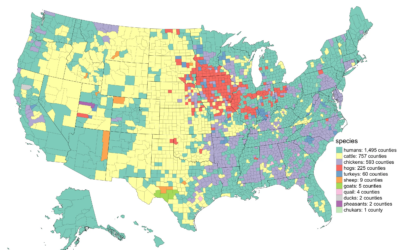
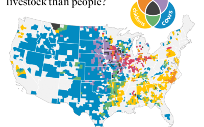
The United States Department of Agriculture provides annual inventory data on livestock, crops,…
To estimate public interest in the many political issues across the United States,…
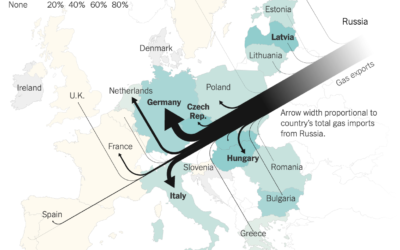
Speaking of Russian gas, Josh Holder, Karl Russell and Stanley Reed for The…
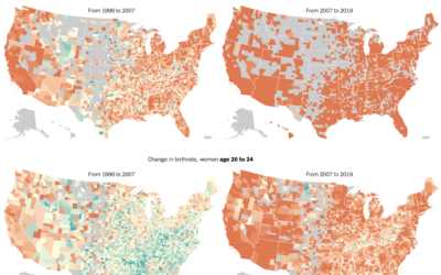
The New York Times mapped birth rates, which are down almost everywhere, especially…