Borne out of everyday curiosities, learning experiments, and mild insomnia.
An ongoing series about looking at the everyday through the eyes of data and charts.
Reviving the currently defunct Census-produced publication with current data.
Not everything has to be visualized. I do it anyway.
Based on the “half-your-age-plus-seven” rule, the range of people you can date expands with age. Combine that with population counts and demographics, and you can find when your non-creepy dating pool peaks.
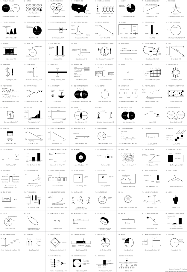
In celebration of their 100-year anniversary, the American Film Institute …
So far we’ve seen when you will die and how other people tend to die. Now let’s put the two together to see how and when you will die, given your sex, race, and age.
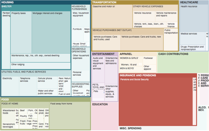
We know spending changes when you have more money. Here’s by how much.
Minimum wage has increased over the years, but by how much depends on where you live.
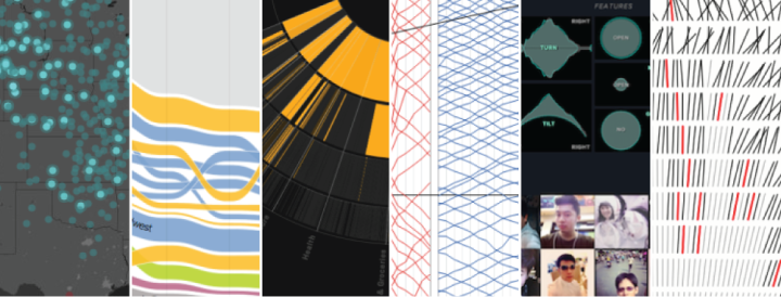
It’s always tough to pick my favorite visualization projects. Nevertheless, I gave it a go.
Some jobs tend towards higher divorce rates and some lower.
Some occupations have more turnover than others. See how it varies for your occupation and others.
It seems like people don’t stick with the same job for as long as they used to, but maybe that’s not the case.
Why Americans are unemployed varies across groups.
A practical resource for beginners who want to visualize data for humans.