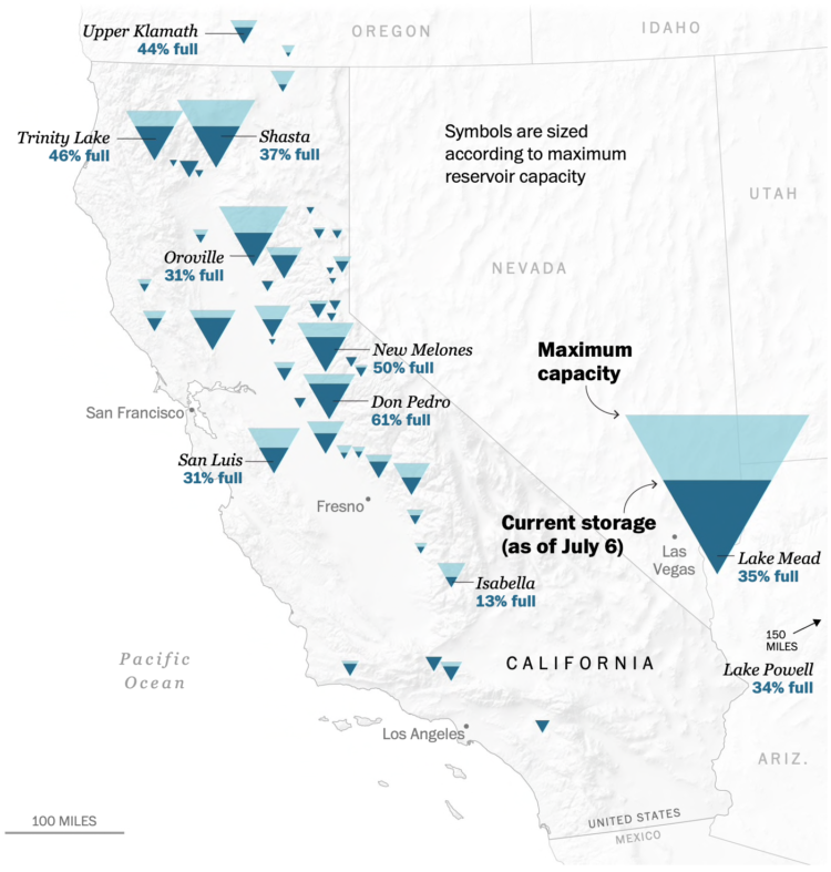
To show water levels in California’s drying reservoirs, The Washington Post used upside down triangles to represent each reservoir.
I like the idea to use an encoding that kind of looks like a reservoir, but my brain can’t help but read the fill level through height instead of area. Maybe the tradeoff isn’t worth it in this case? Compare this against a circle representation from 2015.
 Visualize This: The FlowingData Guide to Design, Visualization, and Statistics (2nd Edition)