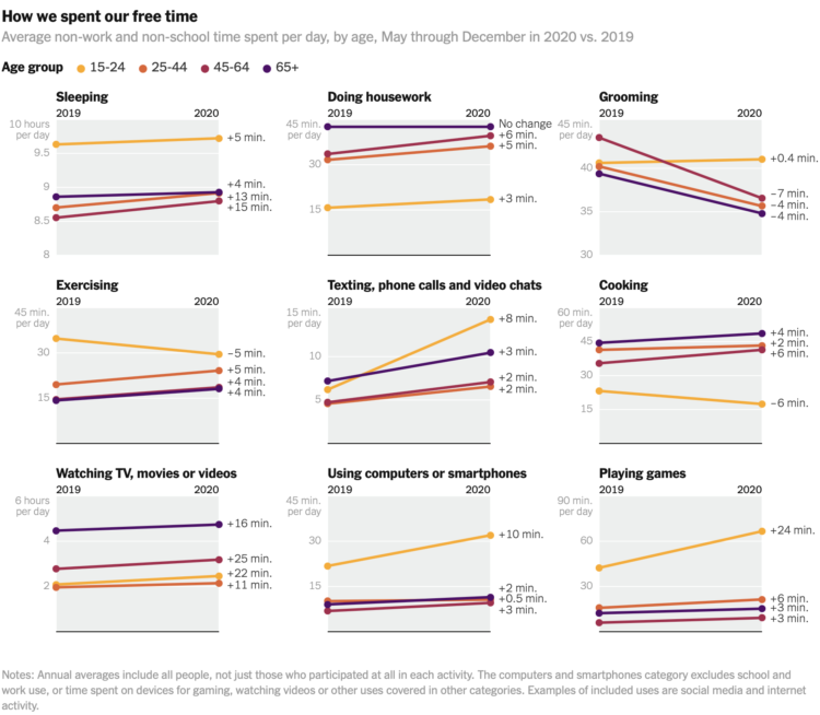
Ben Casselman and Ella Koeze for The New York Times compared time use in 2020 against time use in 2019, among different demographic groups.
As we know, the pandemic affected everyone differently. The slope charts show overall averages, so it would be an interesting next step to look at more granular variations. I suspect you’d see more pronounced shifts.

 Visualize This: The FlowingData Guide to Design, Visualization, and Statistics (2nd Edition)