To highlight challenges in other countries, Giving What We Can imagined a birth…
comparison
-

Imagining a global lottery where you are born with less
-
Members Only
Comparing multiples
This week we make it easier to compare multiple charts when differences are small but significant.
-
Members Only
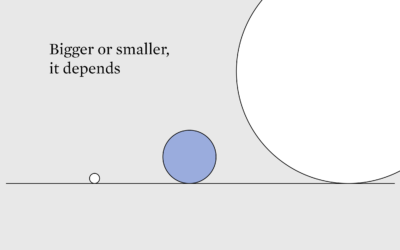
Better or Worse, More or Less
Comparisons, also known as the thief of joy, are unavoidable, so we might as well make fair ones that consider context.
-
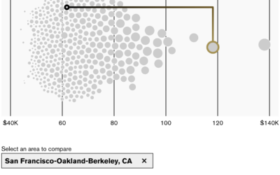
Where you would feel richer and poorer
New to me, Bloomberg has an interactive by Claire Ballentine and Charlie Wells…
-
Members Only
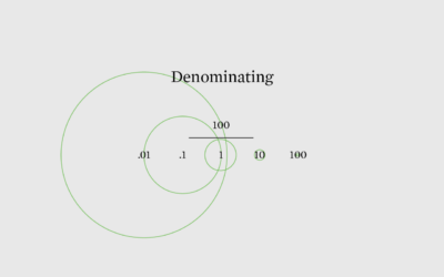
Looking for a Denominator
To decide if values are high or low, sometimes you have to divide the numbers for a relative comparison instead of an absolute one.
-
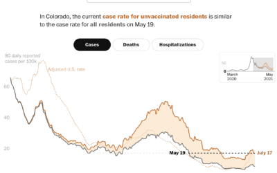
Case rates adjusted for the unvaccinated
Covid-19 cases in the United States were down, but they’re moving up again,…
-
Members Only
Relative Comparison – The Process 136
In analysis and visualization, you’re often tasked with the “compared to what” question. Your approach will change the perspective.
-
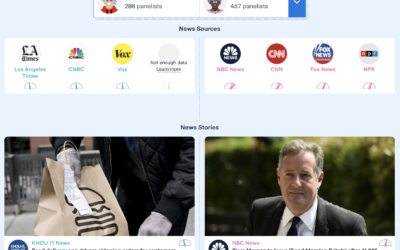
Facebook feed comparison between groups
As part of their Citizen Browser project to inspect Facebook, The Markup shows…
-
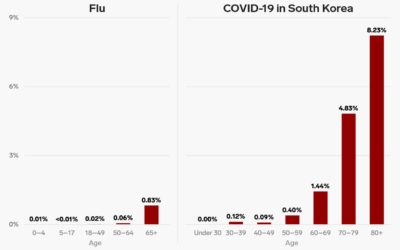
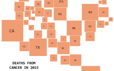
Poor comparison between two bar charts
A chart from Business Insider makes a poor attempt to compare the death…
-
Members Only

Making Comparisons Easier When Presenting Data (The Process #40)
Visualization is all about making comparisons. If you have nothing to compare to, then the chart fails. In this issue I describe some of the ways you can make your charts more comparable.
-
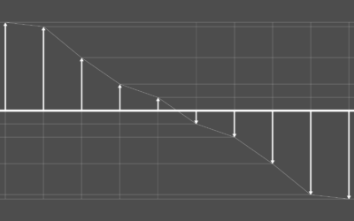
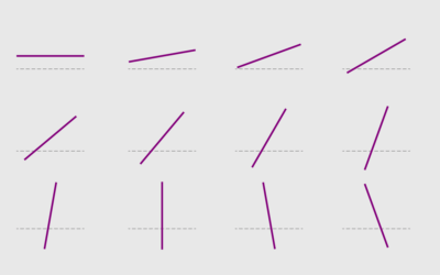
Visualizing Differences
Focus on finding or displaying contrasting points, and some visual methods are more helpful than others. A guide.
-
Useless Data Comparisons
Apples and oranges situations where the comparisons make no sense.
-
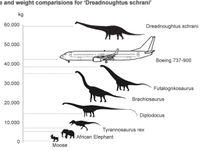
Dinosaurs versus airplane
Scientists found the fossils of a giant dinosaur that they estimate was 26…
-
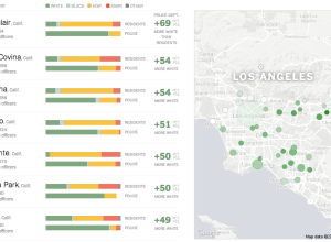
Race distributions of police departments versus residents →
When you compare distributions of race for police departments and for the residents…
-

Size comparison of everything
If you’re like me, you often wonder how big the Stay Puft Marshmallow…
-
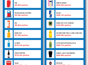
Gallons of stuff that cost more than gasoline
In response to Sarah Palin’s complaints about gas prices around four dollars per…
-
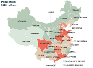
Chinese provinces compared to countries
It’s easy to forget just how big some countries are. For example, China:…
Recently for Members
Second Edition
 Visualize This: The FlowingData Guide to Design, Visualization, and Statistics (2nd Edition)
 Visualize This: The FlowingData Guide to Design, Visualization, and Statistics (2nd Edition)
New tools, refined process.
Browse by Chart Type See All →


