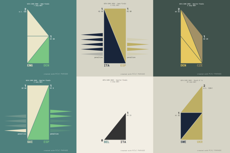
Krisztina Szűcs used sets of animated triangles to show how each match played out. The triangles in the middle move up as each team scores, and the triangles on the side represent penalty kicks.
Krisztina Szűcs used sets of animated triangles to show how each match played out. The triangles in the middle move up as each team scores, and the triangles on the side represent penalty kicks.
Paul Ford has been learning R to better understand the field of Statistics. The takeaway:
Deep in its heart, R is a language for making charts, and it’s genuinely fun to go into its world: statistics, natural sciences, sociology — all right there. You will never pry me away from JavaScript or Python or the whole web stack of standards and protocols. They’re how I make things happen in the world, and they are very much my home base, but using more specific tools is always an education. It’s like suddenly discovering a new wing of a big museum, and realizing that there’s still a lot to learn.
I would say it’s a language for analyzing data, and charts are a big part of the process. But the big sell of R has always been its specificity. The need to understand data drives its design and growth, which means you avoid starting a lot of analyses from scratch.

Maybe it’s better to focus on the present to do the best with what we have, which moves us towards the future.
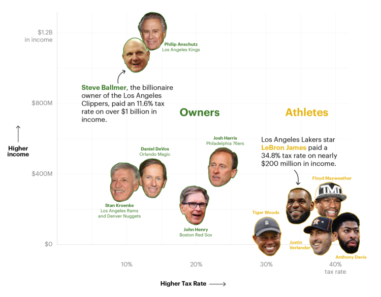
ProPublica continues their analysis of an anonymous dump of tax records, this time with a focus on billionaire sports owners:
The law favors people who are rich because they own things over people who are rich because they make a high income from their work. Wages — the main source of income for most people, including athletes — are taxed at the highest rates of all, topping out at a marginal rate of 37% plus an extra 3.8% for Medicare. The government takes a smaller share of money made from, say, selling a stock. That’s not to mention the benefits available to people who own businesses, such as the paper losses created by buying a sports team.
Easy solution: We’ll all just buy a sports team.
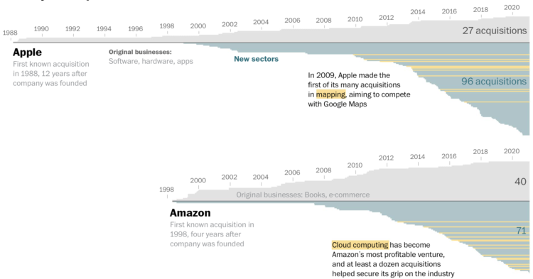
Big tech — Amazon, Apple, Google, and Facebook — got big and then got bigger with acquisitions of smaller companies. The Washington Post took a comprehensive look at all of the acquisitions over the years:
They all followed a similar pattern. First, they became dominant in their original business, like e-commerce for Amazon and search for Google. Then they grew tentacles, making acquisitions in new sectors to add revenue streams and outflank competitors.
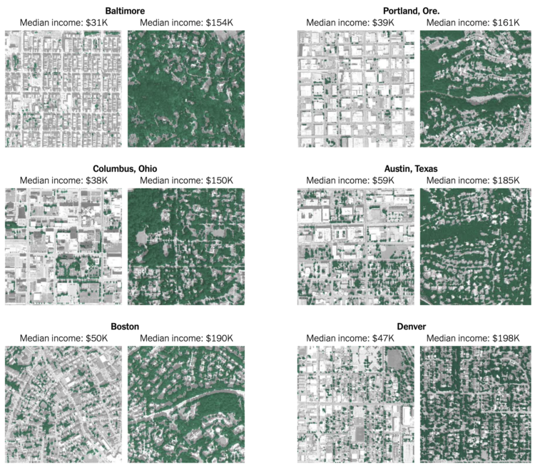
Ian Leahy and Yaryna Serkez for NYT Opinion look at income and tree canopy in major cities. Higher median income neighborhoods correlate with cleaner and cooler air.

PhotoChrome is a straightforward tool that lets you use search terms to find a color palette. Just enter a query, and it spits out a color scheme of hex values based on matching images.
It’s like Picular from a few years ago but more focused with a copy-paste.
[arve url=”https://vimeo.com/568430412″ loop=”no” muted=”no” /]
Aerial photographer Lior Patel followed a herd of sheep in Yokneam. The results are much more interesting than they sound. [via Colossal]
See also the work of Tim Whittaker who produced a video of the same ilk. I don’t know what to call it, but I am very much into this genre of calming sheep herding videos for the mind. Although I feel like herding up close must be kind of stressful.
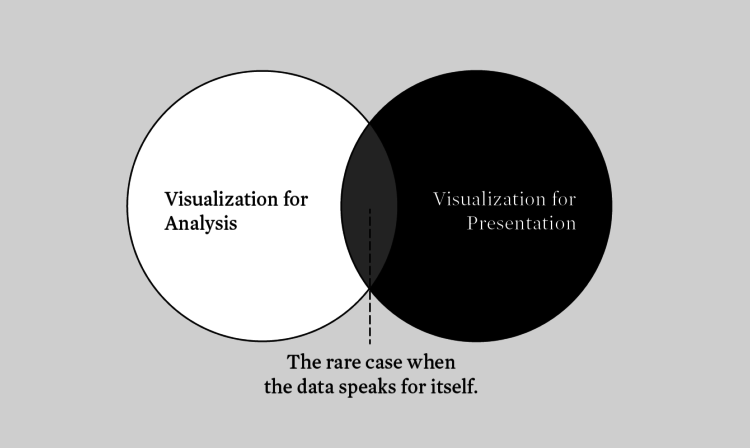
There’s visualization for analysis. There’s visualization for presentation. There’s overlap between the groups, but the differences require a varied approach.

NPR put together a set of stories, videos, and interactives about bringing more joy into your life, which of course is always welcome.
FlowingData turned 14 years old last week. Is that old? It feels old.
The site started as a sandbox to put class projects. Flat HTML files. JPEG files. Google Maps placemarkers. Flash. Vanilla JavaScript.
As I studied from across the country, it turned into a place to share links with classmates. Did you see that project on Infosthetics? How did Stamen make that map? These big infographics are getting out of hand.
I experimented. To my surprise and delight, stuff I made traversed the internets. Some work landed in my friends’ and family’s feeds through roundabout routes. I learned how visualization could reach a lot of people and get them excited about data.
Statistics grew out of that required course that everyone hated. Data also grew. It got big. It became a science.
Visualization grew with the data. Once thought of as just an analytical tool (to some), it developed into a medium for communication, expression, and storytelling.
As I finished my PhD, thinking about my future, I took job interviews. I think as the interviewee, you’re supposed to try to impress the interviewers. But deep down, it was the other way around for me. I was looking for someone to convince me that what they had to offer was better than running FlowingData. I didn’t find anything.
So, here I am, 6,243 posts, guides, tutorials, links, and projects later. Sheesh.
Thanks for reading. Thank you to supporting members. If you’re not a member yet and you’d like to keep the data flowing, I’d of course appreciate your support. I’m hoping to do this for many more years.
Introduction to Modern Statistics by Mine Cetinkaya-Rundel and Johanna Hardin is a free-to-download book:
Introduction to Modern Statistics is a re-imagining of a previous title, Introduction to Statistics with Randomization and Simulation book. The new book puts a heavy emphasis on exploratory data analysis (specifically exploring multivariate relationships using visualization, summarization, and descriptive models) and provides a thorough discussion of simulation-based inference using randomization and bootstrapping, followed by a presentation of the related Central Limit Theorem based approaches.
Read it in the browser or buy a print version. A good deal either way.
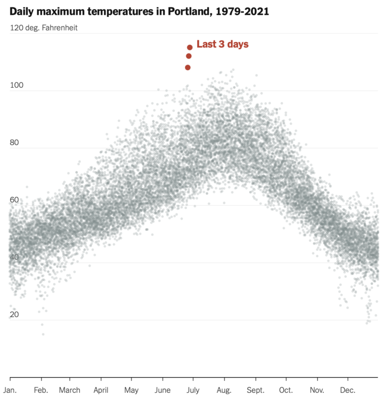
It’s been hot in the Pacific Northwest the past few days. NYT’s The Upshot plotted the temperatures against previous max temperatures since 1979. Hot.
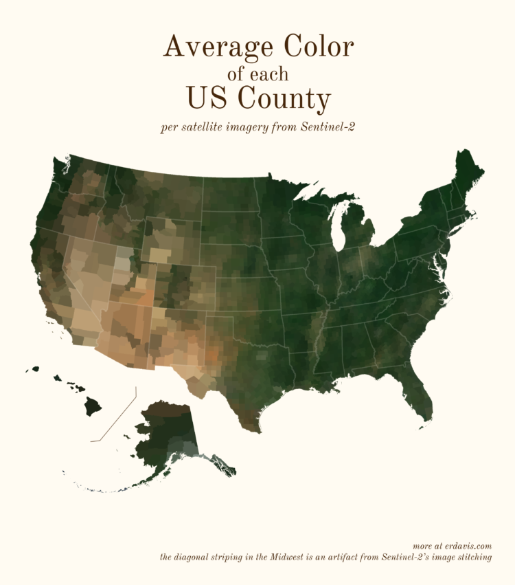
Based on satellite imagery, Erin Davis found the average color of places around the world. The above is by county in the United States, but Davis also made maps by country, which are a mix of greens, browns, and yellows.
See also the NYT piece from 2020, which framed color by political leaning.
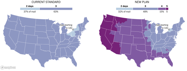
Postmaster General Louis DeJoy proposed new standards for first-class mail, which would slow down how long it takes for you to receive a letter. The Washington Post made an interactive (paywall) to see how the plan would change delivery times from your ZIP code.
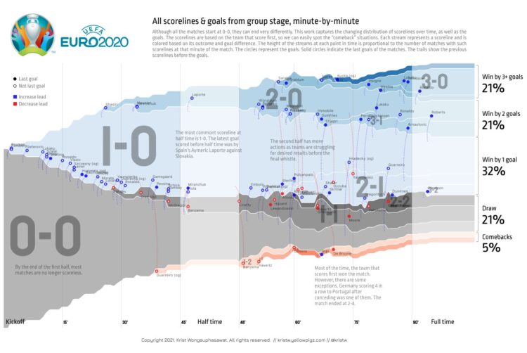
To see all the matches from the group stage of Euro 2020 in one chart, Krist Wongsuphasawat used a streamgraph showing aggregate scorelines from kickoff to finish. All matches start at 0-0, and the team that scores first, colored in blue, almost always wins.
The percentage of comeback wins surprises me, as someone who knows almost nothing about soccer.

Here’s the good stuff for June 2021.
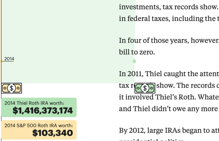
ProPublica continues their analysis of an anonymous IRS tax records dump. In their most recent, they look at how Peter Thiel uses a Roth IRA to avoid taxes on billions.
In the second half of the piece, a time series chart showing the growth of Thiel’s account versus a standard maxed out account. The data progresses as you scroll, which moves the article forward, until it fills the whole window. Nice.
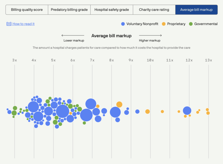
Using data collected by Johns Hopkins University, Michelle McGhee and Will Chase for Axios provide a visual reference for the billing practices of for-profit hospitals:
Rising deductibles and out-of-pocket costs are increasingly leaving patients responsible for bloated medical bills. A new analysis by Johns Hopkins University reveals that many of the top 100 hospitals by revenue in the U.S. use predatory tactics to pursue patients with unpaid bills.
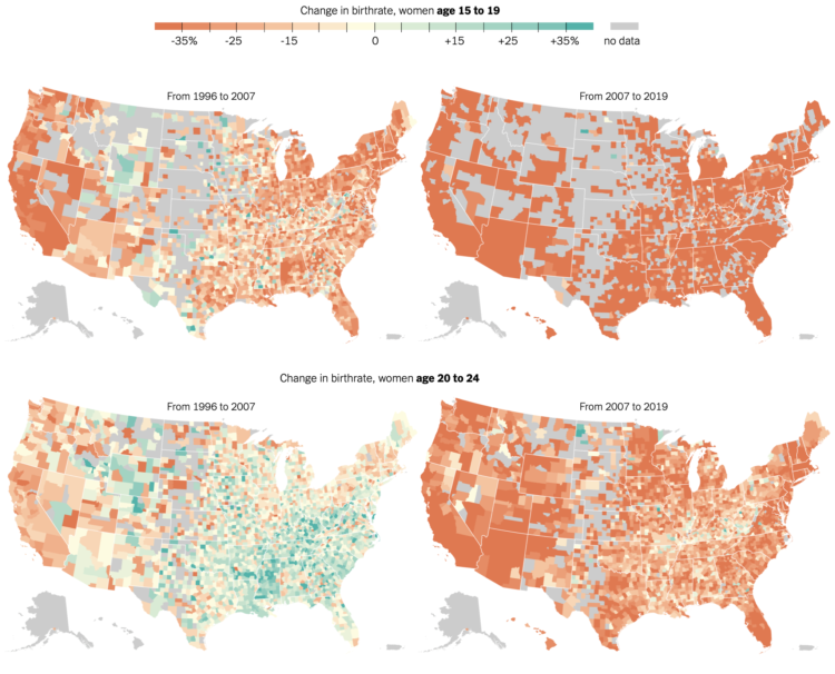
The New York Times mapped birth rates, which are down almost everywhere, especially among women in their 20s:
The result has been the slowest growth of the American population since the 1930s, and a profound change in American motherhood. Women under 30 have become much less likely to have children. Since 2007, the birthrate for women in their 20s has fallen by 28 percent, and the biggest recent declines have been among unmarried women. The only age groups in which birthrates rose over that period were women in their 30s and 40s — but even those began to decline over the past three years.


 Visualize This: The FlowingData Guide to Design, Visualization, and Statistics
Available now.