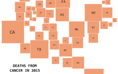
Care of Fox 8 in New Orleans, a baseline just below 92 degrees…
baseline
-
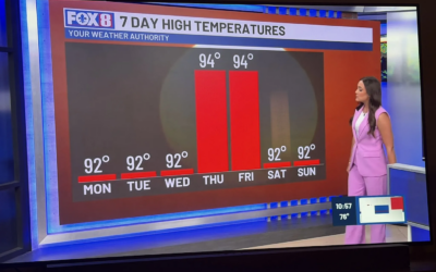
Two degrees looks like a lot
-
Members Only
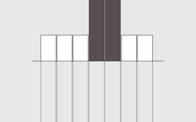
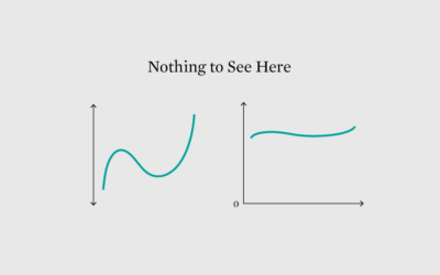
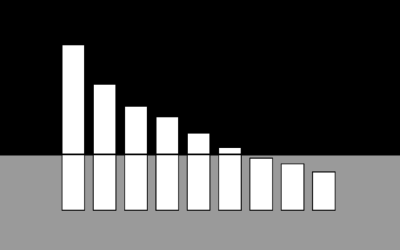
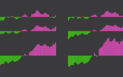
Wrong chart for the data
This week, a bar chart was the wrong choice.
-
Members Only
Comparing multiples
This week we make it easier to compare multiple charts when differences are small but significant.
-
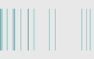
Improved Relative Time, a comparison to many more things in the timeline
You’re familiar with AD and BC, but you probably haven’t heard of AiP…
-

Multiplication mistake leads to exaggerated plastic cautions
There was a brouhaha a couple months ago over research that suggested black…
-
Members Only
Baseline Point of View
The point of visualization is to understand what data is about, which is rarely just about the numbers and almost always about what the data represents.
-
Why Line Chart Baselines Can Start at Non-Zero
There is a recurring argument that line chart baselines must start at zero, because anything else would be misleading. The critique is misguided.
-
Increasing mortality baseline
There was a time not that long ago when a hundred covid deaths…
-
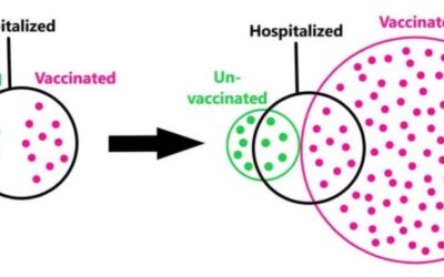
Euler diagram to illustrate base rate fallacy
Some people point out that vaccinated people are still hospitalized as a defense…
-
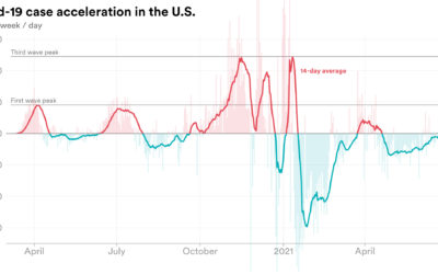
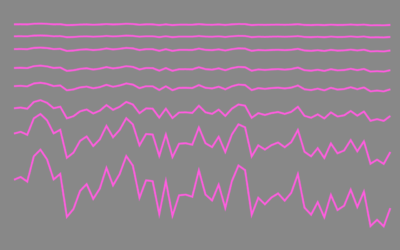
Rate of change in Covid-19 cases
We’re all familiar with the Covid-19 line charts that show cases over time,…
-
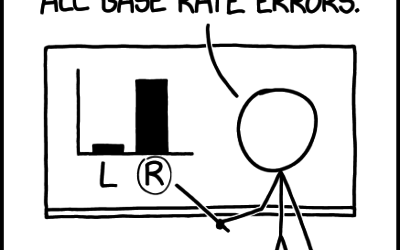
xkcd: Base Rate
xkcd points out the importance of considering the baseline when making comparisons:…
-
Members Only
Adjust Your Baseline for Better Comparisons (The Process 093)
The right baseline provides a way to compare everything else in a useful way. The wrong baseline makes the rest of the data useless.
-
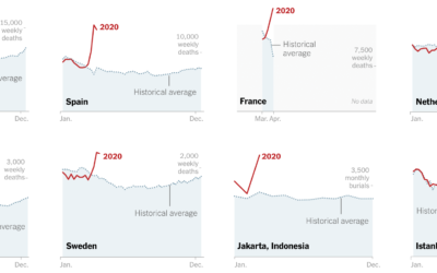
Missing deaths
The daily counts for coronavirus deaths rely on reporting, testing, and available estimates,…
-
Members Only
Bar Chart Baselines Don’t Have to Start at Zero? (The Process #66)
False.
-
Members Only
Adjusting the Point of Reference to Highlight Different Aspects of the Data (The Process #49)
They provide an anchor in your charts, and you compare everything else against the anchor. Where you set the anchor changes your chart completely.
-
Members Only
Line Chart Baselines Do Not Have to Start at Zero (The Process #39)
There was renewed interest in — gasp — truncated axes this week, a never-ending debate about whether starting axes at non-zero is misleading.
-
Useless Data Comparisons
Apples and oranges situations where the comparisons make no sense.
-
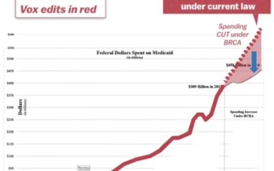
Misleading Medicaid funding with the baseline
The administration tweeted a chart that shows the Senate Republican health care bill…
-
Shift Your Point of View to When America Was “Better”
How good or bad something is depends on what you compare against.
-

Trump bar chart baselines are the worst baselines. Sad.
The Donald Trump campaign has a habit of highlighting poll results with a…
Recently for Members
Second Edition
 Visualize This: The FlowingData Guide to Design, Visualization, and Statistics (2nd Edition)
 Visualize This: The FlowingData Guide to Design, Visualization, and Statistics (2nd Edition)
New tools, refined process.
Browse by Chart Type See All →


