It’s like a line chart, but it specifically uses a reference point, which becomes the baseline, to compare all the other categories to.
Use color to reinforce or add another layer of meaning to a regular line chart.
By shifting the baseline to a reference point, you can focus a line chart on relative change, which can improve the visibility of smaller categories.
For the Washington Post’s Department of Data, Andrew Van Dam looks at historical…
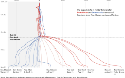
You might have heard that Elon Musk bought Twitter, and among the many…
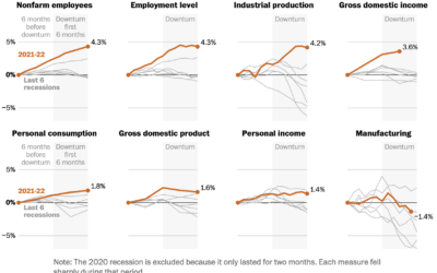
People disagree whether the United States is in a recession or not, because…
The number of births per month has been decreasing over the past decade. The pandemic seems to have sped up the process in the beginning.
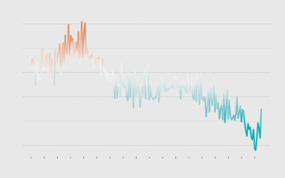
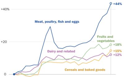
Using Consumer Price Index, Alyssa Fowers and Rachel Siegel for The Washington Post…
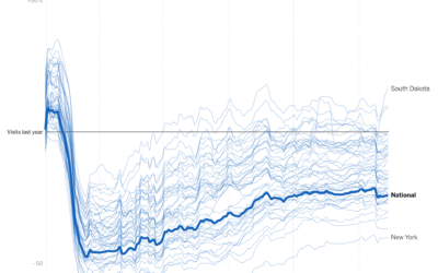
Businesses are still seeing visits mostly down compared to last year, which shouldn’t…
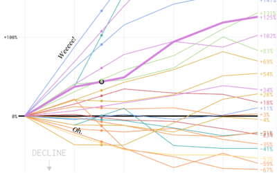
We looked at shifts in job distribution over the past several decades, but it was difficult to see by how much each occupation group changed individually. This chart makes the changes more obvious.
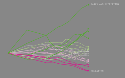
As industries change and interests shift, some bachelor's degrees grow more popular while others become less so.