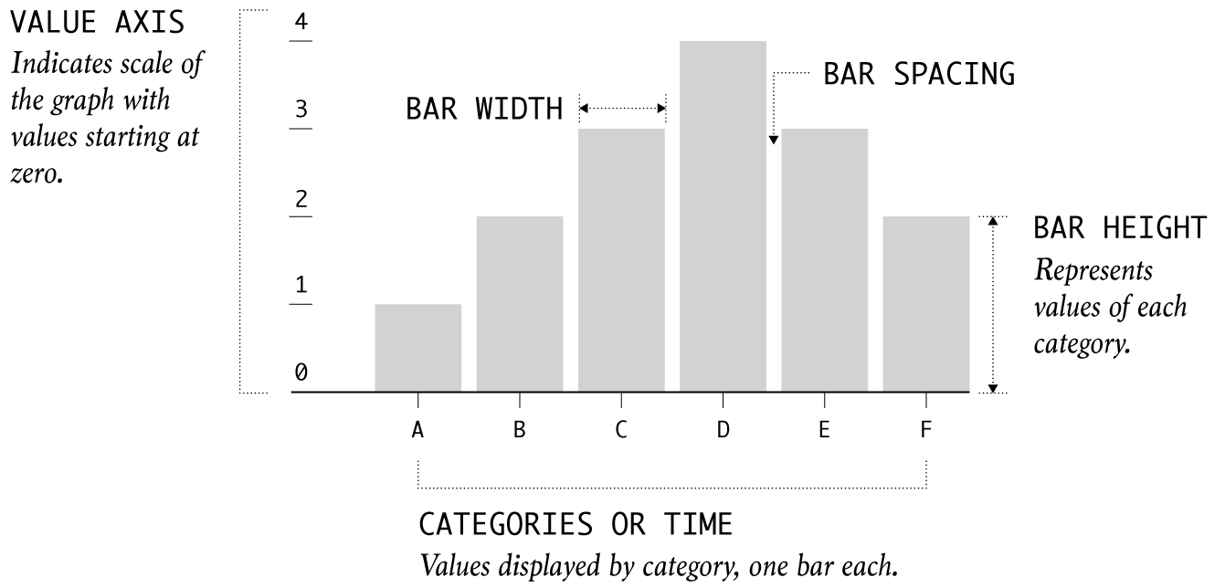
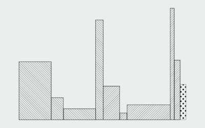
The old standby. The classic. The bar height or length represents data. The baseline starts at zero.
This week, a bar chart was the wrong choice.
This week, we talk limitations of the defaultiest of defaultiest chart types.
When bars are stacked, we can see shifts in composition, but the layout can also make it harder to see patterns individually. Let's look at our options.
Marimekko charts, or mosaic plots, allow you to compare categories over two quantitative variables.
This past month an old chart type poked its head out from behind the trees and I'm here for it.
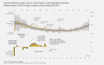
Show current evolution against expected historical variability and add one or more series that could account for the difference.
The New York Times counted Elon Musk’s promises on X/Twitter and Tesla earnings…
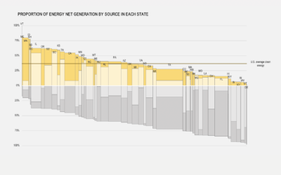
Lazaro Gamio and Josh Holder for the New York Times break down energy…
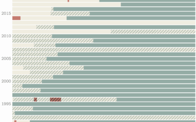
Most states gained population, but a few saw more people move out than move in, based on the newest estimates from the Census Bureau.
Peter Oppenheimer, the chief global equity strategist for Goldman Sachs, points to the…
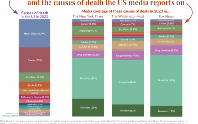
Our World in Data compared causes of death in the United States against…
Just under half of adults in the United States said they had an alcoholic beverage in the past 30 days. Does this change for various groups?
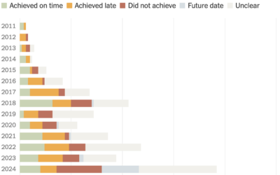
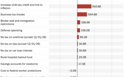
As one might expect, Congress is having trouble figuring out how to fund…
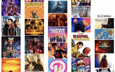
This summer was supposed to be a return to pre-pandemic levels of movie-going,…
See how common activities were for a given time of day, age, and sex.
The Washington Post starts with a bar chart to show the major changes…
People tend to marry or partner with those closer to their age. However, some venture outside the typical range.
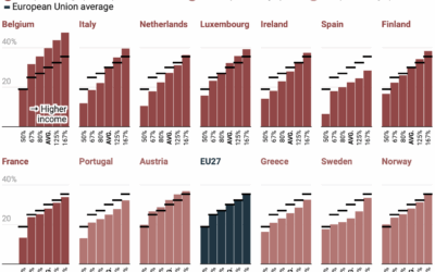
There is always ample discussion about progressive tax rates in the United States.…
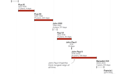
Pope Francis’ papacy started in 2013 and lasted 12 years and 39 days.…
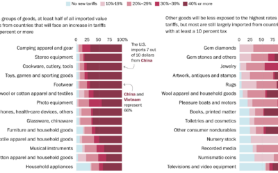
You get a tariff. And you get a tariff. And you. And you.…
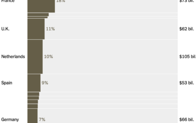
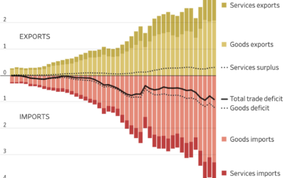
The Wall Street Journal has a handful of charts that briefly explain trade…
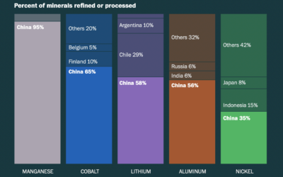
To make batteries for electric vehicles, manufacturers require materials from all over the…