Looks like a radar. That’s why it’s called a radar chart.
With cyclical data, a circular format might be useful. Combine that with a smooth density to reduce noise, and you got yourself a plot.
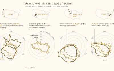
National parks are increasingly crowded, which kind of detracts from the peaceful wilderness…
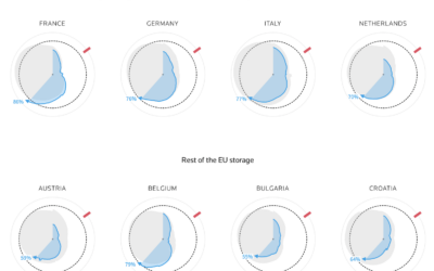
Reuters goes with the radar chart to show gas supplies, as European countries…
Survey participants were asked to grade fast food burger restaurants on eight criteria. This is how each restaurant ranked.