Guides
Tips and suggestions for working with and designing with data.
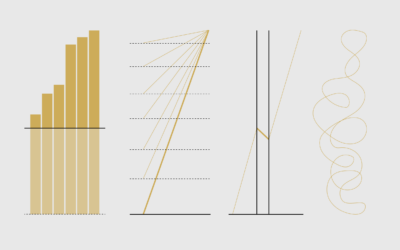
Defense Against Dishonest Charts
This is a guide to protect ourselves and to preserve what is good about turning data into visual things.
Why Line Chart Baselines Can Start at Non-Zero
There is a recurring argument that line chart baselines must start at zero, because anything else would be misleading. The critique is misguided.
Ask the Question, Visualize the Answer
Let's work through a practical example to see how asking and answering questions helps guide you towards more focused data graphics.
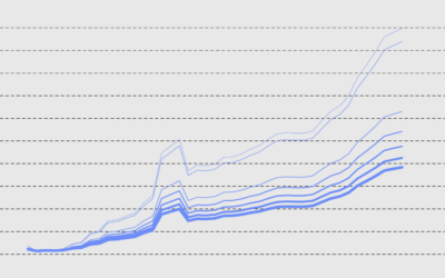
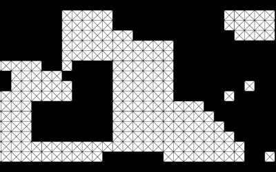
Visualizing Patterns on Repeat
Things have a way of repeating themselves, and it can be useful to highlight these patterns in data.

Why People Make Bad Charts (and What to Do When it Happens)
It's important to consider the reasons so that we don't overreact. Otherwise, we're just berating, pointing, and laughing all of the time, and that's not good for anyone.
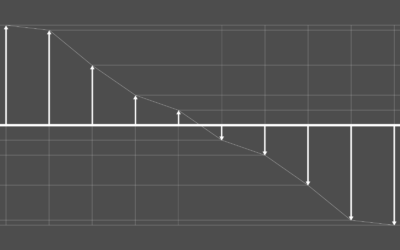
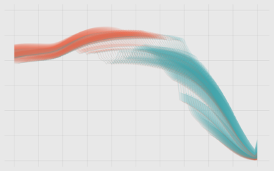
Visualizing Differences
Focus on finding or displaying contrasting points, and some visual methods are more helpful than others. A guide.

Visualizing Outliers
Step 1: Figure out why the outlier exists in the first place. Step 2: Choose from these visualization options to show the outlier.
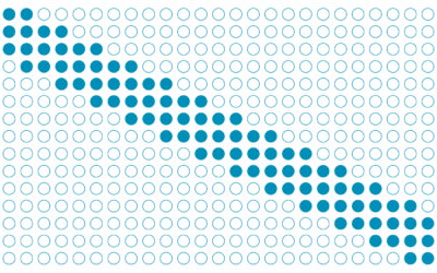
Visualizing Incomplete and Missing Data
We love complete and nicely formatted data. That's not what we get a lot of the time.
Visualizing the Uncertainty in Data
Data is an abstraction, and it's impossible to encapsulate everything it represents in real life. So there is uncertainty. Here are ways to visualize the uncertainty.
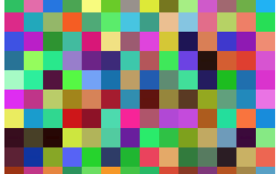
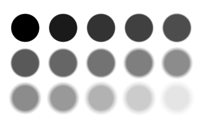
4 Tools to Pick Your Chart Colors
These are the quick and simple tools I use to pick colors to represent data.

Summary Statistics Tell You Little About the Big Picture
Mean, median, and mode. These are the first things you learn about in…

How to Spot Visualization Lies
Many charts don't tell the truth. This is a simple guide to spotting them.