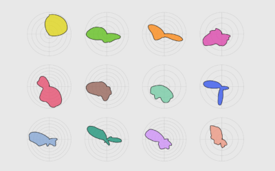
Using geometric shapes as an encoding can provide another dimension to your charts.
R
-
Members Only
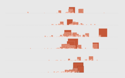
How to Make Symbol-based Glyph Charts, with R Examples
-
Making map art in R
If you can make maps in your software and customize the aesthetics, you…
-
Presidential Plinko
To visualize uncertainty in election forecasts, Matthew Kay from Northwestern University used a…
-
Friends sitcom transcript dataset
For your analytical perusal, Emil Hvitfeldt provides ten seasons’ worth of scripts from…
-
Members Only
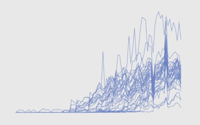
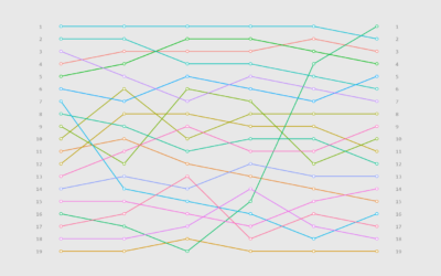
How to Untangle a Spaghetti Line Chart (with R Examples)
Put multiple time series lines on the same plot, and you quickly end up with a mess. Here are practical ways to clean it up.
-
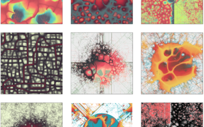
Using a slime mold simulation for generative art
Slime mold are single-celled organisms that can work together to form multicellular structures.…
-
Members Only

How to Make a Spiral Chart in R
Using a spiral might not be the best way to encode data. But here’s how to do it anyway. Just in case.
-
Members Only
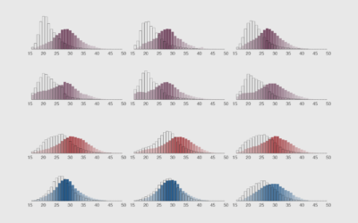
How to Make Animated Histograms in R, with ggplot and gganimate
Make them move to show a shift in distributions over time.
-
Members Only
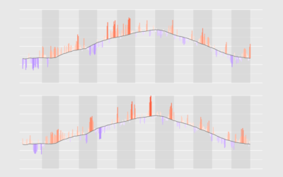
How to Visualize Anomalies in Time Series Data in R, with ggplot
Quickly see what’s below and above average through the noise and seasonal trends.
-
How to Flatten the Curve, a Social Distancing Simulation and Tutorial
Using R, we look at how your decreased interaction with others can help slow the spread of infectious diseases.
-
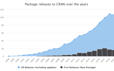
R turned 20 years old
R turned 20 last week. The first public release of R was on…
-
Members Only
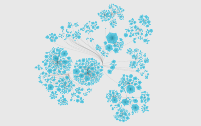
How to Visualize Hierarchical Graphs in R, with ggraph and tidygraph
Network graphs are a good way to find structure and relationships within hierarchical data. Here are several ways to do it.
-

Scripts from The Office, the dataset
The decade is almost done. You’re sitting there and you’re thinking: “I wish…
-
Members Only
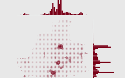
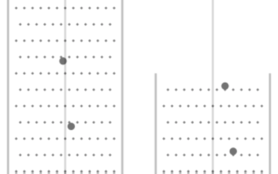
How to Make a Grid Map with Histograms in R, with ggplot
Layout multiple charts in a single view. Then adjust the scales appropriately for maximum comparability and a unified graphic.
-
Members Only
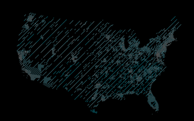
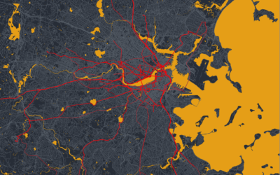
How to Draw Maps with Hatching Lines in R
Fill areas with varying line density to give more or less visual attention. With geographic maps, the technique is especially useful to adjust for population density.
-
Teaching R to 7th graders
Joshua Rosenberg describes his one-day experience teaching R to 7th graders:
[T]he activity… -
Members Only
How to Make a Bump Chart in R, with ggplot
Visualize rankings over time instead of absolute values to focus on order instead of the magnitude of change.
-

Detailed generative art in R
Thomas Lin Pedersen has been sharing his generative art pieces as of late:…
-
Optimizing a Pokémon team with simulation
Emily Robinson recently took up Pokémon on Nintendo Switch:
I recently started playing… -
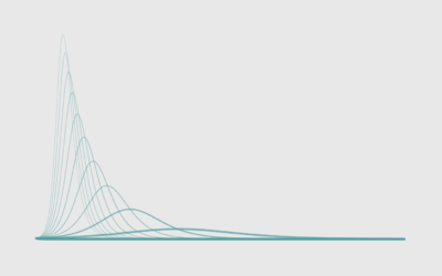
Members Only
How to Make a Polar Density Plot in R
With cyclical data, a circular format might be useful. Combine that with a smooth density to reduce noise, and you got yourself a plot.
Recently for Members
Second Edition
 Visualize This: The FlowingData Guide to Design, Visualization, and Statistics (2nd Edition)
 Visualize This: The FlowingData Guide to Design, Visualization, and Statistics (2nd Edition)
New tools, refined process.
Browse by Chart Type See All →


