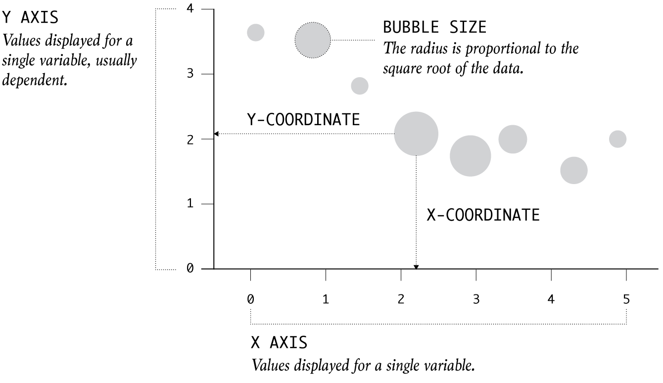
Points are placed like in a scatter plot, but they are sized based on the square root of data values.
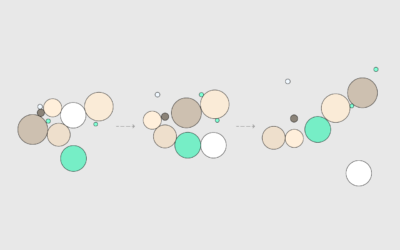
Pack circles, figure out the transitions between time segments, and then generate frames to string together.
Represent individual counts with grouped units to make data feel less abstract.
When you choose visual encodings before considering the data, you usually end up with results that aren't so great.
Adjust coordinates, geometries, and encodings with packed circles to make various types of charts.
Learn how to build a custom visualization using D3.js and get acquainted with the popular JavaScript library.
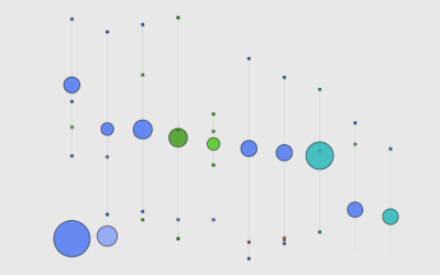
Ooo, bubbles... It's not the most visually efficient method, but it's one of the more visually satisfying ones.
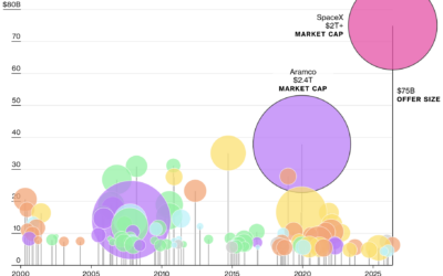
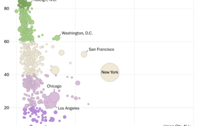
For Bloomberg, Demetrios Pogkas, Jennah Haque, and Kiel Porter show the projected scale…
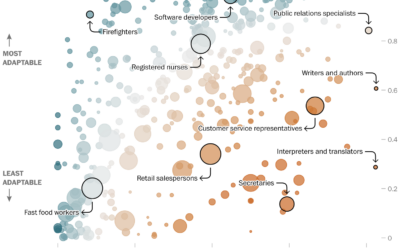
Researchers at GovAI and Brookings estimated vulnerability to job displacement due to AI.…
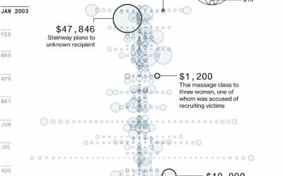
Bloomberg gained access to an email cache from Jeffrey Epstein’s Yahoo Mail inbox,…
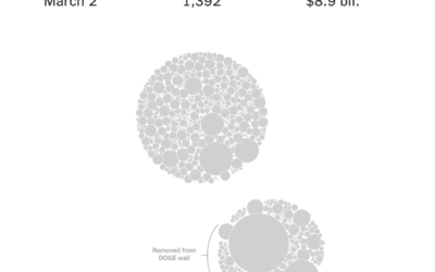
The “Department of Government Efficiency” keeps a “Wall of Receipts” to signal transparency…
Using body mass index (BMI), which is calculated with height and weight, most people fall into the categories of overweight or obese.
It's gotten more difficult to get into top colleges over the years, but most schools have either admitted students at the same rate or increased admission rates since 2001.
As you get older, it might start to feel like everyone is getting younger around you. At what point are you older than the majority?
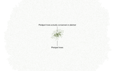
Marc Benioff, the CEO of Salesforce, set out to plant and conserve 1…
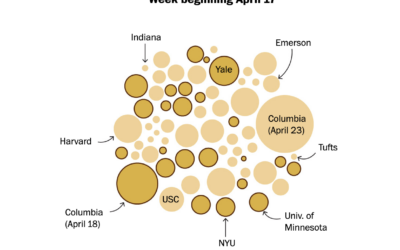
Based on estimates from the Crowd Counting Consortium, the Washington Post shows the…
NatureQuant processes and analyzes satellite imagery to quantify people’s access to nature. They…
These are income ranges for the ten most common jobs at different income levels.
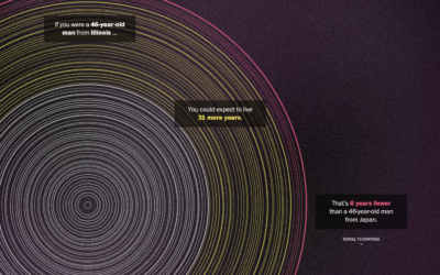
The Washington Post goes with a tree ring metaphor to compare life expectancy…
In 2020, our everyday routines shifted dramatically, but over the past few years, it's felt like things are getting back to where they were. How back are we?
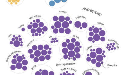
Bed Bath & Beyond filed for bankruptcy, so Alex Leeds Matthews and Amy…
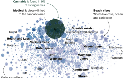
Daniel Wolfe for The Washington Post looked at the similar word choices across…
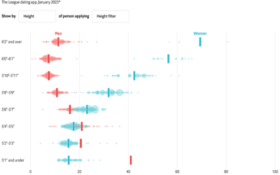
With online dating apps, you’re able to filter out potential matches based on…