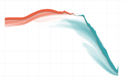
By shifting the baseline to a reference point, you can focus a line chart on relative change, which can improve the visibility of smaller categories.
R
-
Members Only
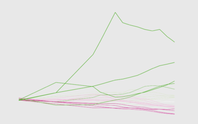
How to Make Baseline Charts in R
-
Members Only
Select Your Weapon (The Process #48)
Some people love the Tidyverse in R. Others are less fond of it. For me, the more tools the better.
-
What is R, what it was, and what it will become
Roger Peng provides a lesson on the roots of R and how it…
-
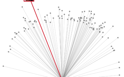
Damian Lillard’s Game-Winner in Context
Here are all the playoff threes he’s made in his playoff career, plus some R code.
-
Members Only
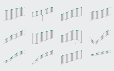
How to Make a Bump Chart in R
Visualize rankings over time instead of absolute values to focus on order instead of the magnitude of change.
-

Hatching image effect in R
Here’s a fun thing to try in R. Jean Fan posted some code…
-
Members Only
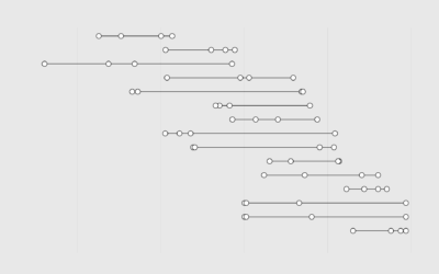
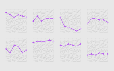
How to Make Dot Timelines in R
For when you want to show the occurrence of events over time.
-
Members Only
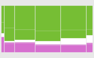
How to Make a Mosaic Plot in R
Also known as a Marimekko diagram, the mosaic plot lets you compare multiple qualitative variables at once. They can be useful, sometimes.
-
Members Only
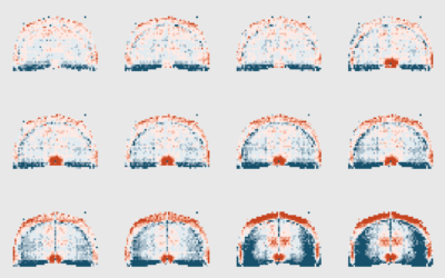
How to Make Animated (GIF) Heatmaps in R
Using color as the visual encoding, show changes over time in two dimensions.
-
Members Only
Tufte Tweet Follow-up; Visualization Tools and Resources Roundup for December 2018
Edward Tufte criticized R for not being able to do some things typographically. It came in a tweet and was likely misunderstood. Sort of. I got a clarification from the man himself.
-
Members Only
How I Made That: Animated Difference Charts in R
A combination of a bivariate area chart, animation, and a population pyramid, with a sprinkling of detail and annotation.
-
Members Only
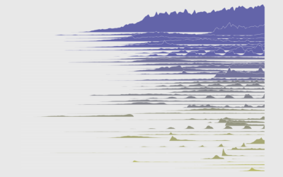
How to Make Frequency Trails in R
Also known as ridgeline plots, the method overlaps time series for a 3-D-ish view of the data. While perhaps not the most visually efficient, the allure is undeniable.
-
Members Only
How to Make Better-Looking, More Readable Charts in R
Defaults are generalized settings to work with many datasets. This is fine for analysis, but data graphics for presentation benefit from context-specific design.
-
Members Only

Wrong Tool, Right Tool, More Tools for Visualization
Welcome to the new members-only newsletter: The Process. In this first update, a certain data graphics expert seems to really dislike R, which prompts a look into the visualization tools we use and what one might get out of a bigger toolbox.
-
Members Only
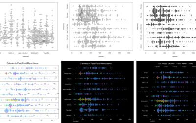
How to Visualize Ranges of Data in R
When you want to focus on the magnitude of differences between low and high values, use visual cues that highlight distance.
-
Members Only
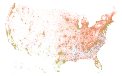
How I Made That: National Dot Density Map
Mapping one dot per person, it’s all about putting the pieces together.
-
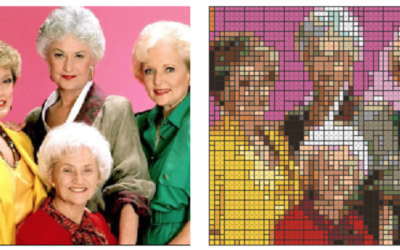
Convert an image to LEGO brick shopping list in R
Every day you wish you could convert a picture of your family or…
-
Members Only
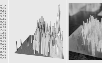
3-D Printing: How to Prepare the Data in R
Moving your data from the digital screen to something more physical isn’t as tricky as it seems. Here’s how I did it.
-
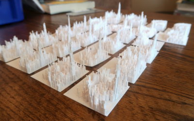
Data, R, and a 3-D Printer
We almost always look at data through a screen. It’s quick and good for exploration. So is there value in making data physical? I played around with a 3-D printer to find out.
-
Datasets for teaching data science
Rafael Irizarry introduces the dslabs package for real-life datasets to teach data science:…
Recently for Members
Second Edition
 Visualize This: The FlowingData Guide to Design, Visualization, and Statistics (2nd Edition)
 Visualize This: The FlowingData Guide to Design, Visualization, and Statistics (2nd Edition)
New tools, refined process.
Browse by Chart Type See All →


