How to Visualize Anomalies in Time Series Data in R, with ggplot
Quickly see what’s below and above average through the noise and seasonal trends.
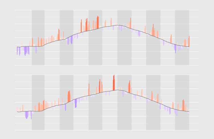
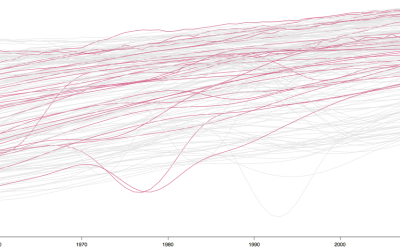
Whether or not values in a time series are normal or abnormal can be tricky to show because of underlying trends and periodic cycles in the data. One technique to visualize this aspect of time series data is to visualize the normal values, and plot the deviations from those normal values (sometimes called “anomalies”) on top of those.
This technique applies especially well to weather data. In order to show how normal or abnormal cold and hot weather spells are, plotting the raw numbers is usually not very interesting: it is much more meaningful to plot the deviations from the normal values to see if a spell is unusually hot or cold for the time of the year.
To access this full tutorial, you must be a member. (If you are already a member, log in here.)
Get instant access to this tutorial and hundreds more, plus courses, guides, and additional resources.
Membership
You will get unlimited access to step-by-step visualization courses and tutorials for insight and presentation — all while supporting an independent site. Files and data are included so that you can more easily apply what you learn in your own work.
Learn to make great charts that are beautiful and useful.
Members also receive a weekly newsletter, The Process. Keep up-to-date on visualization tools, the rules, and the guidelines and how they all work together in practice.
See samples of everything you gain access to:
About the Author
Maarten is a data journalist and data visualization consultant from Belgium. He likes maps, ggplot and a good story.