How to Make a Bump Chart in R, with ggplot
Visualize rankings over time instead of absolute values to focus on order instead of the magnitude of change.
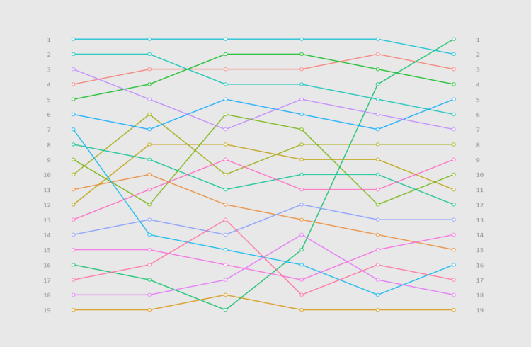
The bump chart is a line chart variant that focuses specifically on ranks over time instead of absolute values.
The advantage of the bump chart is that it’s unaffected by large differences in magnitudes, whereas a standard line chart might find itself with a bunch of lines clustered at the bottom because of a high-value category. The bump chart instead spaces ranks evenly.
With this in mind, the process of making a bump chart is similar to making a line chart in ggplot. The difference is that you need to calculate ranks first (if they’re not available already), and because you’re looking at ranks, it is a good idea to adjust the vertical scale accordingly.
To access this full tutorial, you must be a member. (If you are already a member, log in here.)
Get instant access to this tutorial and hundreds more, plus courses, guides, and additional resources.
Membership
You will get unlimited access to step-by-step visualization courses and tutorials for insight and presentation — all while supporting an independent site. Files and data are included so that you can more easily apply what you learn in your own work.
Learn to make great charts that are beautiful and useful.
Members also receive a weekly newsletter, The Process. Keep up-to-date on visualization tools, the rules, and the guidelines and how they all work together in practice.
See samples of everything you gain access to:
About the Author
Maarten is a data journalist and data visualization consultant from Belgium. He likes maps, ggplot and a good story.