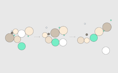
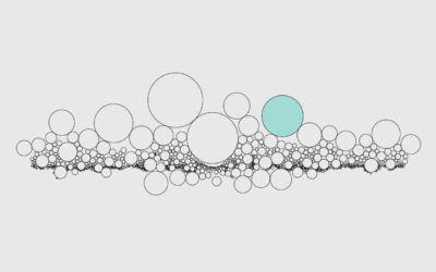
Circle size represents data like with a bubble chart, but there is typically no x-y axis. Instead position often represents grouping or is used to maximize space.
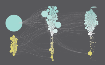
Pack circles, figure out the transitions between time segments, and then generate frames to string together.
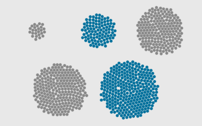
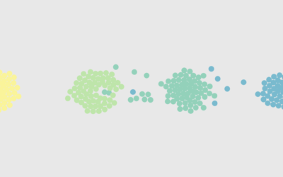
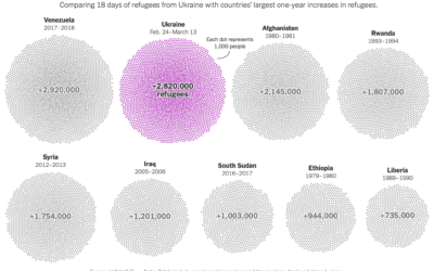
Represent individual counts with grouped units to make data feel less abstract.
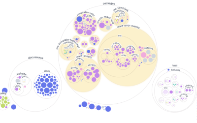
Adjust coordinates, geometries, and encodings with packed circles to make various types of charts.
Ooo, bubbles... It's not the most visually efficient method, but it's one of the more visually satisfying ones.
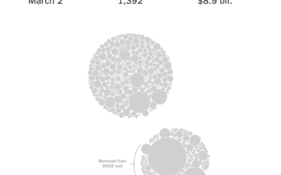
The “Department of Government Efficiency” keeps a “Wall of Receipts” to signal transparency…
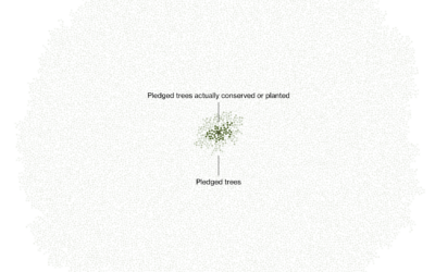
Marc Benioff, the CEO of Salesforce, set out to plant and conserve 1…
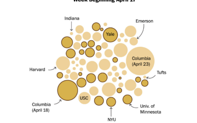
Based on estimates from the Crowd Counting Consortium, the Washington Post shows the…
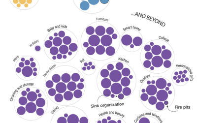
Bed Bath & Beyond filed for bankruptcy, so Alex Leeds Matthews and Amy…
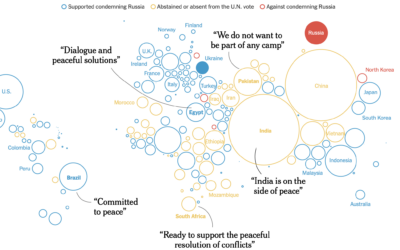
The New York Times shows how the west tried to isolate Russia and…
There are things that make us happy. There are things where we find meaning in the everyday. What are the things that give us both?
Agar.io is a multiplayer game where people control cells in a Petri dish-type…
Millions of Ukrainians (over three million as of this writing) have left their…
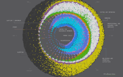
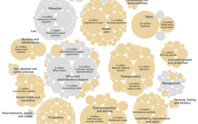
This is a 24-hour snapshot for a day in the life of Americans.
We see percentages for the vaccinated and unvaccinated, and people can easily misinterpret…
Most people are familiar with the file-and-folder view. Sort alphabetically, date, or file…
Researchers asked 10,000 participants to list ten things that recently made them happy. I counted and connected the dots.
The Bloomberg medal tracker is fun to look at. I think the graphics…
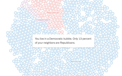
Gus Wezerek, Ryan D. Enos, and Jacob Brown for NYT Opinion use neighborhood-level…
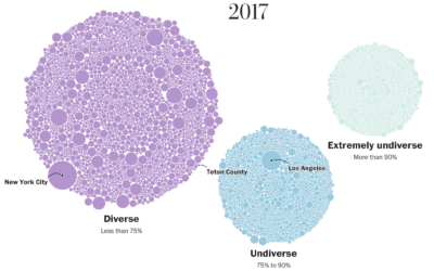
Matthew Conlen, in an article by Abby Goodnough and Jan Hoffman for NYT,…
The Washington Post visualized 13,000 school districts to show the change in diversity…