Tutorials
Visualize your data like an expert with hundreds of practical how-tos for presentation, analysis, and understanding.
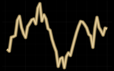
Line Chart with Decorative Neon Accents
We do it because things that glow in the dark are awesome, including line charts.
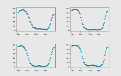
Aggregating Time Use Microdata
Being able to work with microdata from the American Time Use Survey, via IPUMS, means you can subset, filter, and categorize how you want. This makes it easier to explore questions.
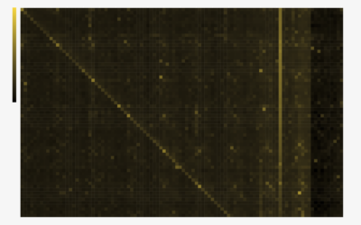
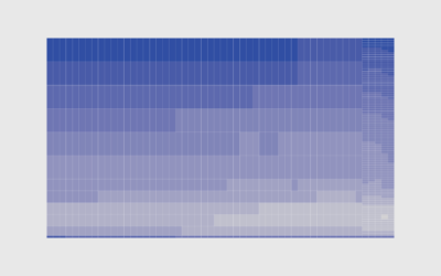
Heatmaps and Defining Color Scales
With color as the visual encoding, choose the scales that allow you to see actual patterns.
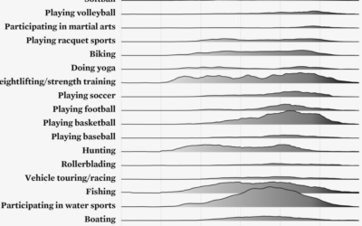
Ridgeline Chart with Color Gradients
Ridgeline charts are nice to look at, and that is enough reason to make them. Use a gradient fill for extra sauce.
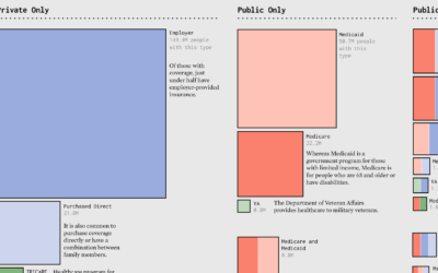
Make the Chart: Scaled Squares with Color Bands
Areas represent total counts and the colors indicate categories. Together, the symbols show the distributions in a population.
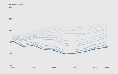
Make the Chart: Interactive Line Chart with Ghost Trails
Using faded lines to show the overall changes in a time series and to provide a point of reference for the present.
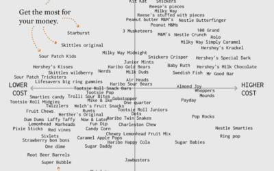
Make the Chart: Scatterplot Using Text Instead of Dots
I made a chart about Halloween candy. Even dumb charts need attention and require that choices are made.
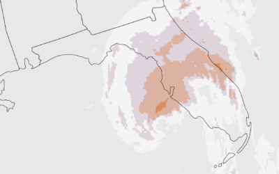
Make the Chart: Precipitation Map as Animated GIF
Weather. Data. Map. Animation. They go well together to show sudden changes over time.
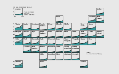
Make the Chart: Grid Map with Stacked Areas
Breaking it down to the small steps and choices with data, code, and editing that lead to a finished chart.
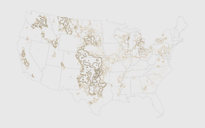
How to Map with Contour Lines and GeoTIFF in R
GeoTIFF data can provide high granularity but make it hard to see patterns when data is sparse. Contour lines provide an aggregated view that makes patterns easier to see.
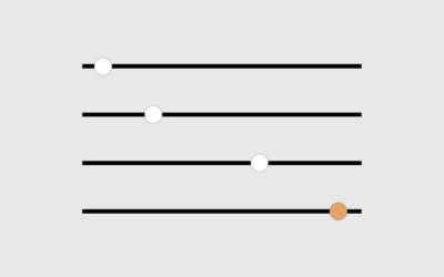
How to Use a Slider to Let Readers Customize Charts
A simple user-controlled slider can help readers look at a dataset from their own point of view.
How to Make a Cartogram with Packed Circles in R
There are packages to make cartograms, but in some cases you might need a more flexible solution.
How to Make a Heatmap with Irregular Bins in R
There are existing functions and packages to make heatmaps in R, but when the data is irregular, it's worth going custom.
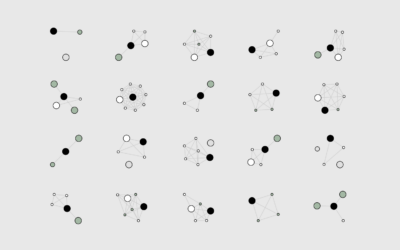
How I Made That: Network Diagrams of All the Household Types
Process the data into a usable format, which makes the visualization part more straightforward.
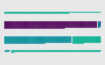
How to Make Unit-Based, Variable Width Bar Charts
In a cross between unit charts and variable width bar charts, we can show total counts and relative proportions at the same time.
How to Make a Smoother Animated Growth Map in R
Show change over time and geography with smooth transitions.
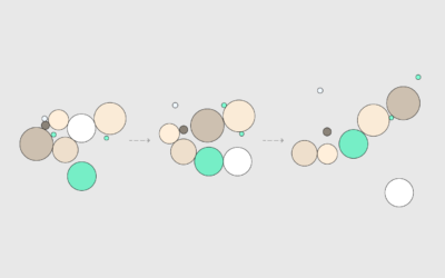
How to Animate Packed Circles in R
Pack circles, figure out the transitions between time segments, and then generate frames to string together.
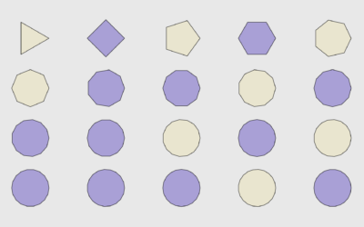
How to Draw and Use Polygons in R
R provides functions for basic shapes, but you can also draw your own for maximum fun.