Show connections in the circular layout for a more compact presentation.
R
-
Members Only
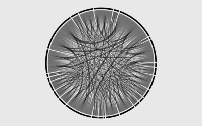
How to Make Chord Diagrams in R
-
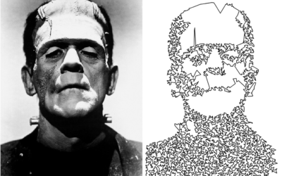
Traveling salesman image drawing
This is a fun drawing experiment in R by Antonio Sánchez Chinchón. A…
-
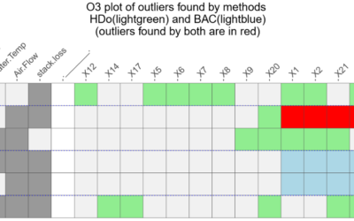
Outlier detection in R
Speaking of outliers, it’s not always obvious when and why a data point…
-
Members Only
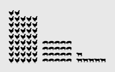
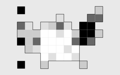
How to Make Unit Charts with Icon Images in R
Make the unit chart less abstract with icons that represent the data, or use this in place of a bar chart.
-
Link
Let it flow, let it flow, let it flow →
The particles R package from Thomas Lin Pedersen ports d3-force from d3.js to R. Make a bunch of dots move.
-
Members Only
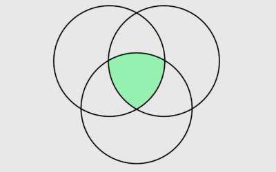
How to Make Venn Diagrams in R
The usually abstract, qualitative and sometimes quantitative chart type shows relationships. You can make them in R, if you must.
-

Field Guide to the R Ecosystem
If you’re looking to acquaint yourself with R — the non-coding aspects of…
-
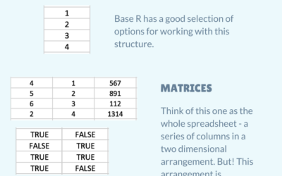
R data structures for Excel users
Introducing yourself to R as an Excel user can be tricky, especially when…
-
12 Days of ChaRt-mas
As everyone has already checked out for the rest of the year, I’m going to mess around with R to the tune of The Twelve Days of Christmas and nobody can stop me.
-
Members Only
How to Make a State Map Grid with Small Multiples in R
Combining small multiples with the grid layout can make for an intuitive geographic reference.
-
Members Only
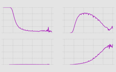
Compact Ways to Visualize Distributions in R
For when you want to show or compare several distributions but don’t have a lot of space.
-
Members Only
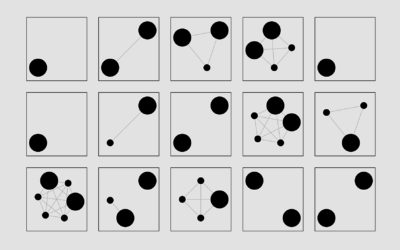
Getting Started with Network Graphs in R
Add the vertices. Connect them with edges. Repeat as necessary.
-
Members Only
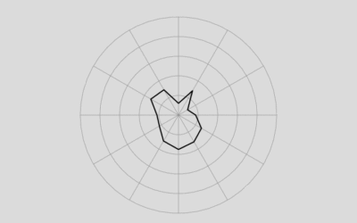
How to Make (and Animate) a Circular Time Series Plot in R
Also known as a polar plot, it is usually not the better option over a standard line chart, but in select cases the method can be useful to show cyclical patterns.
-
Members Only
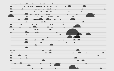
How to Make a Semicircle Plot in R
It’s the half cousin of the bubble plot with less overlap and more straight edges.
-
Link
World Tile Grid Map in ggplot2 →
A straightforward tutorial on using squares instead of geographic boundaries.
-
Link
R or Python? →
Big community and lots of tools for both.
-
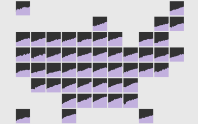
Members Only
How to Make a State Grid Map in R
Something of a cross between a reference table and a map, the state grid provides equal space to each state and a semblance of the country to quickly pick out individual states.
-
Members Only
How to Make Animated Line Charts in R
Sometimes it’s useful to animate the multiple lines instead of showing them all at once.
-
Members Only
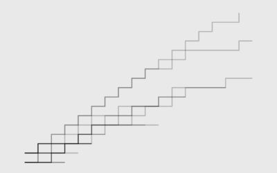
How to Make a Multi-line Step Chart in R
For the times your data represents immediate changes in value.
-
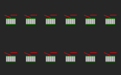
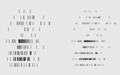
Members Only
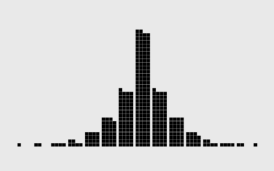
Symbols-based Unit Charts to Show Counts in R
Add visual weight by using individual items to show counts.
Recently for Members
Second Edition
 Visualize This: The FlowingData Guide to Design, Visualization, and Statistics (2nd Edition)
 Visualize This: The FlowingData Guide to Design, Visualization, and Statistics (2nd Edition)
New tools, refined process.
Browse by Chart Type See All →


