How to Make a Grid Map with Histograms in R, with ggplot
Layout multiple charts in a single view. Then adjust the scales appropriately for maximum comparability and a unified graphic.
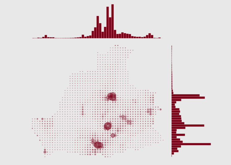
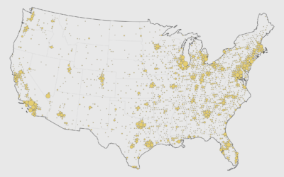
World maps that show population by longitude and latitude are almost like a meme in cartography and data visualization. But in this tutorial, you take this a step further, and make a map that shows population by longitude and latitude at the country level.
To access this full tutorial, you must be a member. (If you are already a member, log in here.)
Get instant access to this tutorial and hundreds more, plus courses, guides, and additional resources.
Membership
You will get unlimited access to step-by-step visualization courses and tutorials for insight and presentation — all while supporting an independent site. Files and data are included so that you can more easily apply what you learn in your own work.
Learn to make great charts that are beautiful and useful.
Members also receive a weekly newsletter, The Process. Keep up-to-date on visualization tools, the rules, and the guidelines and how they all work together in practice.
See samples of everything you gain access to:
About the Author
Maarten is a data journalist and data visualization consultant from Belgium. He likes maps, ggplot and a good story.