How to Make a Polar Density Plot in R
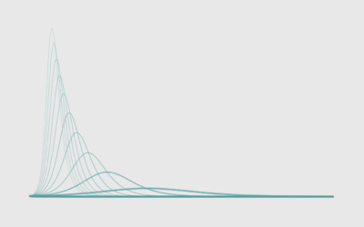
With cyclical data, a circular format might be useful. Combine that with a smooth density to reduce noise, and you got yourself a plot.
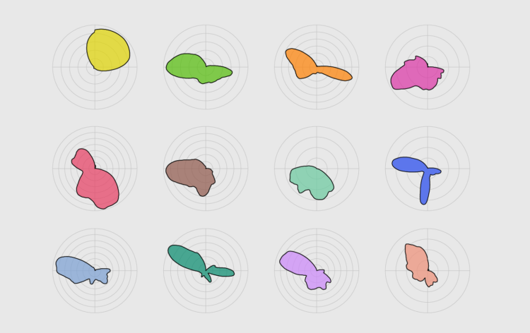
Use of a circular layout oftentimes seems like someone was trying to make some data look nice. Other times, the circular layout can fit better in the space you have. Or, your data is cyclical, so it can be useful to overlay the same periods over each other to compare.
Whatever the reason may be, the polar coordinate system is not something to shun away. It can be useful for the right case.
In this tutorial, you visualize data that is cyclical and smooth out the data to reduce noise and focus more on the overall distribution. The result, depending on who you ask, is a polar, spider, or radar plot with a smoothed density curve.
To access this full tutorial, you must be a member. (If you are already a member, log in here.)
Get instant access to this tutorial and hundreds more, plus courses, guides, and additional resources.
Membership
You will get unlimited access to step-by-step visualization courses and tutorials for insight and presentation — all while supporting an independent site. Files and data are included so that you can more easily apply what you learn in your own work.
Learn to make great charts that are beautiful and useful.
Members also receive a weekly newsletter, The Process. Keep up-to-date on visualization tools, the rules, and the guidelines and how they all work together in practice.
See samples of everything you gain access to:
About the Author
Nathan Yau is a statistician who works primarily with visualization. He earned his PhD in statistics from UCLA, is the author of two best-selling books — Data Points and Visualize This — and runs FlowingData. Introvert. Likes food. Likes beer.