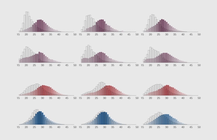
How to Make Animated Histograms in R, with ggplot and gganimate
Make them move to show a shift in distributions over time.
How cool would it be to just add a few lines of code to a static ggplot visualisation to turn it into an informative, engaging and fun to watch animation? Well, the gganimate package does just that. It extends the grammar and logic for the construction of static graphics of the ggplot package with verbs to breath life and animation into them.
In this tutorial, you’ll learn how to make small multiple histograms with ggplot and animate them with gganimate.
To access this full tutorial, you must be a member. (If you are already a member, log in here.)
Get instant access to this tutorial and hundreds more, plus courses, guides, and additional resources.
Membership
You will get unlimited access to step-by-step visualization courses and tutorials for insight and presentation — all while supporting an independent site. Files and data are included so that you can more easily apply what you learn in your own work.
Learn to make great charts that are beautiful and useful.
Members also receive a weekly newsletter, The Process. Keep up-to-date on visualization tools, the rules, and the guidelines and how they all work together in practice.
See samples of everything you gain access to:
About the Author
Maarten is a data journalist and data visualization consultant from Belgium. He likes maps, ggplot and a good story.