How to Make a Spiral Chart in R
Using a spiral might not be the best way to encode data. But here’s how to do it anyway. Just in case.

In 1900, W.E.B. Du Bois and his students visualized black America with a series of charts. You can view the collection via the Library of Congress. One of the charts was a spiral that showed where black people lived at the time:
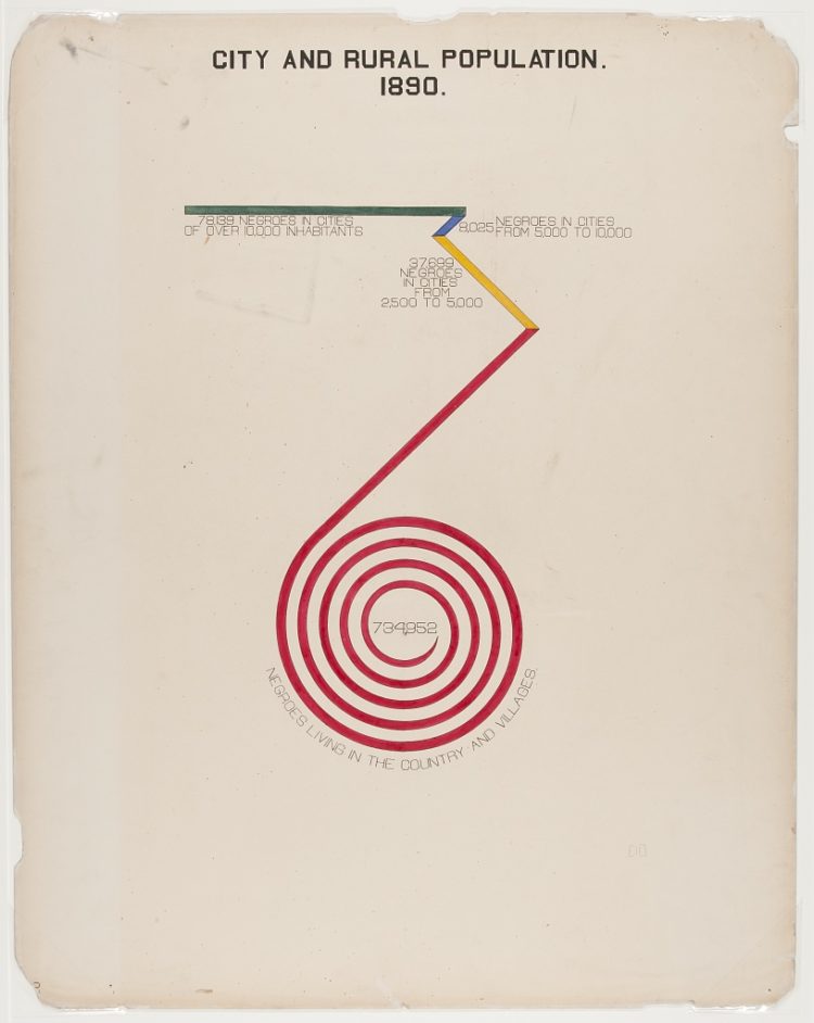
An FD reader asked if there was a name for the chart type, but I don’t think there’s any formal name for it. The best I could come up with was a stacked spiral chart.
It’s like a stacked bar chart that twists around. The length of the line or bar represents the data. So the longer the linear length, the greater the relative value.
Curious about making something similar in R, I made this:
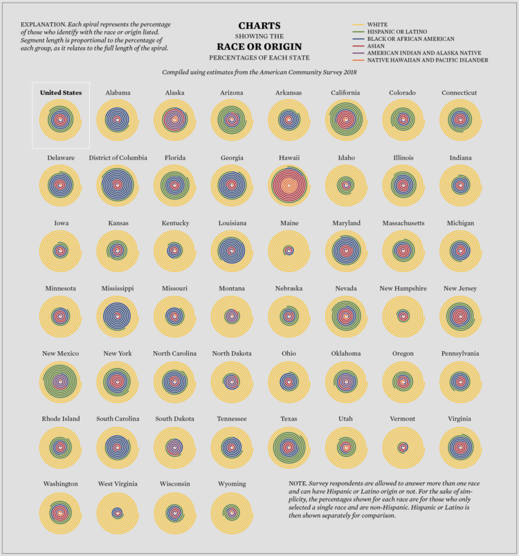
The tricky part with reading this chart is that my brain seems to want to interpret area as a the visual encoding instead of line length. Arcs on the outside, while they use length, appear to take up less visual space.
I still need to experiment more, but I feel like this can be remedied with thinner lines and more space. Maybe this doesn’t work well with small multiples. I’m not sure, but the best way to find out is to put it out there and see how people interpret it.
So here’s a tutorial how to do it. Maybe it’s not the most visually efficient chart type, but these things have a way of becoming useful in the end.
To access this full tutorial, you must be a member. (If you are already a member, log in here.)
Get instant access to this tutorial and hundreds more, plus courses, guides, and additional resources.
Membership
You will get unlimited access to step-by-step visualization courses and tutorials for insight and presentation — all while supporting an independent site. Files and data are included so that you can more easily apply what you learn in your own work.
Learn to make great charts that are beautiful and useful.
Members also receive a weekly newsletter, The Process. Keep up-to-date on visualization tools, the rules, and the guidelines and how they all work together in practice.
See samples of everything you gain access to:
About the Author
Nathan Yau is a statistician who works primarily with visualization. He earned his PhD in statistics from UCLA, is the author of two best-selling books — Data Points and Visualize This — and runs FlowingData. Introvert. Likes food. Likes beer.