How to Flatten the Curve, a Social Distancing Simulation and Tutorial
Using R, we look at how your decreased interaction with others can help slow the spread of infectious diseases.
The uncertainty around the coronavirus can make it feel like things are out of our control. We don’t quite know the case fatality rate or the infection rate, because there isn’t enough reliable data yet, so the numbers swing over a wide range depending on what you read.
However, we — as in the world — are mostly in agreement that we need to “flatten the curve” so that even if the coronavirus infects a lot of people, the rate is low enough so that the health care system doesn’t buckle. And hopefully, in the long run, fewer people are infected.
You’ve probably seen a version or five of the curve by now. This one is by Drew Harris:
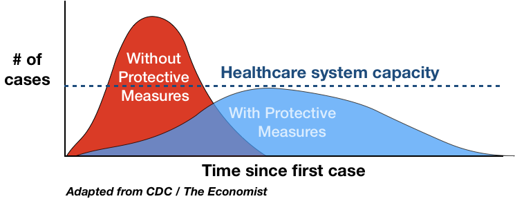
We want there to be enough ventilators when we reach the peak of the curve.
So how do we flatten the curve? It began with encouragement to wash our hands (properly) and then a push for social distancing. Where I live we’ve been ordered to “shelter at home” for the next three weeks. Only leave the house and interact with others for essential activities.
In a land of things we can’t control, we can control social distancing almost completely, and research has shown it can be extremely effective in slowing the spread of infectious diseases.
DISCLAIMER
I use a basic mathematical model in this tutorial and these are simulations of an abstract disease.Sheltering at home, with little ability to think about much else, I wanted to see for myself. Here’s how I did it in R, how you can run simulations yourself, and how you can plot the results over time.
Setup
If you want to follow along with the code, I use R, a free language and environment for statistical computing and graphics. You’ll want to install it first if you haven’t already. Installation is usually straightforward.
I also use three R packages:
- EpiModel — Mathematical modeling for infection disease dynamics. See more details here.
- animation — Used for animated GIFs, etc.
- extrafont — Bring in fonts that don’t come bundled with R.
Open the R console and install with install.packages():
install.packages(c("EpiModel", "extrafont", "animation"),
                 dependencies = TRUE)
Load the packages with library():
library(EpiModel)
library(extrafont)
library(animation)
Simulations
Now you’ll run a simulation using the EpiModel package.
Using a Susceptible-Infectious-Recovered (SIR) model, each person in the simulation can either be susceptible to the disease, infected, or recovered. You can specify the rates of each.
Set the parameters:
param <- param.dcm(inf.prob = 0.2, act.rate = 1, rec.rate = 1/20,
                   a.rate = 0, ds.rate = 0, di.rate = 1/80, dr.rate = 0)
You can read the full docs by entering ?param.dcm.Here’s what each parameter represents:
- inf.prob — Probability of infection between a susceptible and infected person.
- act.rate — Average number of transmissible acts, like shaking hands.
- rec.rate — Average rate of recovery with immunity.
- a.rate — Arrival rate of new susceptible people to the population, like a birth.
- ds.rate — Departure rate of susceptible people, like a death not caused by the disease.
- di.rate — Departure rate for infected people.
- dr.rate — Departure rate for recovered people.
We don’t know many of the rates for sure yet, and for simplicity’s sake, we assume a fixed population where more people are not born or die of other causes (a.rate, ds.rate, and dr.rate are set to 0).
inf.prob probably goes down when we wash our hands properly and frequently, but I don’t know by how much or how well people actually wash their hands.
So for now, we focus on act.rate. By social distancing, we try to decrease that number. We try to bring it as close to 0 as possible, because if the virus has nowhere to go, it’s a lot harder for it to spread.
Set the initial parameters of the population with 1,000 susceptible people, 1 infected, and 0 recovered:
init <- init.dcm(s.num = 1000, i.num = 1, r.num = 0)
Then set the controls for the “Deterministic Compartmental Model”:
control <- control.dcm(type = "SIR", nsteps = 500, dt = 0.5)
I’m out of my element here, so please let me know if I mis-use any of these models.Again we use a SIR model and run the simulation 500 times in 0.5 time unit increments. In this exercise, we’re less interested in actual time units and more interested in the changes.
Run the simulation with the specified model parameters:
mod <- dcm(param, init, control)
Easily access the data by turning the results into a data frame:
mod.df <- as.data.frame(mod)
Plot
The simulation outputs results for several variables, but for our purposes, we’re interested in the number infected over time.
> mod.df[1:10, c("time", "i.num")]
   time    i.num
1   1.0 1.000000
2   1.5 1.072396
3   2.0 1.150021
4   2.5 1.233252
5   3.0 1.322491
6   3.5 1.418169
7   4.0 1.520750
8   4.5 1.630726
9   5.0 1.748629
10  5.5 1.875025
Then use plot():
# Plot it.
plot(mod.df$time, mod.df$i.num, type="l")
It looks like a curve:
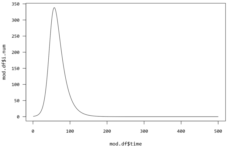
It’s time to flatten it.
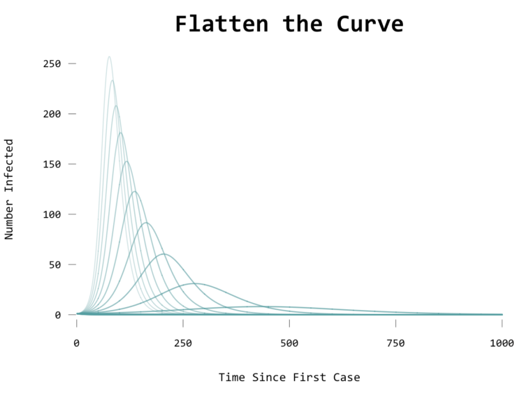
You could go with a default plot, but I like to customize.Instead of plotting the data for a simulation, start with a blank plot:
# Blank plot
plot(NA, type="n", xlim=c(0,1000), ylim=c(0, 250),
     bty="n", axes=FALSE,
     xlab="Time Since First Case", ylab="Number Infected",
     main="Flatten the Curve")
You can have R draw the default axes by setting axesto TRUE in plot(), but this is how you can customize the axes. Here’s a tutorial for that.Draw the axes:
# Simplified axes
axis(1, seq(0,1000,250), lwd=0, lwd.ticks = .5, pos = -5)
axis(2, at=seq(0, 250, 50), lwd=0, lwd.ticks=.5, pos=-2)
Then you’ll run simulations for several act.rate values, ranging from 0.8 to 0:
act.rates <- seq(.8, 0, by=-.05)
Also, adjust the control to 1,000 steps instead of 500 like before:
control <- control.dcm(type = "SIR", nsteps = 1000, dt = 0.5)
As you’ll see soon, it takes longer for the curve to play out when act.rate is lower.
Run a for-loop and run the simulation for each rate. Instead of a call to plot() at the end of each simulation, you use lines() to add to the existing plot:
# Run simulation then plot, for each acts per person
for (rt in act.rates) {
    param <- param.dcm(inf.prob = 0.2, act.rate = rt, rec.rate = 1/20,
                       a.rate = 0, ds.rate = 0, di.rate = 1/80, dr.rate = 0)
    mod <- dcm(param, init, control)
    mod.df <- as.data.frame(mod)
    lines(mod.df$time, mod.df$i.num,
          col=rgb(85/255,158/255,161/255,min(1-rt+.1, 1)),
          lwd=1+(1-rt))
}
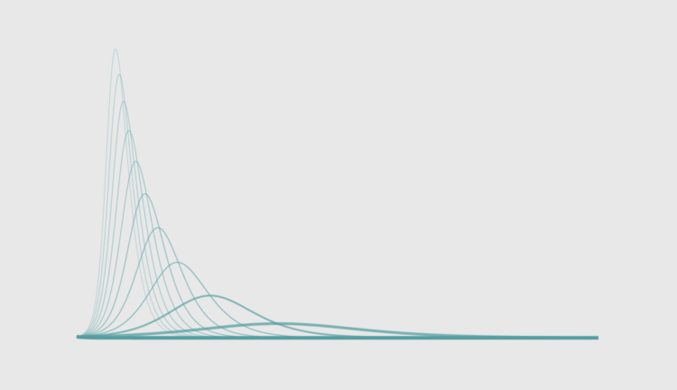
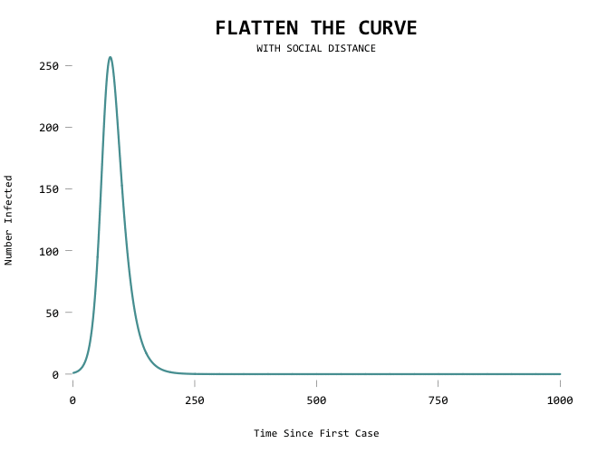
The fewer acts between people, the flatter the curve, and the closer you get to zero, the fewer chances of the disease finding another host:
Animate
For more on animation in R, see the tutorial on How to Make Animated Line Charts.To animate, you can use saveGIF() from the animation package. Check out the tutorial download for the full source, but here’s the gist of it. Using saveGIF(), you run the for-loop and a frame for the GIF is created on each plot creation:
saveGIF({

    # Run simulation then plot, for each acts per person
    for (rt in act.rates) {

        # Plot same as above.
        # ...

    }

}, movie.name="flatten-curve-animated.gif", interval=.15, ani.width=670, ani.height=500)
The result:

It would be useful to show the first line as a mode of comparison though so that you can see where you’ve flattened from:
saveGIF({

    # Run simulation then plot, for each acts per person
    for (rt in act.rates) {

        # Blank plot.
        # ...

        # Line for baseline sim.
        lines(mod.orig.df$time, mod.orig.df$i.num,
              col=rgb(85/255,158/255,161/255,.5),
              lwd=1)

        # Simulate and draw current line.
        # ...

    }

}, movie.name="flatten-curve-animated-basic.gif", interval=.15, ani.width=670, ani.height=500)
Aiming for zero:
The big motivator here is to flatten the curve so that the health care system can handle all the cases at any given time. Add a capacity line marker:
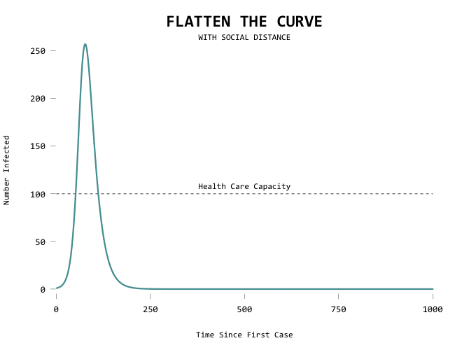
Here’s the code in full:
saveGIF({

    # Baseline sim.
    param <- param.dcm(inf.prob = 0.2, act.rate = .8, rec.rate = 1/20,
                       a.rate = 0, ds.rate = 0, di.rate = 1/100, dr.rate = 0)
    mod.orig <- dcm(param, init, control)
    mod.orig.df <- as.data.frame(mod.orig)

    act.rates <- seq(.8, .1, by=-.02)
    for (rt in act.rates) {

        # Blank plot.
        par(family="Consolas", cex.axis=1.1, las=1, cex.main=2)
        plot(NA, type="n", xlim=c(0,1000), ylim=c(0, 300),
             bty="n", axes=FALSE,
             xlab="Time Since First Case", ylab="Number Infected",
             main="FLATTEN THE CURVE")
        mtext("WITH SOCIAL DISTANCE", side=3)
        axis(1, seq(0,1000,250), lwd=0, lwd.ticks = .5, pos = -5)
        axis(2, at=seq(0, 250, 50), lwd=0, lwd.ticks=.5, pos=-2)

        # Capacity marker
        lines(x=c(0,1000), y=c(100,100), lty=2)
        text(x=500, y=100, "Health Care Capacity", pos=3)

        # Line for baseline sim.
        lines(mod.orig.df$time, mod.orig.df$i.num,
              col=rgb(85/255,158/255,161/255,.5),
              lwd=1)

        # Simulate and draw current line.
        param <- param.dcm(inf.prob = 0.2, act.rate = rt, rec.rate = 1/20,
                           a.rate = 0, ds.rate = 0, di.rate = 1/100, dr.rate = 0)
        mod <- dcm(param, init, control)
        mod.df <- as.data.frame(mod)
        if (max(mod.df$i.num) <= 100) {
            linecol <- "#815C93"
            lwd <- 6
        } else {
            linecol <- rgb(85/255,158/255,161/255,1)
            lwd=3
        }

        lines(mod.df$time, mod.df$i.num,
              col=linecol,
              lwd=lwd)
    }
}, movie.name="flatten-curve-animated-w-capacity.gif", interval=.15, ani.width=670, ani.height=500)
If I were to take this outside of R, I’d put a pause when the curve goes below the capacity level and maybe add annotation at that frame using ImageMagick.
Wrapping up
For more on modeling the spread of Covid-19, you might want to refer to the recently released report from the Imperial College.Again, we’re working with a simplified model for an abstract infectious disease. Real life is more complex and there are many unknowns. But, we do the best we can with the information we have and we take it from there one day at a time.
To summarize:
- Wash your hands.
- Keep your distance.
These are the things you can control as an individual. Together, we flatten the curve.
Made possible by FlowingData members.
Become a member to support an independent site and learn to make great charts.
About the Author
Nathan Yau is a statistician who works primarily with visualization. He earned his PhD in statistics from UCLA, is the author of two best-selling books — Data Points and Visualize This — and runs FlowingData. Introvert. Likes food. Likes beer.
4 Comments
Add Comment
You must be logged in and a member to post a comment.


Hi Nathan! Thanks so much for the great tutorial. I had one tiny note on your code, in that you have to update the the nsteps argument of the control variable from 500 to 1000 to get your exact final GIF.
Thanks, Caitlin! I had done that in the source but forgot to mention the new nsteps value in the text. Updated.
i am getting error for fps should be a multiple of 100. Can you please help me with that?
When does this error come up for you?