Round and round and round and round and round.
The discussions this week felt familiar. Probably because we've seen this many times, since the beginning of charts themselves.
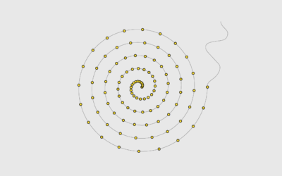
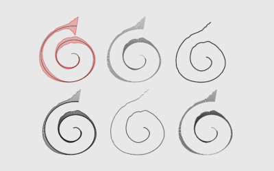
Now that we've discovered another way to annoy chart snobs, here's how you can make your own spirals.
Sometimes a chart type seems terrible. But you'll never know until you try.
Using a spiral might not be the best way to encode data. But here's how to do it anyway. Just in case.
I heard you like spiral charts when the data is seasonal. I think…
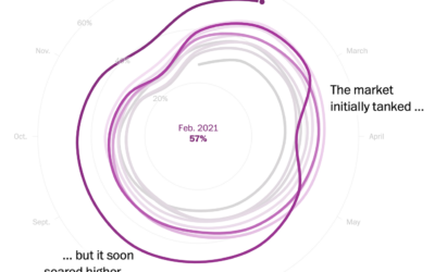
Say what you will about circular visualization, but the spiral plays. This one…
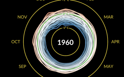
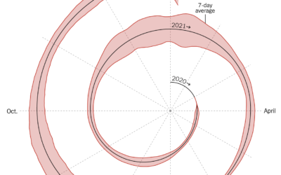
This spiralized chart by Gus Wezerek and Sara Chodosh for NYT Opinion has…
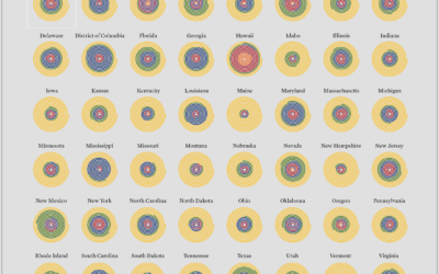
Here is the breakdown for each state in the United States, based on estimates from the American Community Survey.