If you’re looking to switch or just want to expand your skills, this…
R
-
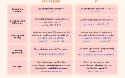
Switching from Python to R
-
Members Only
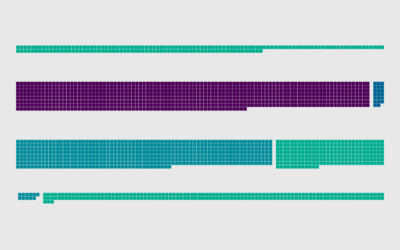
How to Make Unit-Based, Variable Width Bar Charts
In a cross between unit charts and variable width bar charts, we can show total counts and relative proportions at the same time.
-
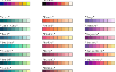
Improved color palettes in R
Achim Zeileis and Paul Murrell provide a rundown of the more user-friendly color…
-
Members Only
How to Make a Smoother Animated Growth Map in R
Show change over time and geography with smooth transitions.
-
Members Only
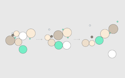
How to Animate Packed Circles in R
Pack circles, figure out the transitions between time segments, and then generate frames to string together.
-
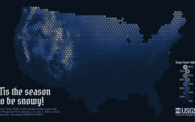
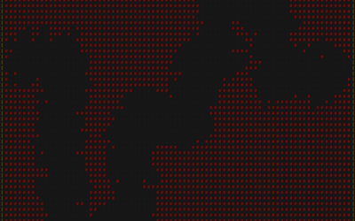
Snow cover mapped using snowflakes
To show snow cover across the United States, Althea Archer for the USGS…
-
New Visualization in R Course, and Other Updates
I have two course-related updates on FlowingData. First, there’s a new course on…
-
Deleting your tweets with R
Twitter isn’t in a great place right now, so maybe you want to…
-
Introduction to Data Science, an open source book
Introduction to Data Science, by Harvard biostatistics professor Rafael A. Irizarry, is an…
-
Members Only
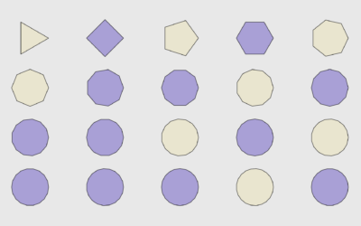
How to Draw and Use Polygons in R
R provides functions for basic shapes, but you can also draw your own for maximum fun.
-
RStudio changes name to Posit
RStudio, the company behind the IDE of the same name, are changing their…
-
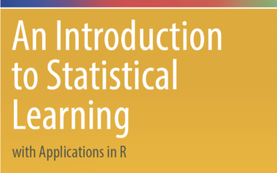
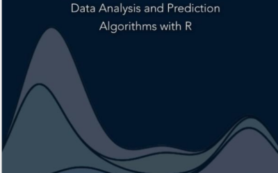
Introduction to statistical learning
An Introduction to Statistical Learning, by Gareth James, Daniela Witten, Trevor Hastie, and…
-
Members Only

How to Make an Animated Donut Chart in R
There are “better” ways to show proportions over time, but sometimes you just want an animated donut.
-
Catching students cheating with R
Matthew Crump, a psychology professor who discovered high volume cheating in his class…
-
R packages useful for sports analytics
If you’re into R and analyzing sports data, you’ll want to save this…
-
Procedural dungeons in R
Matt Dray is developing a package in R that runs a text-based game.…
-
Members Only
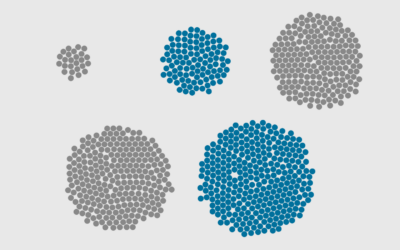
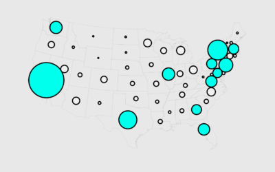
How to Make Bubble Clusters in R
Represent individual counts with grouped units to make data feel less abstract.
-

Ross Ihaka, co-creator of R, reflects on the language
NZ Herald talked to Ross Ihaka, one of the creators of R:
Today,… -
Members Only
How to Make Cartograms in R
While the reshaped geography doesn’t work all the time, the use of size to show data can be more intuitive in some cases.
-
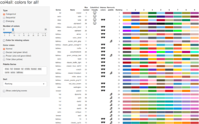
Colors for All, R package
If you use color as a visual encoding, you should make sure every…
Recently for Members
Second Edition
 Visualize This: The FlowingData Guide to Design, Visualization, and Statistics (2nd Edition)
 Visualize This: The FlowingData Guide to Design, Visualization, and Statistics (2nd Edition)
New tools, refined process.
Browse by Chart Type See All →


