How to Untangle a Spaghetti Line Chart (with R Examples)
Put multiple time series lines on the same plot, and you quickly end up with a mess. Here are practical ways to clean it up.
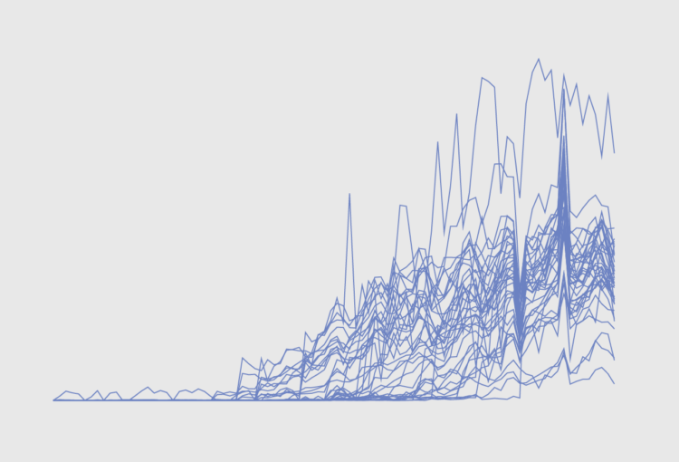
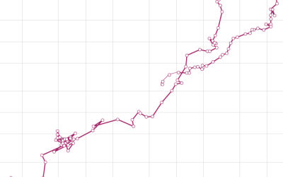
Line charts are good for showing trends over time. Put two lines on a single chart and you can compare trends for two categories. Keep adding lines, and the chart becomes hard to read in a hurry.
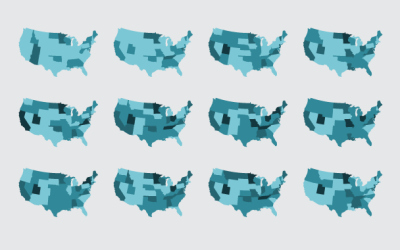
In this tutorial, we look at four possible solutions and alternatives to the resulting spaghetti plot.
To access this full tutorial, you must be a member. (If you are already a member, log in here.)
Get instant access to this tutorial and hundreds more, plus courses, guides, and additional resources.
Membership
You will get unlimited access to step-by-step visualization courses and tutorials for insight and presentation — all while supporting an independent site. Files and data are included so that you can more easily apply what you learn in your own work.
Learn to make great charts that are beautiful and useful.
Members also receive a weekly newsletter, The Process. Keep up-to-date on visualization tools, the rules, and the guidelines and how they all work together in practice.
See samples of everything you gain access to:
About the Author
Nathan Yau is a statistician who works primarily with visualization. He earned his PhD in statistics from UCLA, is the author of two best-selling books — Data Points and Visualize This — and runs FlowingData. Introvert. Likes food. Likes beer.