Here’s a fun/alarming weather map from The Pudding. Using data from the Applied…
-
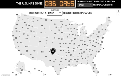
Days since record-high temperatures
-
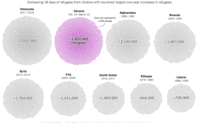
Total refugees from Ukraine, compared to other countries
Millions of Ukrainians (over three million as of this writing) have left their…
-
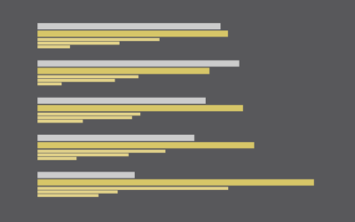
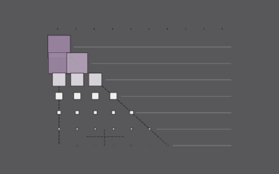
Who Takes Care of the Kids, By Household Income
Higher income usually means more childcare, and lower income usually means less.
-
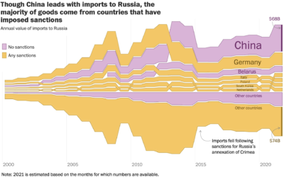
Imports to Russia from countries that imposed sanctions and not
For The Washington Post, Andrew Van Dam, Youjin Shin and Alyssa Fowers plotted…
-

US spending on Ukraine
For NYT’s The Upshot, Bianca Pallaro and Alicia Parlapiano break down the United…
-
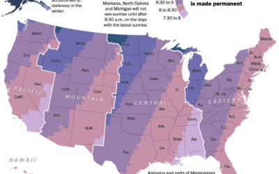
Sunrise times with permanent Day Light Saving
Changing the clocks twice a year can be a hassle, so some people…
-
Members Only

For Your Own Approval – The Process 181
Eventually you gotta make the charts for yourself and not for some expert’s approval.
-
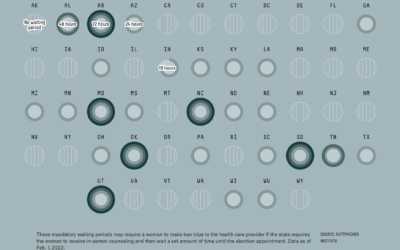
Abortion restrictions in the U.S. mapped
For FiveThirtyEight, Anna Wiederkehr and Amelia Thomson-DeVeaux, with illustrations by Nicole Rifkin, delve…
-
Members Only
How to Make Cartograms in R
While the reshaped geography doesn’t work all the time, the use of size to show data can be more intuitive in some cases.
-

Your place in the world population
Population.io by World Data Lab asks your birthday, country of residence, and gender.…
-
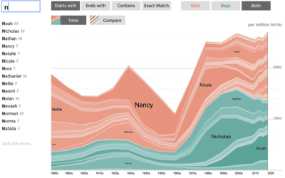
NameGrapher to explore past baby name trends
NameGrapher is an interactive chart that lets you explore historical trends for baby…
-
Increasing mortality baseline
There was a time not that long ago when a hundred covid deaths…
-
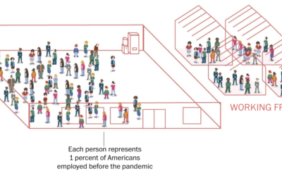
Percentage breakdowns of pandemic life
To broadly show how people have lived in the U.S. during these past…
-
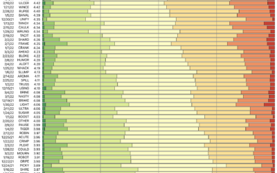
Wordle analysis through the lens of 15m tweets
I don’t know if you’ve heard of it, but there’s this game called…
-
Members Only
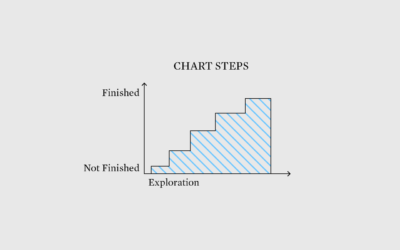
Stepping Towards a Finished Chart – The Process 180
Thinking about the tiny steps along the way to making a chart, even a relatively straightforward one.
-
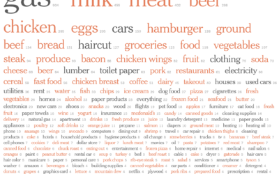
Price increases people have noticed
Inflation is high. For NYT’s The Upshot, Emily Badger, Aatish Bhatia and Quoctrung…
-
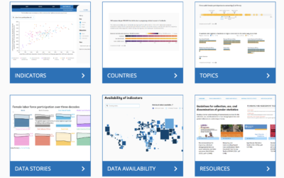
World Bank’s Gender Data Portal
In an effort to make gender inequalities more obvious, World Bank updated their…
-
Oldest, Youngest, and Middle Children, in Differently Sized U.S. Households
I looked at the percentages of people with a given number of kids in the family and the order they were born.
-
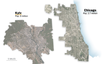
Scale of Ukrainian cities
When you look inside the cities around the world, you will often find…
-
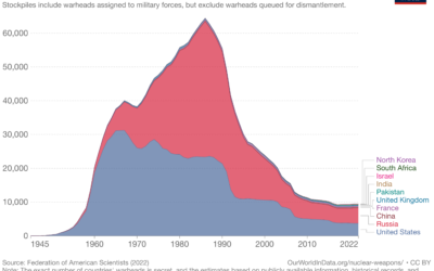
Reducing the risk of nuclear war
For Our World in Data, Max Roser discusses the risk and possible destruction…
Recently for Members
Second Edition
 Visualize This: The FlowingData Guide to Design, Visualization, and Statistics (2nd Edition)
 Visualize This: The FlowingData Guide to Design, Visualization, and Statistics (2nd Edition)
New tools, refined process.
Browse by Chart Type See All →


