The year’s almost up, so let’s get right into it. Here’s the good stuff for December.
-
Members Only
Visualization Tools and Learning Resources, December 2022 Roundup
-
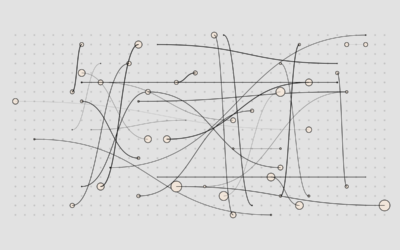
Best Data Visualization Projects of 2022
Every year, I pick my favorite data visualization projects, which tend to cover a wide range of purposes but are typically for presentation. Here are my favorites for 2022.
-
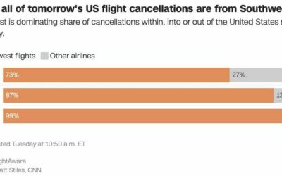
Southwest flight cancellations
There were a lot of flight cancellations this week, but Southwest Airlines is…
-
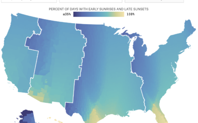
Apply your daylight saving preferences to the rest of the country
We like to complain about changing time an hour back or forward, and…
-
Inevitably super rich
Sometimes it feels like a foregone conclusion that most of the money ends…
-
Members Only
Finding the Point
Visualization for the sake of visualization is a drag and fleeting. Find purpose for your work.
-
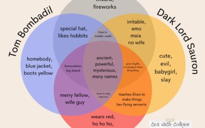
Lord of the Rings and Santa Venn diagram
Kaitlyn Facista, of Tea with Tolkien, made a four-part Venn diagram that shows…
-
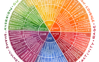
Visual exploration through emotional granularity
We often talk about emotions in more basic terms, such as disgust, joy,…
-
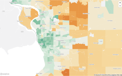
Carbon footprint in the city versus the suburbs
Bringing it down the Census tract level, Nadja Popovich, Mira Rojanasakul and Brad…
-
VIS 2022 talks are online
With the holidays just about here, I’m sure there’s nothing you’d rather do…
-
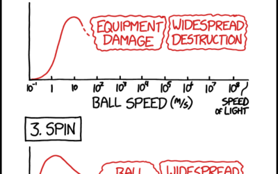
xkcd on optimal bowling metrics
xkcd charted optimal bowling in terms of aim, speed, spin, and weight. This…
-

Stable Diffusion to generate spectrograms to convert to sounds
Stable Diffusion is an AI model that lets you enter text to generate…
-
Members Only
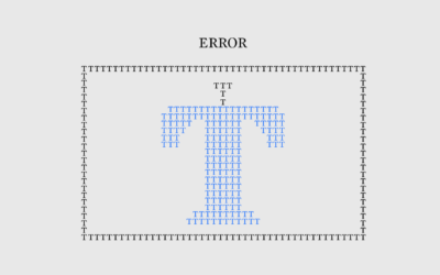
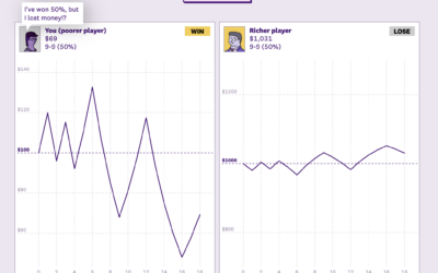
Mistaken Error
That can’t be for real, right? Right? A basic chart is not quite what it seems.
-
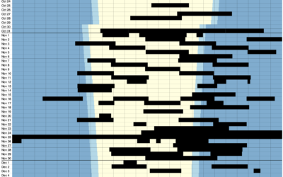
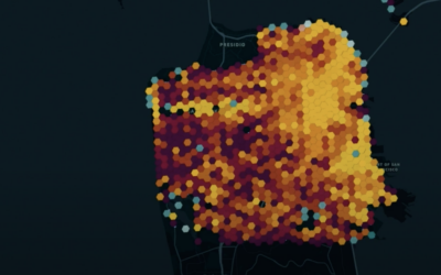
One home’s blackouts in Kyiv
Volodymyr Agafonkin and his family live in Kyiv, Ukraine. He visualized when the…
-
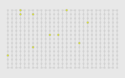
Conway’s Game of Life in infinite space
Conway’s Game of Life is a zero-person game where cells in a grid…
-

Bodybuilder risks
The human body has its limits, so many bodybuilders take steroids to increase…
-
Information Graphic Visionaries delivered
Visualization still seems like a relatively new thing, but it has a history…
-
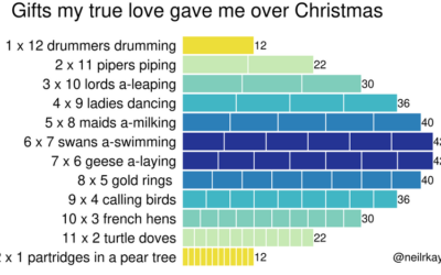
Gifts my true love gave to me over the 12 days of Christmas
From Reddit user neilrkaye. This is very important.…
-
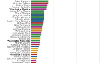
Perfect seasons needed to get over .500 overall
Here’s a fun one from Philip Bump for The Washington Post. Bump simply…
-
Members Only
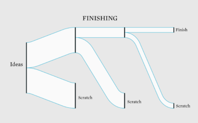
Scratching Projects
Sometimes it’s not worth finishing what you start.
Recently for Members
Second Edition
 Visualize This: The FlowingData Guide to Design, Visualization, and Statistics (2nd Edition)
 Visualize This: The FlowingData Guide to Design, Visualization, and Statistics (2nd Edition)
New tools, refined process.
Browse by Chart Type See All →


