We’ve been hearing a lot about inflation rates lately on a national scale.…
-
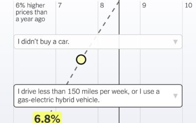
Inflation based on your spending
-
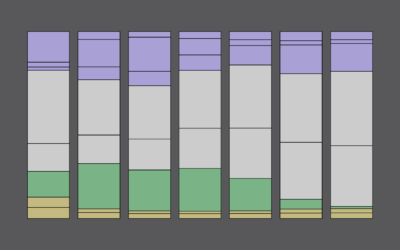
How Much Time We Spend Alone and With Others
Oftentimes what we’re doing isn’t so important as who we’re spending our time with.
-

Chart used as drink label
For Swee Kombucha, Bedow used a stacked chart as a food label to…
-

Scale of one million deaths
The United States is about to reach one million confirmed Covid deaths, or…
-
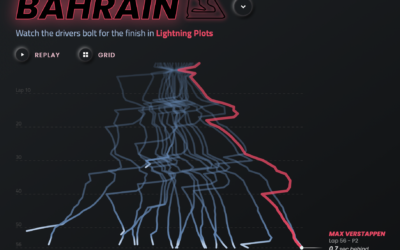
F1 Racing results plotted as lightning
Joey Cherdarchuk used a lightning metaphor to visualize the outcomes of races from…
-

Formula 1 car redesign
The rules around a car’s aerodynamics for Formula 1 racing changed a lot…
-

Global warming bike path
The @LpzfuersKlima team have completed painting a giant representation of the Warming Stripes…
-
Members Only
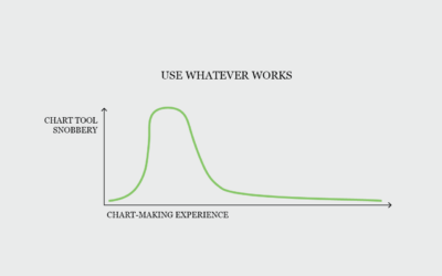
Chart Tool Snob
Use the tool that works for you.
-
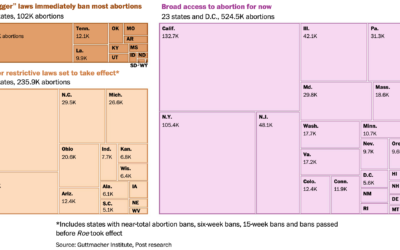
Number of abortions in each state, by restriction status
The Washington Post has a set of charts showing the current status of…
-
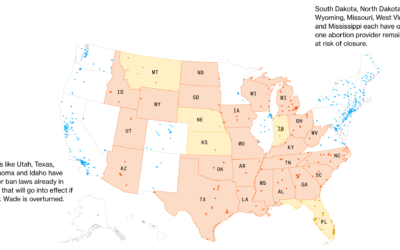
Map of clinics at risk of closure
If Roe v. Wade is overturned, over 200 clinics would potentially have to…
-
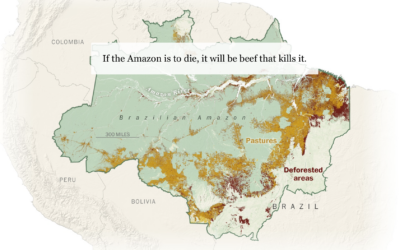
Beef and the rainforest
People like beef. To raise more cattle, companies need more land. Sometimes to…
-

Procedural dungeons in R
Matt Dray is developing a package in R that runs a text-based game.…
-
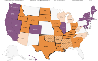
State policy if Roe v. Wade were overturned
If Roe v. Wade were overturned, abortion policies would change in many states.…
-
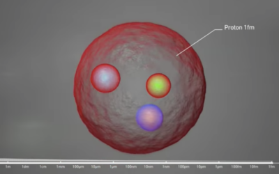
Scale of atoms
…
-

Tucker Carlson word usage and patterns
Tucker Carlson hosts a nightly show viewed by millions. The New York Times…
-
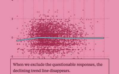
A test for a potentially flawed study on randomness and age
In 2017, a study posited that human behavior complexity peaks at age 25…
-
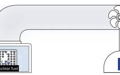
Nuclear energy rebrand
Nuclear energy has bad memories linked to it, which tends to draw fear…
-
Members Only
Visualization Tools and Learning Resources, April 2022 Roundup
Here’s the good stuff for April.
-
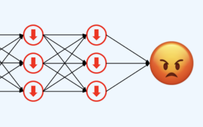
AI says if you’re the a**hole
There’s a subreddit where people share a story and ask if they’re the…
-
Facebook doesn’t seem to fully know how their data is used internally
Lorenzo Franceschi reporting for Motherboard on a leaked Facebook document:
“We do not…
Recently for Members
Second Edition
 Visualize This: The FlowingData Guide to Design, Visualization, and Statistics (2nd Edition)
 Visualize This: The FlowingData Guide to Design, Visualization, and Statistics (2nd Edition)
New tools, refined process.
Browse by Chart Type See All →


