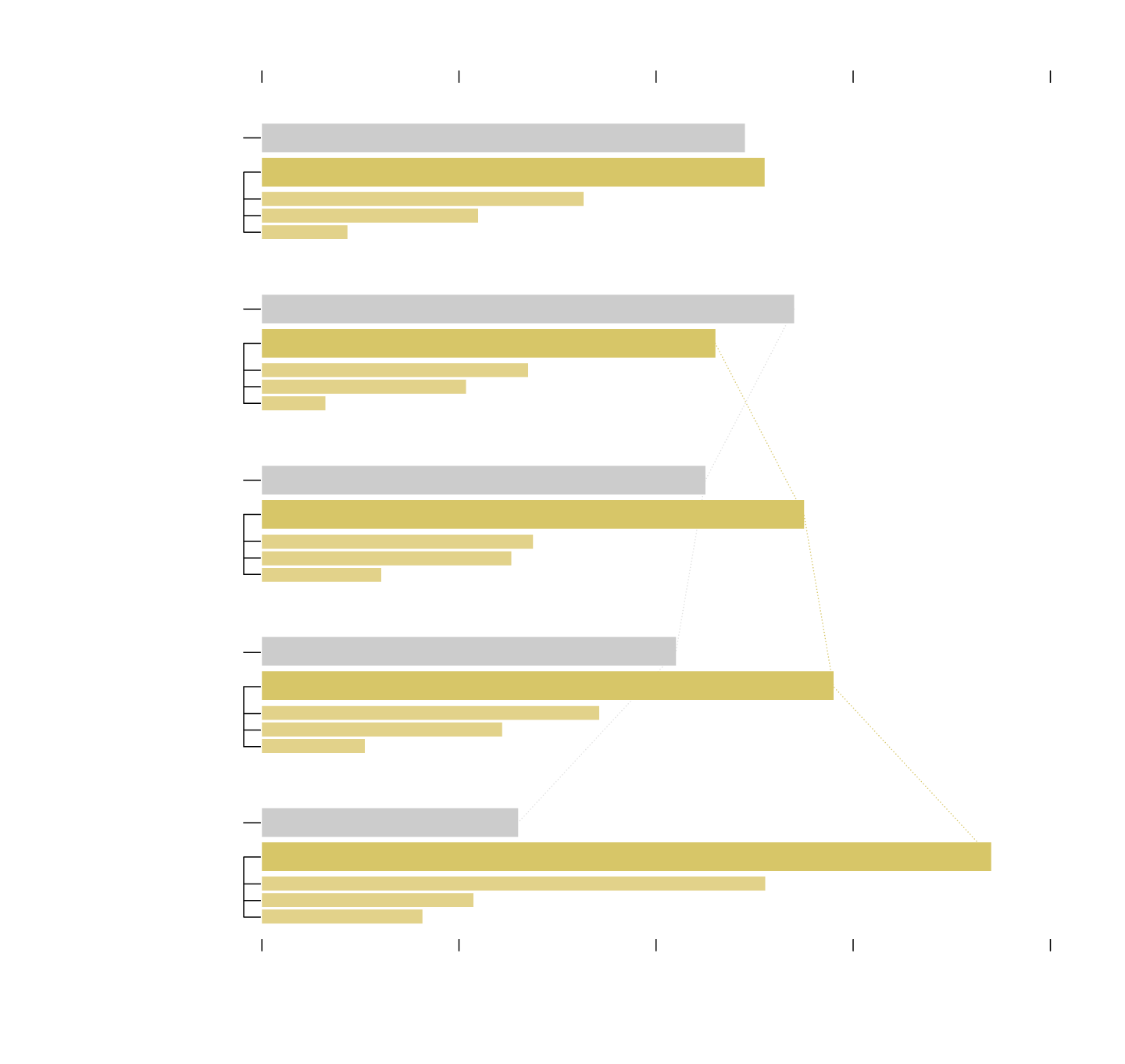
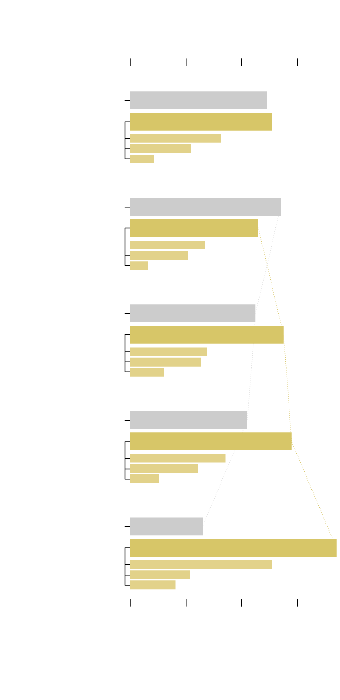
Who Takes Care of the Kids, By Household Income
Childcare is expensive in the United States. So as you would expect, higher-income households tend to use non-parental childcare more, whereas lower-income households tend more towards only parental care. Here are the percentages, based on 2019 estimates from the National Center for Education Statistics.
PERCENTAGE OF CHILDREN UNDER 5, NOT YET IN KINDERGARTEN
0%
20%
40%
60%
80%
$20,000 OR LESS
Only Parental Care
Non-Parental Care
Center-Based
Parents or guardians can have use more than one type of non-parental care, so the sum of the parts is greater than the whole.
Relative
Non-relative
$20,001 TO $50,000
Lower-income households are more likely not to use outside childcare.
Only Parental Care
Non-Parental Care
Center-Based
Relative
Non-relative
$50,001 TO $75,000
Only Parental Care
Non-Parental Care
Center-Based
Relative
Non-relative
$75,001 TO $100,000
Only Parental Care
Non-Parental Care
Center-Based
Relative
Non-relative
Higher household income tends to mean more non-parental childcare.
$100,001 OR MORE
Only Parental Care
Non-Parental Care
Center-Based
Relative
Non-relative
0%
20%
40%
60%
80%
PERCENTAGE OF CHILDREN UNDER 5, NOT YET IN KINDERGARTEN
SOURCE: NATIONAL CENTER FOR EDUCATION STATISTICS
PERCENTAGE OF CHILDREN UNDER 5,
NOT YET IN KINDERGARTEN
0%
20%
40%
60%
$20k OR LESS
Only Parental Care
Non-Parental Care
Center-Based
Non-relative
Relative
$20k TO $50k
Only Parental Care
Non-Parental Care
Center-Based
Non-relative
Lower-income households are more likely not to use outside childcare.
Relative
$50k TO $75k
Only Parental Care
Non-Parental Care
Center-Based
Non-relative
Relative
$75k TO $100k
Only Parental Care
Non-Parental Care
Center-Based
Non-relative
Relative
Higher household income tends to mean more non-parental childcare.
$100k OR MORE
Only Parental Care
Non-Parental Care
Center-Based
Non-relative
Relative
0%
20%
40%
60%
PERCENTAGE OF CHILDREN UNDER 5,
NOT YET IN KINDERGARTEN
SOURCE: NATIONAL CENTER FOR EDUCATION STATISTICS
Check out the NCES data here for more categories.
See also the time-based splits between men and women.
Chart Type Used

Become a member. Support an independent site. Get extra visualization goodness.
See What You Get