Crystal Owens, Max Fan, John Hart, and Gareth McKinley from Massachusetts Institute of…
-

Fracture and flow of Oreo cookies
-
Members Only

How to Make Bubble Clusters in R
Represent individual counts with grouped units to make data feel less abstract.
-
Tracking the CIA to demo phone tracking
Sam Biddle and Jack Poulson for The Intercept reporting on Anomaly Six, a…
-
Applying sentiment analysis usefully
Sentiment analysis can be fun to apply to varying types of text, but…
-
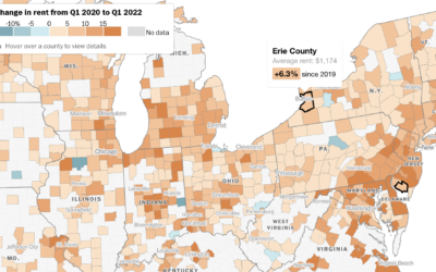
How much rent increased where you live
Rent increased pretty much everywhere in the United States over the past year.…
-
Who We Spend Time with as We Get Older
In high school, we spend most of our days with friends and immediate family. But then we get jobs, start a family, retire, and there’s a shift in who we spend our days with.
-
Members Only

Stuck in a Form
When you choose visual encodings before considering the data, you usually end up with results that aren’t so great.
-
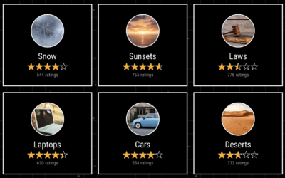
Earth Reviews
Given our love for making our opinions heard for products on the internets,…
-
Calculating win probabilities
Zack Capozzi, for USA Lacrosse Magazine, explains how he calculates win probabilities pre-game…
-

Agent-based modeling in JavaScript
Atomic Agents is a JavaScript library by Graham McNeill that can help simulate…
-

Wildfires and floods, a geographic before and after
In 2021, a large portion of North America was stuck in a heat…
-
Scraping public data ruled legal
For TechCrunch, Zack Whittaker reporting:
In its second ruling on Monday, the Ninth… -

Redrafting the NBA, based on past player performance
With the NBA playoffs underway, it can be fun to watch the best…
-
Tax services want your data
Taxes are due today in the U.S. (yay). Geoffrey A. Fowler for The…
-

Ross Ihaka, co-creator of R, reflects on the language
NZ Herald talked to Ross Ihaka, one of the creators of R:
Today,… -

Tonga shockwave around the world
Earlier this year, an underwater volcano erupted in the island nation of Tonga.…
-
Members Only
Manually
Manually editing charts is worthwhile, despite the possibility of manually making mistakes.
-

Comparing rich people incomes and the taxes they pay
Based on leaked IRS data for the 400 wealthiest Americans, ProPublica provides a…
-

Social Media Usage by Age
Here’s the breakdown by age for American adults in 2021, based on data from the Pew Research Center.
-
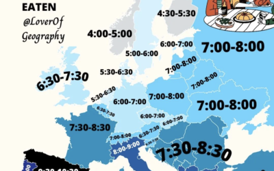
When people eat dinner in Europe
This map by @loverofgeography shows the usual dinner times for countries in Europe.…
Recently for Members
Second Edition
 Visualize This: The FlowingData Guide to Design, Visualization, and Statistics (2nd Edition)
 Visualize This: The FlowingData Guide to Design, Visualization, and Statistics (2nd Edition)
New tools, refined process.
Browse by Chart Type See All →


