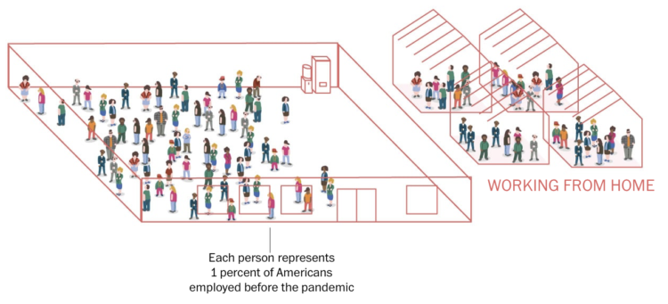
To broadly show how people have lived in the U.S. during these past two years, The Washington Post shows percentages for various questions, such as “Have you had long covid?” and “Did you work from home?” But instead of using something like pie charts, they used people icons in illustrated unit charts.
In the above, each person represents a percentage point. There’s also a multiple-choice element to the piece, which helps readers relate personally, but I think it’s mostly there as a way to reveal the full answer breakdowns.
Projects like this one always remind me of World of 100.


 Visualize This: The FlowingData Guide to Design, Visualization, and Statistics (2nd Edition)