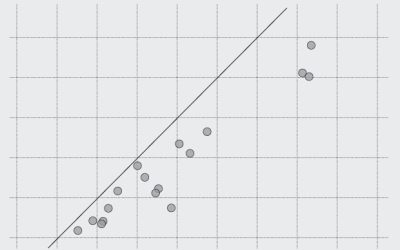
A generalized form of the scatter plot, the dots can be placed in various coordinate systems.
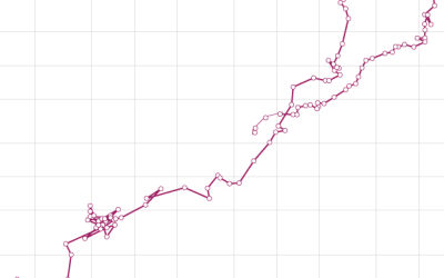
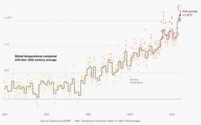
It looks like a tornado. It's messy. It's circular. It almost looks intentionally confusing. But how bad is it really?
Easily compare multiple categories and spot differences between two or more series.
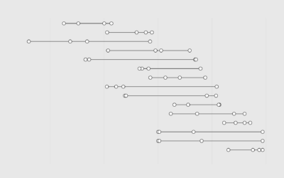
For when you want to show the occurrence of events over time.
Let's work through a practical example to see how asking and answering questions helps guide you towards more focused data graphics.
It's easy to draw dots. The challenge is to make them meaningful and readable.
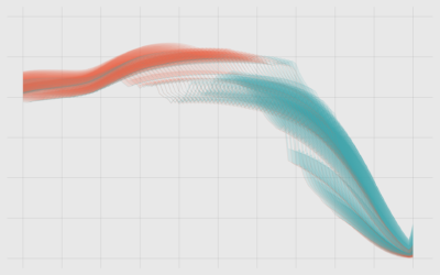
The combination of a time series chart and a scatter plot lets you compare two variables along with temporal changes.
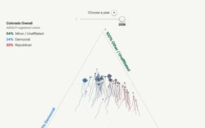
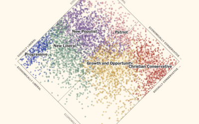
U.S. voters have historically stuck with two political parties, but that’s changing in…
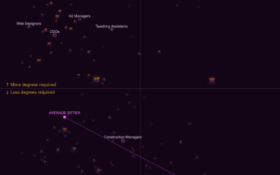
Some occupations have more turnover than others. See how it varies for your occupation and others.
Here is how middle-income varies across the states and the country overall, by household size.
The cost of living varies across the United States, depending on what you're buying. See the differences in this chart.
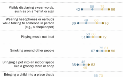
Pew Research asked U.S. adults if certain behaviors in public, such as cursing…
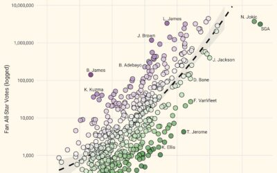
NBA all-star voting is mostly for the fans, which means some players can…
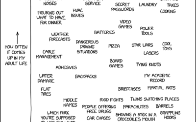
xkcd charted topics that seemed like they’d come up often with grown ups…
In the United States, a two-party system means that candidates, who are supposed…
This is some good step charting by Mira Rojanasakul for the New York…
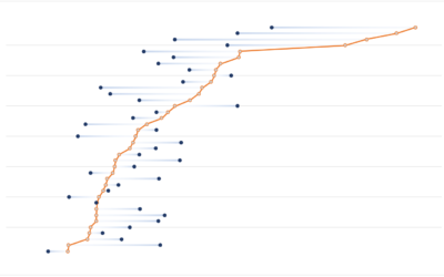
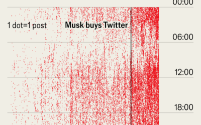
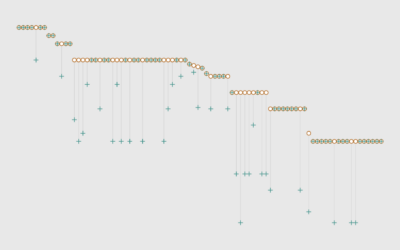
Not to dwell on Musk, but I was reminded of this dot plot…
Some jobs require a lot of standing, crouching, and climbing, whereas other jobs…
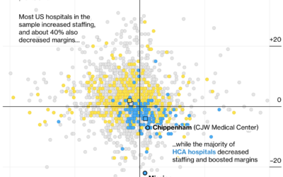
Many hospitals in the United States are for-profit, which itself is not a…
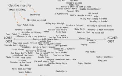
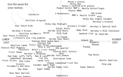
I made a chart about Halloween candy. Even dumb charts need attention and require that choices are made.
This is very important. How did your favorite candy rate?
China recently increased their retirement age to 63 for men and 55 for women. Even with the adjustment, the country is still on the lower end when compared to other countries.
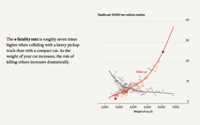
The Economist examines car weight and fatalities in car crashes. In two-vehicle collisions,…