How to Make Cartograms in R
While the reshaped geography doesn’t work all the time, the use of size to show data can be more intuitive in some cases.
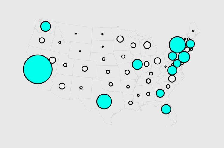
Maps are a good way to visualize spatial data, but to maintain geographic accuracy, there are often tradeoffs. For example, a choropleth map, which shades regions by a specified metric, maintains the same shape regardless of the data you color by. Larger regions always take up more space on the screen and smaller regions take up less space.
Cartograms are a response to this challenge by sizing regions to match the data of interest, at the sacrifice of geographic accuracy. This can get messy, as you can imagine, so you’ll have to use your judgement for when and when not to use them.
To access this full tutorial, you must be a member. (If you are already a member, log in here.)
Get instant access to this tutorial and hundreds more, plus courses, guides, and additional resources.
Membership
You will get unlimited access to step-by-step visualization courses and tutorials for insight and presentation — all while supporting an independent site. Files and data are included so that you can more easily apply what you learn in your own work.
Learn to make great charts that are beautiful and useful.
Members also receive a weekly newsletter, The Process. Keep up-to-date on visualization tools, the rules, and the guidelines and how they all work together in practice.
See samples of everything you gain access to:
About the Author
Nathan Yau is a statistician who works primarily with visualization. He earned his PhD in statistics from UCLA, is the author of two best-selling books — Data Points and Visualize This — and runs FlowingData. Introvert. Likes food. Likes beer.