For The Pudding, Rebecca Monteleone and Jamie Brew (with design and code by…
-

More readable writing illustrated with more readable writing
-
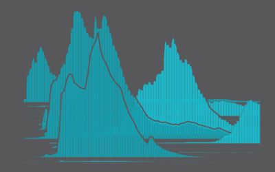
Trendiest Baby Name Every Year Since 1930, in the U.S.
Baby names gain sudden popularity for various reasons. See how it’s changed over the years.
-
Members Only
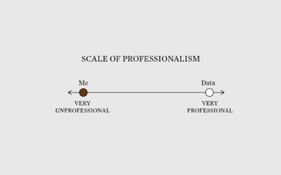
Very Unprofessional – The Process 177
Sometimes being unprofessional works to your advantage when communicating data.
-
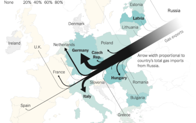
Map of Russian gas exports
Speaking of Russian gas, Josh Holder, Karl Russell and Stanley Reed for The…
-

Russian gas supplies in Europe
For Reuters, Prasanta Kumar Dutta, Samuel Granados and Michael Ovaska detail Europe’s dependence…
-
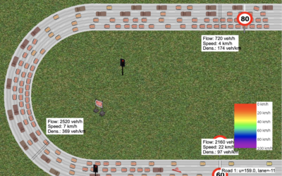
Interactive traffic simulator
Traffic always seems so sensitive to the smallest disruptions. Someone pulls over to…
-
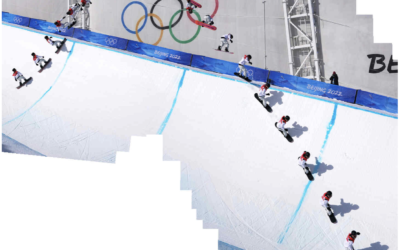
Snowboarding composite photos
If you watched the men’s halfpipe in the Olympics, you were probably impressed…
-
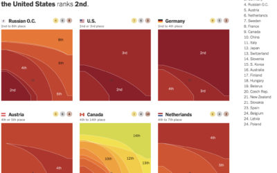
Weighted Olympic medal counts
To decide who’s doing best at the Olympics you have to define what…
-
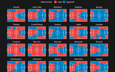
Premier League territory control
The Athletic charted territories on the field to show whether the team of…
-
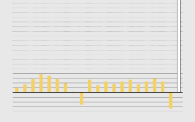
Age of Moms When Kids are Born
It’s a wide range, based on data from the National Center for Health Statistics.
-
Members Only
Good Redundant
Think of the redundancies as reinforcement for a clearer signal.
-

Modernized version of a mid-19th century encylopedia
Between 1849 and 1851, J.G. Heck published a 10-part encyclopedia called Iconographic Encyclopædia…
-
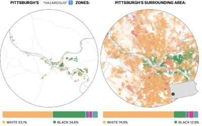
Past redlining still seen in the present
In the 1930s, a group called the Home Owners’ Loan Corporation went to…
-
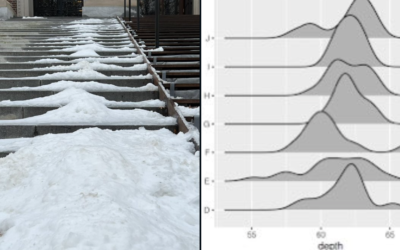
Frequency trails in the snow
Same vibes pic.twitter.com/oXjhdwS3yW
— Matt Blackwell (@matt_blackwell) February 7, 2022This is a…
-
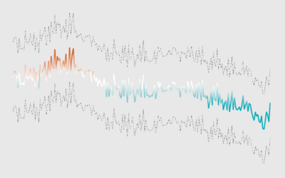
Members Only
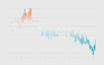
How to Make a Line Chart with a Color Gradient in R
Use color to reinforce or add another layer of meaning to a regular line chart.
-
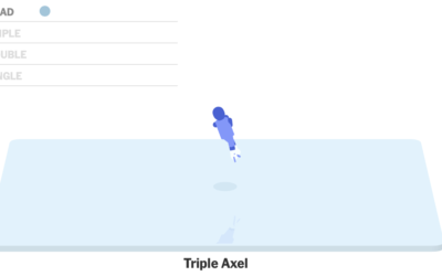
Figure skating animated jumps
Figure skater Nathan Chen set a world record with his performance in the…
-
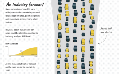
Improving electric vehicle adoption rates
Gas-powered vehicles contribute a big part of total carbon production, so to get…
-
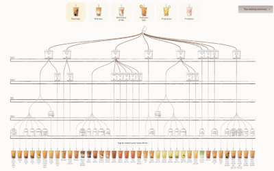
Bubble tea combinations, a visual breakdown
Walk into a boba shop and usually you’ll see a large menu that…
-
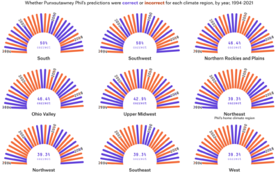
Accuracy of groundhog weather prediction
For FiveThirtyEight, Simran Parwani and Kaleigh Rogers compared Groundhog Day predictions against actual…
-
Members Only
Editing Carefully and That White House Bar Chart with the Weird y-axis – The Process 175
The White House posted a chart with a messed up y-axis. Intentional or no?
Recently for Members
Second Edition
 Visualize This: The FlowingData Guide to Design, Visualization, and Statistics (2nd Edition)
 Visualize This: The FlowingData Guide to Design, Visualization, and Statistics (2nd Edition)
New tools, refined process.
Browse by Chart Type See All →


