The prices of everything seem to be rising a lot lately. Why? For…
-
Inflation explained with eggs
-
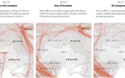
Empty Ukrainian airspace
As you would imagine, Ukrainian airspace looks empty right now. Reuters mapped flights…
-
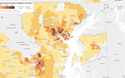
Investors bought up a lot of houses in 2021
Home prices in the U.S. increased dramatically over the past couple of years.…
-
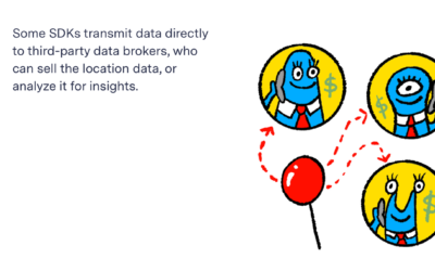
Unregulated location data industry
For The Markup, continuing their reports on data privacy, Alfred Ng and Jon…
-
Members Only
Navigating Through the Uncertainty and Messiness of Data – The Process 179
Connecting back to the real world is how we fill in the gaps.
-

Recontextualized media
The Media Manipulation Casebook summarizes how bad-intentioned people take media from past events,…
-
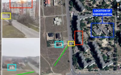
Visual forensics to spot fake videos and photos
It’s easy for anyone to grab a picture or video and claim that…
-

Seeing just the questions
As a way to explore how people use questions in their writing, a…
-
Why Russia is invading Ukraine, a visual guide
RealLifeLore explains the history between the two countries and the multi-faceted motivations behind…
-
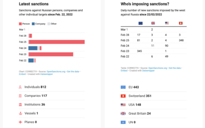
Tracking the sanctions against Russia
Correctiv is tracking sanctions against Russian individuals and companies, based on data from…
-
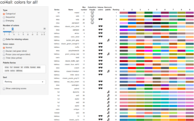
Colors for All, R package
If you use color as a visual encoding, you should make sure every…
-
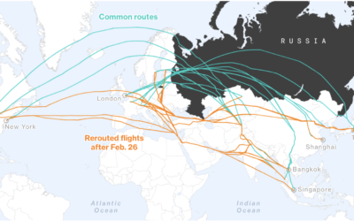
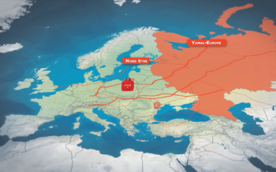
Rerouted flights to avoid Russian airspace
Many countries have banned Russian aircraft from entering their airspace. Russian in turn…
-

Change in Common Household Types in the U.S.
In the 1970s, the most common household type in the U.S. was a married couple with kids. Things are different now.
-
Stat-driven view on how American conservatives shifted against vaccine
As we know by now, conservatives in the U.S. are more commonly against…
-
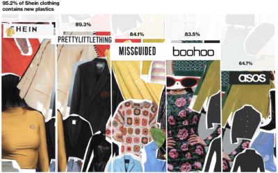
Fashion industry’s environmental impact
For Bloomberg, Rachael Dottle and Jackie Gu look at the current state of…
-
Members Only
Visualization Tools and Learning Resources, February 2022 Roundup
Here’s the good stuff for February.
-
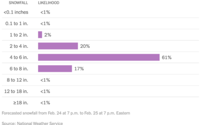
Distribution of snowfall estimates to show uncertainty
For NYT’s The Upshot, Aatish Bhatia, Josh Katz and Margot Sanger-Katz show the…
-
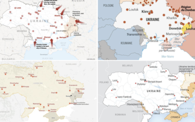
Many Ukraine maps
There are many maps trying to show what is happening in Ukraine right…
-
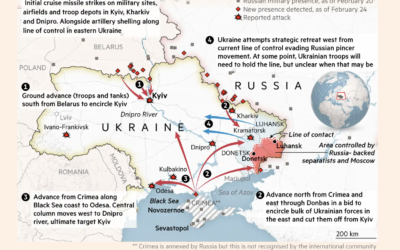
Map of invasion in Ukraine
This map by Henry Foy and Steven Bernard for Financial Times shows a…
-

Statistician answers stat questions
For Wired, stat professor Jeffrey Rosenthal answered statistics questions from Twitter, such as…
Recently for Members
Second Edition
 Visualize This: The FlowingData Guide to Design, Visualization, and Statistics (2nd Edition)
 Visualize This: The FlowingData Guide to Design, Visualization, and Statistics (2nd Edition)
New tools, refined process.
Browse by Chart Type See All →


