Jeff Bezos’ wealth is difficult to understand conceptually, because the scale is just…
-
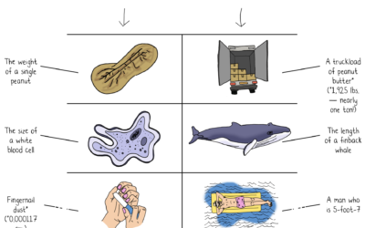
Jeff Bezos wealth to scale
-
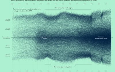
More gender-neutral names
Georgios Karamanis plotted the ratio of girls-to-boys over time for all the names…
-
Members Only
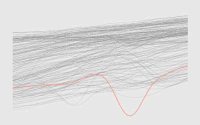
Overlapping Lines
More lines can mean more patterns, more cycles, and more context.
-
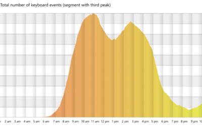
Working the triple peak
Microsoft researchers analyzed keystrokes by time of day, for a sample of Microsoft…
-
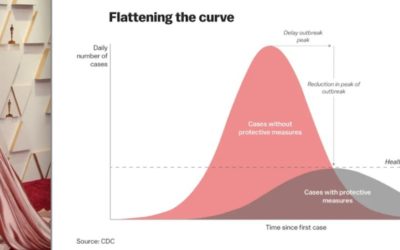
Oscar outfits as public health graphs
The 2022 Oscars came and went, and it was like all anyone could…
-
Lessons learned from making covid dashboards
For Nature, Lynne Peeples spoke to the people behind many of the popular…
-

Ukraine’s defense in Kyiv
The New York Times shows how Russia has tried to take over and…
-
Literacy Scores by Country, in Reading, Math, and Science
See how your country compares.
-

1950 Census released by U.S. National Archives
For privacy reasons, there’s a 72-year restriction on individual Census records, which include…
-
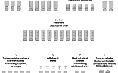
Russia’s logistics problems
For The Washington Post, Bonnie Berkowitz and Artur Galocha report on several facets…
-
Members Only
Visualization Tools and Learning Resources, March 2022 Roundup
Here’s the good stuff for March.
-
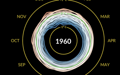
Climate spiral to show temperature change
Say what you will about circular visualization, but the spiral plays. This one…
-
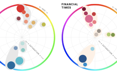
Defining color palettes for all your charts
Selecting a color palette for a single chart can be tricky, which is…
-
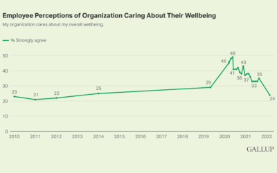
Most people think their employers don’t care about their well-being
Based on polls by Gallup, almost half of U.S. employees thought their employers…
-
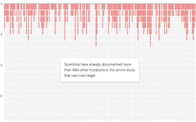
Potential coronavirus mutations
For NYT Opinion, researchers Sarah Cobey, Jesse Bloom, and Tyler Starr, along with…
-

Charting all the vehicles of James Bond
Baryon Design collated data for all the vehicles James Bond used across all…
-

Intercepted Russian radio communications
The New York Times analyzed Russian radio communications near Kyiv. The unencrypted transmissions,…
-
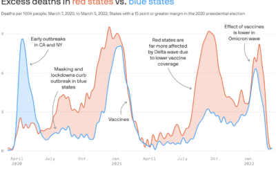
Partisan excess deaths
Excess deaths is the difference between expected deaths based on historical data and…
-
Members Only
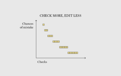
Double Check Twice, Edit Once – The Process 182
Be skeptical of your data in the beginning to save time in the end.
-

Pollution by the rich versus poor
Based on estimates from the World Inequality Lab, Bloomberg shows how wealthier individuals’…
Recently for Members
Second Edition
 Visualize This: The FlowingData Guide to Design, Visualization, and Statistics (2nd Edition)
 Visualize This: The FlowingData Guide to Design, Visualization, and Statistics (2nd Edition)
New tools, refined process.
Browse by Chart Type See All →


