Here are some tips to get you started, based on my own experiences with R, and more recently, the JavaScript library d3.js.
-
5 Tips for Learning to Code for Visualization
-
A Course for Visualizing Time Series Data in R
Learn to visualize temporal patterns in a couple of days.
-
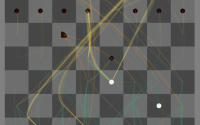
Play chess against the machine and see what it’s thinking
The Thinking Machine, by Martin Wattenberg and Marek Walczak, shows you the thought…
-
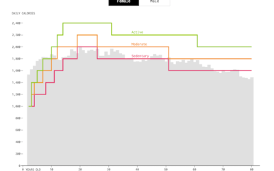
How Much We Eat vs. How Much We Need
On average, we use less energy as we age, and so we should eat less. We don’t always adjust soon enough though.
-
Where people go to and from work
With an animated take on the commute map, Mark Evans shows where people…
-
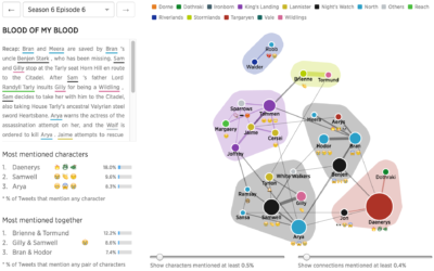
Game of Thrones discussions for every episode, visualized
I hear there’s some show called “Game of Thrones” that’s kind of popular…
-
When she cried
For most, crying isn’t an especially common occurrence over a long period of…
-
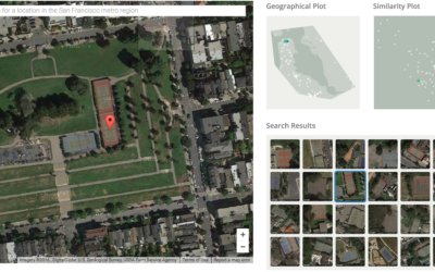
Visual search tool for satellite imagery
Terrapattern is a fun prototype that lets you search satellite imagery simply by…
-
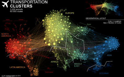
Air transportation network
Flight pattern maps are fun to look at and reveal the complexity of…
-
Automatic versus manual data analysis
Hilary and Roger touch on some interesting topics in the most recent Not…
-
Bias built in to crime prediction
Predictive policing seems to be playing a bigger role in court decisions these…
-
National drug overdose epidemic
Nadja Popovich for the Guardian delves into America’s drug overdose epidemic, starting with…
-
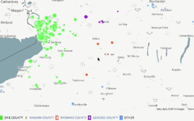
Bot automatically generates maps from American Community Survey data
The American Community Survey is an ongoing survey run by the United States…
-
OpenVis Conf talks all online
If you’re looking for a knowledge bomb during your lunch breaks, the OpenVis…
-
Network visualization shows transitions between states
If you think of network visualization as a collection of nodes and edges,…
-
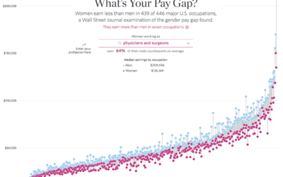
Gender pay gaps for major U.S. occupations
As we all know these days, there exists a gender pay gap across…
-
Link
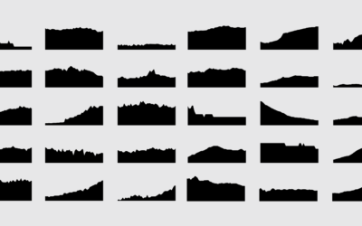
One Chart, Twelve Tools →
Using a bunch of different tools to visualize the same dataset in a similar way.
-
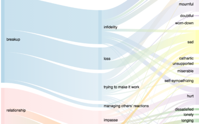
Life transition seen through music listening
Quantified Selfie is a project to find narratives in an individual’s personal dataset.…
-

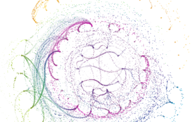
Kung fu particles
Using motion capture methods, Tobias Gremmler collected movement data for two kung fu…
-
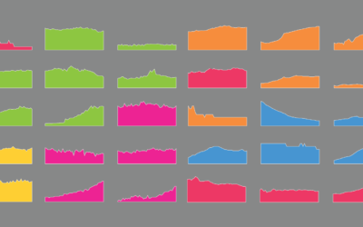
The Changing American Diet
See what we ate on an average day, for the past several decades.
Recently for Members
Second Edition
 Visualize This: The FlowingData Guide to Design, Visualization, and Statistics (2nd Edition)
 Visualize This: The FlowingData Guide to Design, Visualization, and Statistics (2nd Edition)
New tools, refined process.
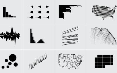
Browse by Chart Type See All →


