How Much We Eat vs. How Much We Need
My two-year-old eats and eats, but you wouldn’t know it by looking at him. Almost every day at the dinner table I wonder where all that food goes in such a tiny body. I understand now why my grandma always laughed in delight as she piled my plate on every chance.
Those days are long gone for me of course. Many good things come with age, but metabolism is not one of them, especially with my lazy, sedentary butt in front of the computer all day.
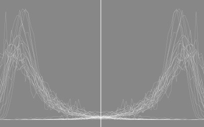
On average, we use less energy as we age, and so we should eat less. We don’t always adjust soon enough though. The chart below shows average calorie needs per day, based on age and activity level, according to the Department of Health. The gray represents average calorie consumption by age, based on data from the 2009-12 National Health and Nutrition Examination Survey.
Sedentary is basically no physical activity other than to accomplish daily living, moderate is the equivalent of 1 and a half to 3 miles per day, and active is anything more.
As you might expect, the average calories for males is higher than for females, but it’s interesting how the male calories ramp up much more at the beginning than for female calories. Also, the female averages after 12 years old always stay under the moderate line, whereas male averages are above the moderate line from mid 20s to late 50s.
I’m not sure if this is just noise, an artifact of underreporting, or if females really do tend to eat less relative to the estimates. So you can take that with a grain of salt. Although anecdotally that last reason seems possible.
One thing’s for sure: I need to move more.
 The Changing American Diet
See what we ate on an average day, for the past several decades.
Chart Types Used


Become a member. Support an independent site. Get extra visualization goodness.
See What You Get