I hear there’s some show called “Game of Thrones” that’s kind of popular these days. Twitter visualized how every episode was discussed, counting the character connections, the emojis used, and the changes over time.
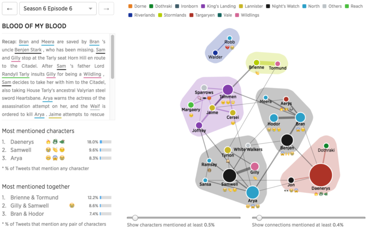
See how popular each character was, and the emojis used to described each character. In the visualization below, each circle represents a character with its size proportional to how often the character was mentioned in the Tweets and color representing affiliation of the character. The most used emojis for each character are displayed under the character name.
[Thanks, @kristw]

 Visualize This: The FlowingData Guide to Design, Visualization, and Statistics (2nd Edition)