The Changing American Diet

After seeing the Open Data Institute’s project on the changing British Diet, I couldn’t help but wonder how the American diet has changed over the years.
The United States Department of Agriculture keeps track of these sort of things through the Food Availability Data System. The program estimates both how much food is produced and how much food people eat, dating back to 1970 through 2013. The data covers the major food categories, such as meat, fruits, and vegetables, across many food items on a per capita and daily basis.
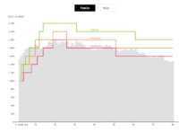
In the interactive below, we look at the major food items in each category. Each column is a category, and each chart is a time series for a major food item, represented as serving units per category. Items move up and down based on their ranking in each group during a given year.
You might notice the sudden rate of increase for cooking oil starting in 2000, but this isn’t from people growing overly fond of frying in a year. Instead, this was from a change in reporting to the Census Bureau. Nevertheless, cooking oil stayed on top through the years.
More interesting is the battle between butter and margarine. The former takes over the latter in 2003. This is not so much because of increased butter consumption, but more about the continuous decline of margarine.
In the dairy section, as you might expect, whole milk declined 79 percent between 1970 to 2013. The lower fat milks took the reins, but the cheeses really took control in this category.
I also didn’t expect dark greens, which includes vegetables like spinach and broccoli, to rise so much from barely anything. Did people really consume basically no dark green vegetables pre-1980s?
And how about chicken with the come-from-behind victory? In 1970, people consumed more than twice as much beef than chicken, but by 1987 it surpassed pork, and in 2004 moved passed beef. Chicken has been on top since. You go, chicken.
Finally, scale the charts by food item, and you see some obvious spikes (and dips), like carrots in the mid-1990s. In 1991, the average daily consumption was 0.05 cups, and that increased by more than 60 percent during a three-year period. This by the way was around the time baby carrots came into vogue.
 How Much We Eat vs. How Much We Need
We might be eating too much.
Nerd Notes
- Estimates come from the United States Department of Agriculture’s Food Availability Data System. The data includes more food items, but for the purposes of this visualization I only included the most popular ones.
- I analyzed and processed the data in R and made the visualization with d3.js.
Chart Type Used

Become a member. Support an independent site. Get extra visualization goodness.
See What You Get