Our daily lives are full of bias. We make assumptions about how the…
-
Using information graphics to calibrate bias
-
Members Only

Drawing Circles and Ellipses in R
Whether you use circles as visual encodings or as a way to highlight areas of a plot, there are functions at your disposal.
-
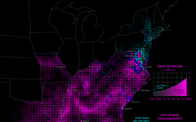
Slavery in the United States, by decade
Mapping slavery from a historical perspective is a challenge, because many old maps…
-
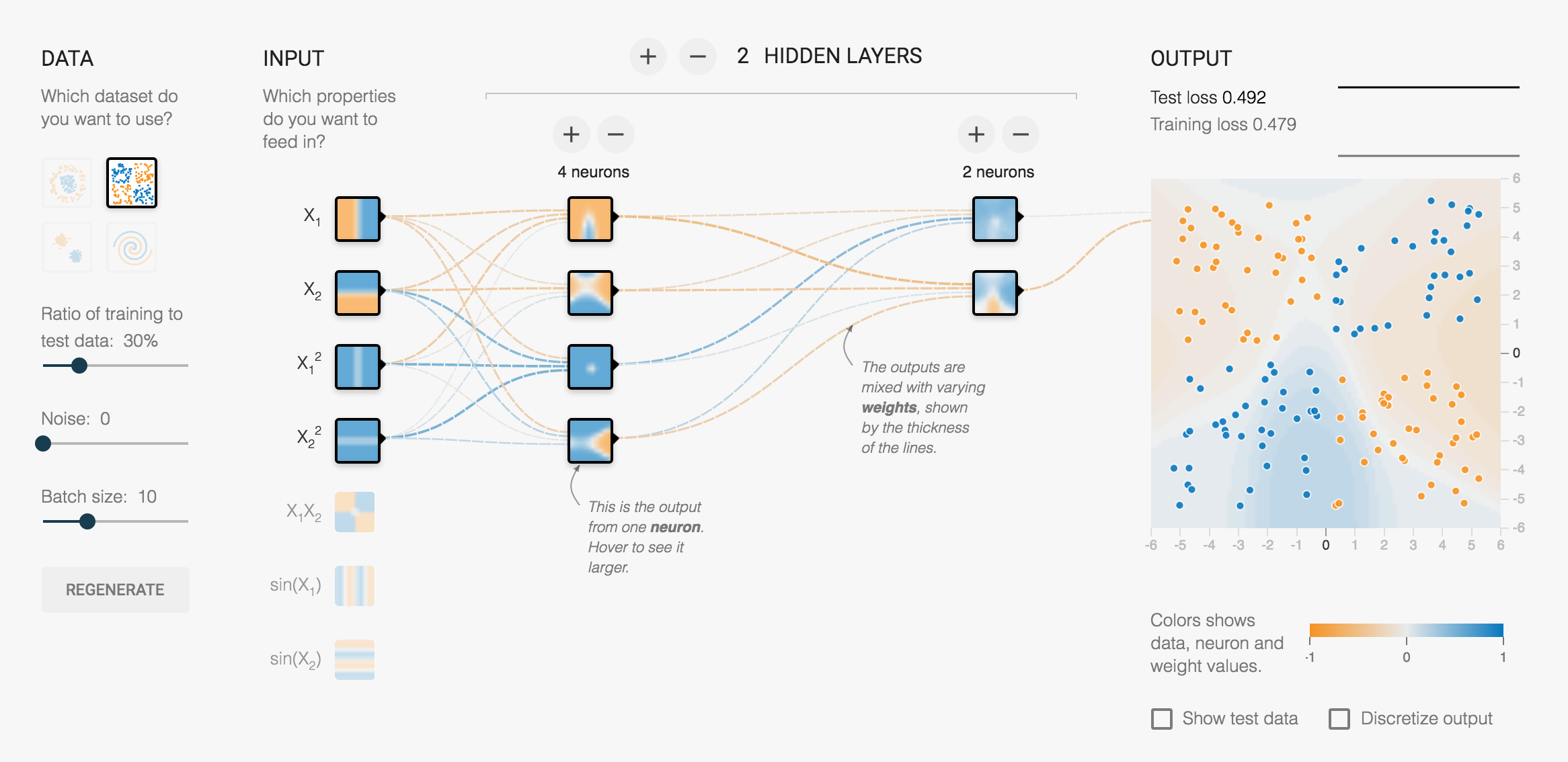
Here’s how a neural network works
Daniel Smilkov and Shan Carter at Google put together this interactive learner for…
-
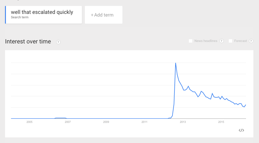
“Well that escalated quickly.”
This is the trend line from Google Trends for “Well that escalated quickly.”…
-
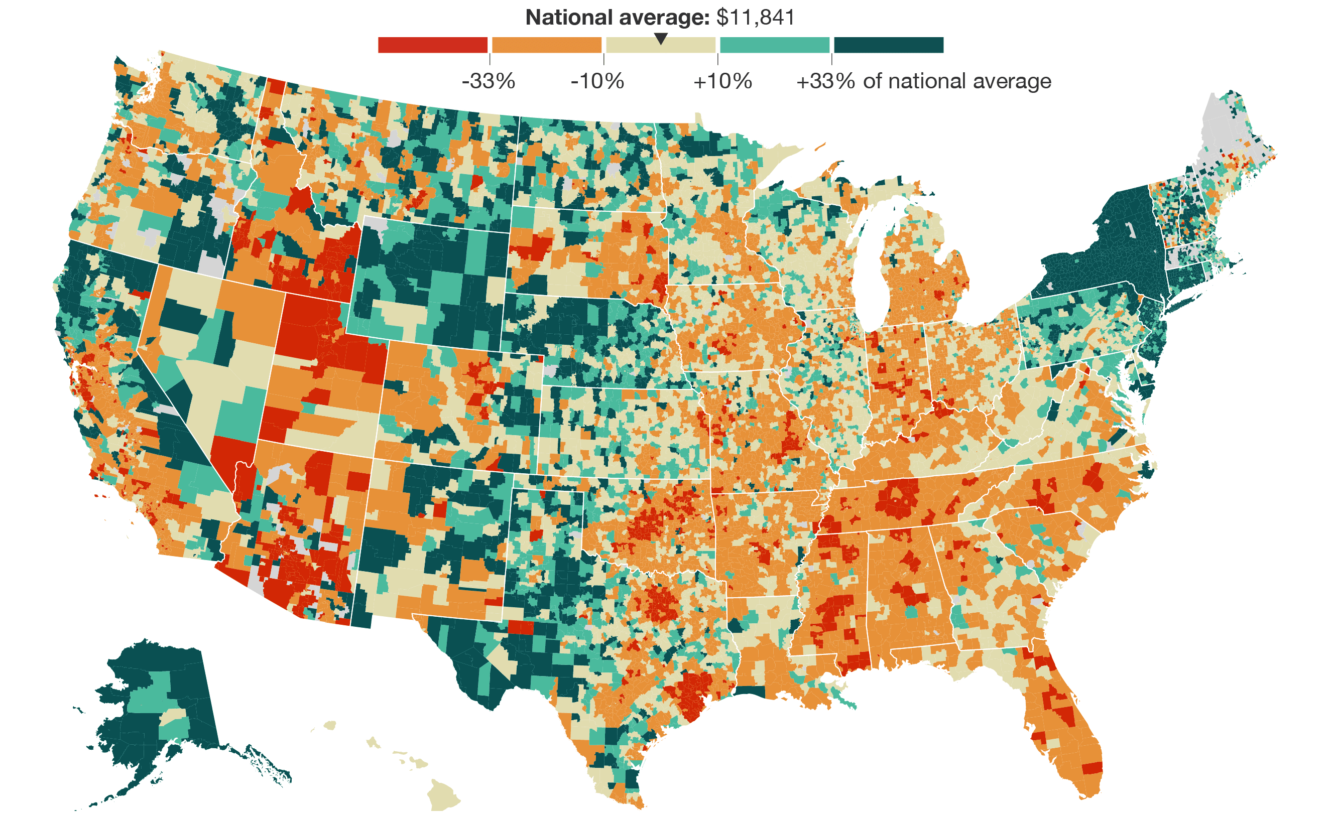
School district spending per student
NPR is running a series on spending and school districts and all its…
-
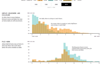
Shifting Parent Work Hours, Mom vs. Dad
Articles about stay-at-home dads and parents with even work loads might make it seem like dads are putting in a lot of hours in the household these days. Are they? How do they compare to moms’ work hours?
-
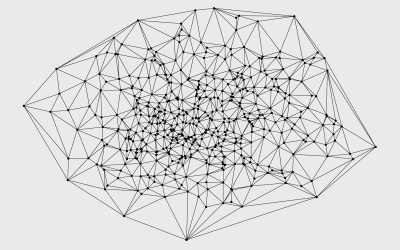
Interconnectedness of the galaxies
A group of researchers are studying how all the galaxies in the universe…
-

Titanic sinking in real-time
Visualization of time is usually about compression so that you can see more…
-
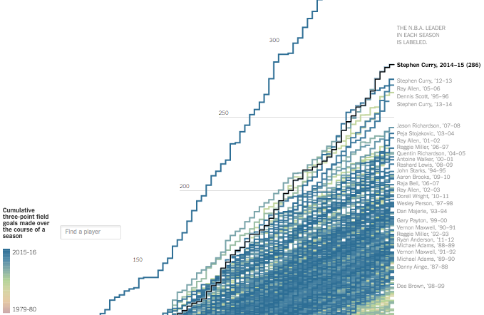
Stephen Curry 3-point record ridiculousness
Stephen Curry made 402 three-pointers this regular season, which is ridiculous. Gregor Aisch…
-
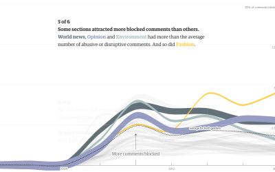
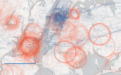
The Guardian analyzes 70m comments, unearthing online abuse
Online comments are an odd entity that can get out of hand quickly,…
-
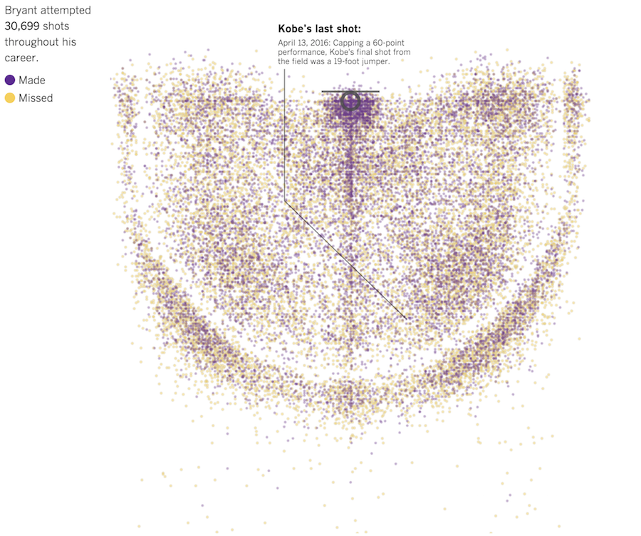
Every Kobe Bryant shot charted
In celebration of Kobe Bryant’s final game, the Los Angeles Times charted all…
-

Virus trading cards
Eleanor Lutz made some trading cards — for viruses.
To make the 3D… -
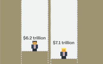
Balance the Trump and Cruz tax plans
The tax plans of Ted Cruz and Donald Trump might seem fine if…
-
Members Only

Drawing Squares and Rectangles in R
R makes it easy to add squares and rectangles to your plots, but it gets a little tricky when you have a bunch to draw at once. The key is to break it down to the elements.
-
Members Only
Voronoi Diagram and Delaunay Triangulation in R
The
deldirpackage by Rolf Turner makes the calculations and plotting straightforward, with a few lines of code. -
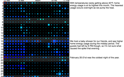
A year of home energy usage, by the hour
Michael VanDaniker found that his energy provider, Baltimore Gas and Electric, provides customers…
-
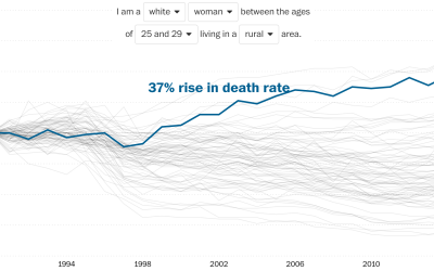
Rising death rates for white women
Overall life expectancy continues to increase, but looking at it from the other…
-
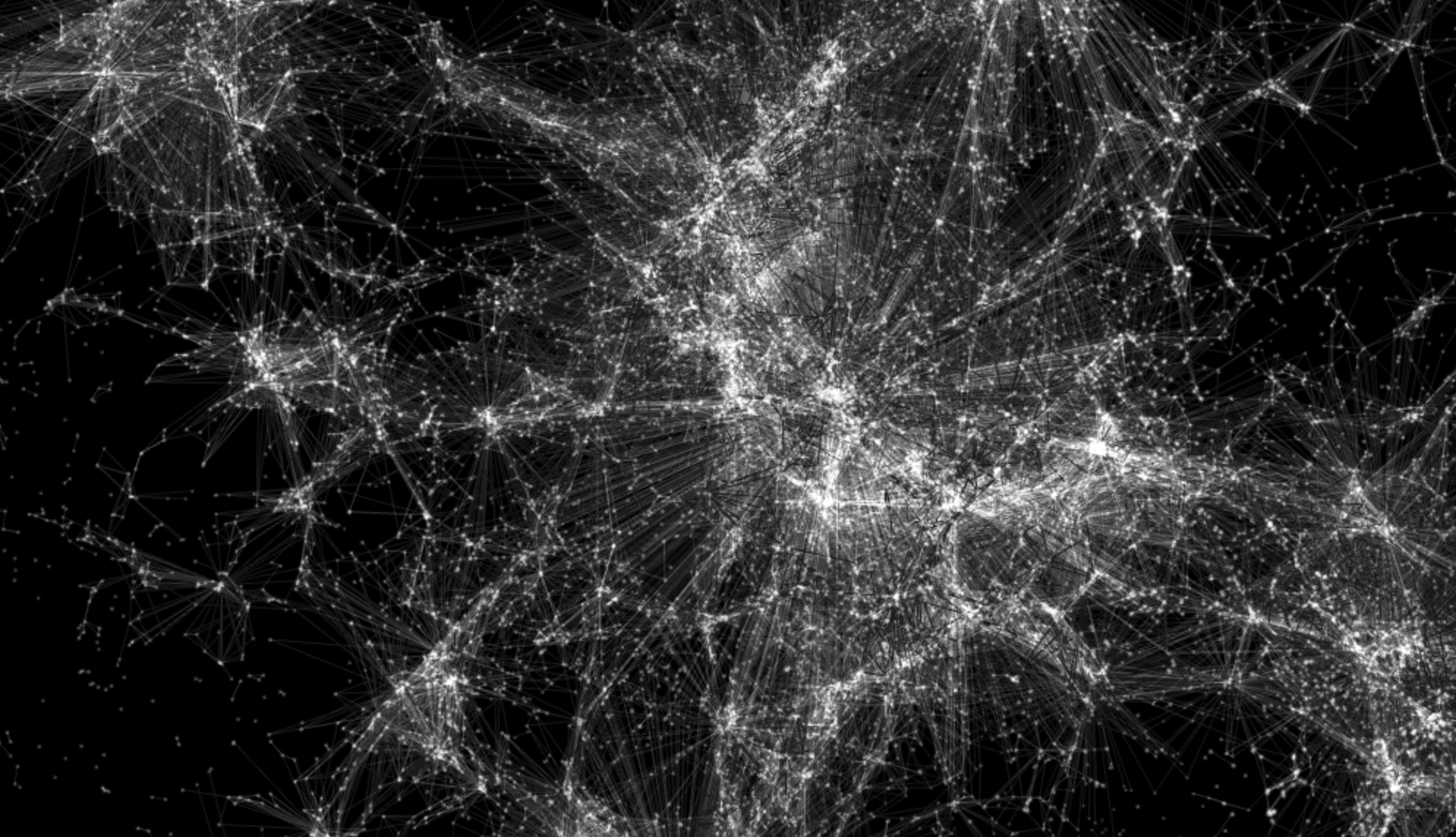
US surveillance flight paths for the FBI and Homeland Security
Peter Aldhous and Charles Seife dug into flight path data, specifically looking for…
-
Treating visualization as a process
Many people think of visualization as a plug-in tool that spits out something…
Recently for Members
Second Edition
 Visualize This: The FlowingData Guide to Design, Visualization, and Statistics (2nd Edition)
 Visualize This: The FlowingData Guide to Design, Visualization, and Statistics (2nd Edition)
New tools, refined process.
Browse by Chart Type See All →


