Gain a sense of direction from otherwise static connections.
-
Link
Animate gradient to imitate flow with d3.js →
-
Link
d3.geo.statePlanes →
Nice projections for US states in D3.
-
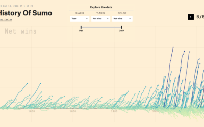
History of Sumo charted
Sumo has a long history that goes back centuries. Unlike most things that…
-
Quartz Atlas opening up to creators
Last year Quartz announced Atlas, which was a place to find all of…
-
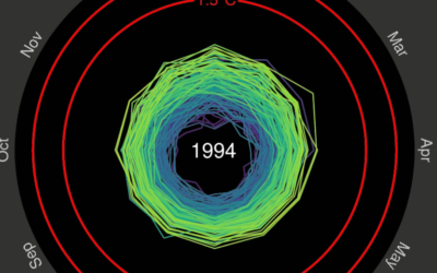
Spiraling global temperature chart
Global temperature is on the rise, as most of us know. Ed Hawkins…
-
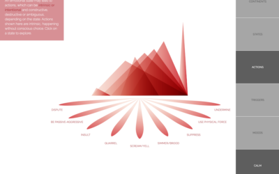
Atlas of Emotions, a collaboration with the Dalai Lama
Emotions are complex and only partially understood, yet such a force in how…
-
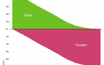
Who is Older and Younger than You (2014)
Here’s a chart to show you how long you have until you start to feel your age.
-
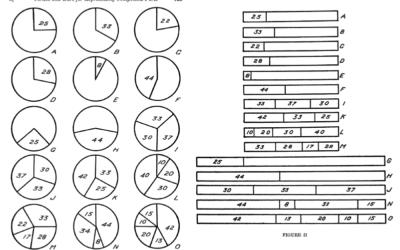
Human perception for visualization
There is visualization in practice and there is visualization in theory and research.…
-
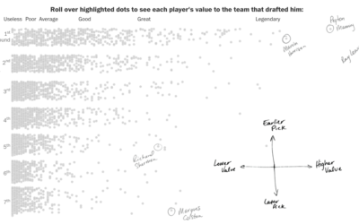
NFL draft pick quality for your team
Despite what commentators and sports analysts might have you think, picking great players…
-
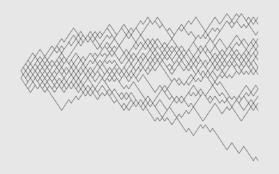
Algorithms for the Traveling Salesman Problem visualized
The Traveling Salesman Problem is a popular puzzle that asks for the shortest…
-
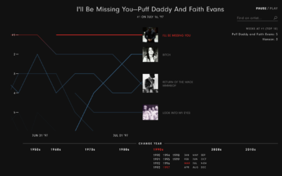
Music timeline plays through decades of top songs
The Year that Music Died from Polygraph is an animated timeline that shows…
-
Members Only
Drawing Lines and Segments in R
Show connections and changes over time with start and end points.
-

Track what your government representatives are doing for you
Taking over an old New York Times project, ProPublica re-launches Represent, which offers…
-
Working Parents
Here are the mothers and fathers who work like you.
-
Link
Wear Patterns →
Naturally occurring visualization in the physical world.
-
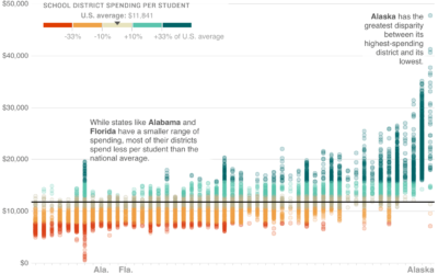
School district spending, against national average
Wrapping up their week-long School Money project, NPR asks: Is there a better…
-
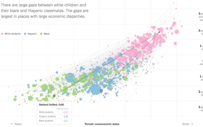
Lower socioeconomic status linked to lower education attainment
The Upshot highlights research from the Stanford Center for Education Policy Analysis that…
-
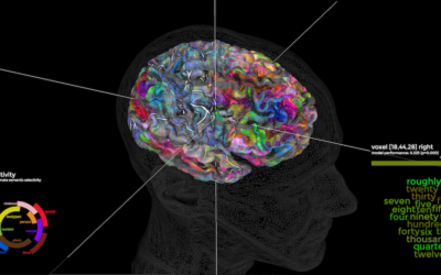
Mapping words to parts of the brain
Using functional magnetic resonance imaging, researchers monitored brain activity in seven people while…
-
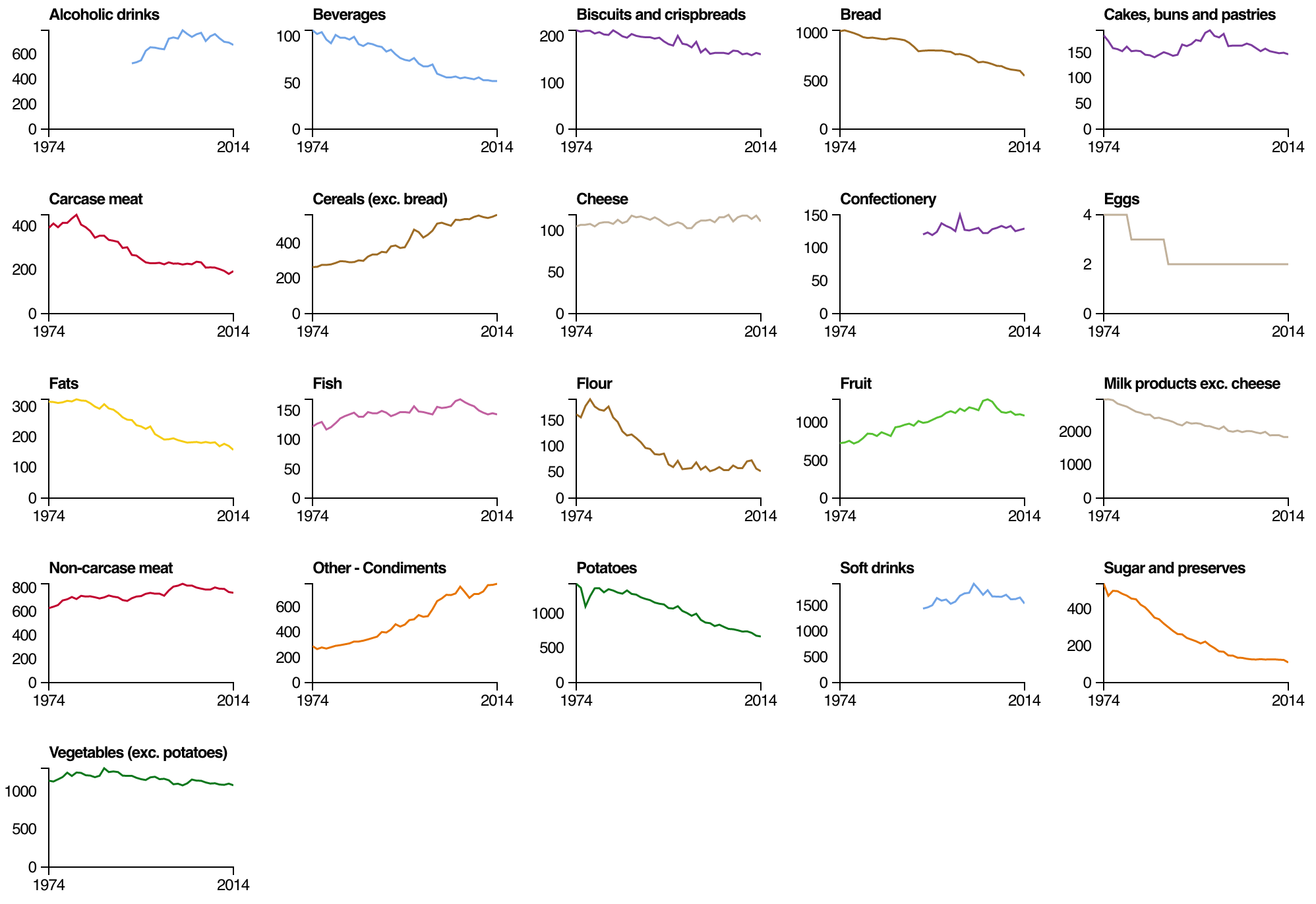
Change in the British diet, since 1974
From the Open Data Institute, an interactive looking at diet data made available…
-
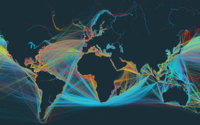
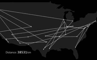
Global shipping in a narrated interactive map
We’ve seen maps for global shipping routes before, but this project — Ship…
Recently for Members
Second Edition
 Visualize This: The FlowingData Guide to Design, Visualization, and Statistics (2nd Edition)
 Visualize This: The FlowingData Guide to Design, Visualization, and Statistics (2nd Edition)
New tools, refined process.
Browse by Chart Type See All →


