As we delve deeper into election season, politicians will spit out more and…
-
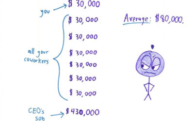
Guide to spotting data BS
-
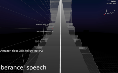
Ride on the VR time series roller coaster
Speaking of virtual reality visualization, this Nasdaq roller coaster by Roger Kenny and…
-
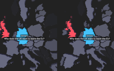
Virtual reality map to show Google Trends
More of an experiment, this VR map, by the Google Trends Lab in…
-

Grace Hopper explains a nanosecond with a visual aid
A nanosecond is a billionth of a second, but we’re not very good…
-
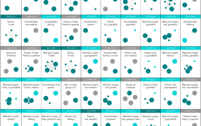
Most Common Family Types in America
Nuclear is still the most common, but there are millions of households in the United States with a different family structure.
-
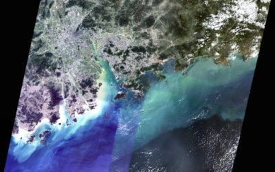
Piecing together satellite images
You might think piecing together satellite imagery is a straightforward task of lining…
-
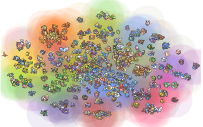
Charting all the Pokemon
Pokemon is everywhere these days. I think it’s just something the world really…
-
Members Only
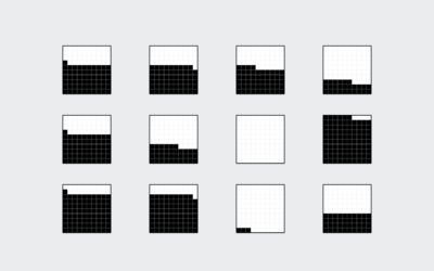
How to Make Square Pie Charts in R
Instead of traditional pie charts that rely on angles and arc lengths to show parts of a whole, try this easier-to-read version.
-
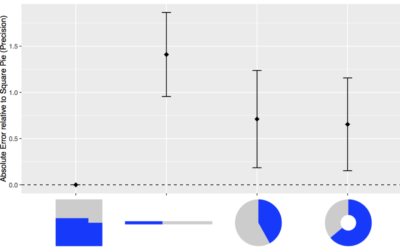
Square pie chart beats out the rest in perception study
Many hate pie charts. Others love them. I think they’re useful but have…
-
Gun deaths
As an introduction to a series on gun deaths in America, FiveThirtyEight uses…
-
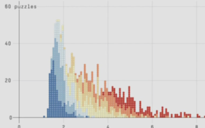
Sketchy summary statistics
Ben Orlin of Math With Bad Drawings explains the pitfalls of using summary…
-
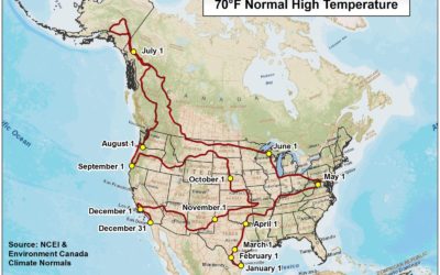
Cross-country road trip at a constant 70 degrees
Road trips are fun, but it can be hard to enjoy yourself when…
-
R in the data journalism workflow at FiveThirtyEight
R has found its way into a good number of news groups who…
-
How Much Alcohol Americans Drink, in 2014
Most people have one or two drinks on average, but some consume much more.
-

History lesson on data visualization
Clive Thompson for Smithsonian Magazine gives a quick history lesson on infographics.
[D]ata… -

Making the Seinfeld theme song with Bieber, Diplo, and Skrillex
Last year the New York Times interviewed Justin Bieber, Diplo, and Skrillex about…
-
Link
One year as a Data Scientist at Stack Overflow →
Detailed description of what it’s like for someone with a stat-heavy background.
-
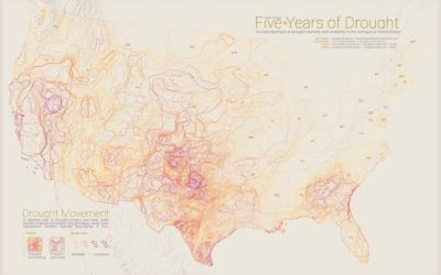
Moving drought boundaries
Drought continues to trudge along. My grass is just about dead, save a…
-
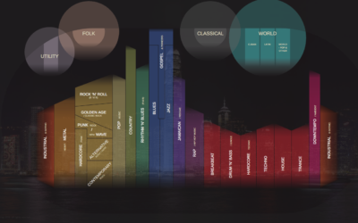
Charted history of music, from its origins to present
Musicmap is an attempt to show the history of music over time and…
-
Members Only
Annotating Charts in R
Let the data speak for itself they say. That doesn’t work a lot of the time, and when that happens, you need to explain.
Recently for Members
Second Edition
 Visualize This: The FlowingData Guide to Design, Visualization, and Statistics (2nd Edition)
 Visualize This: The FlowingData Guide to Design, Visualization, and Statistics (2nd Edition)
New tools, refined process.
Browse by Chart Type See All →


