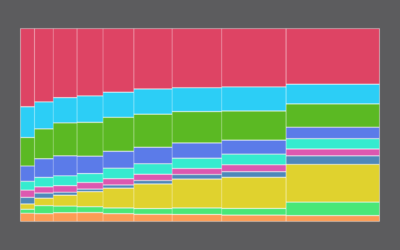
Also known as a Marimekko diagram, this chart uses the width and height of rectangles to represent separate variables. It can be useful to represent multidimensional data.
Marimekko charts, or mosaic plots, allow you to compare categories over two quantitative variables.
Also known as a Marimekko diagram, the mosaic plot lets you compare multiple qualitative variables at once. They can be useful, sometimes.
Everyone loves reading about millionaires who don’t have enough liquidity to buy things,…
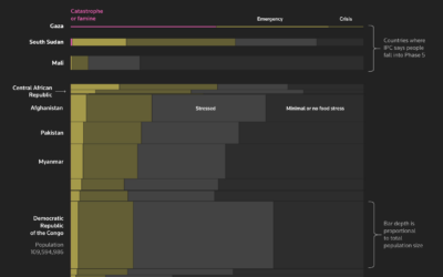
Reuters explores famine around the world through the lens of starving children in…
So people earn a six-figure income without working all the time. What do they do?
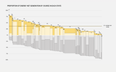
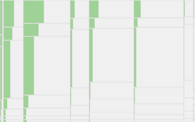
Among households in the United States, 68% are owned and 32% are rented, based on estimates from the American Community Survey in 2021. That breakdown isn't uniform across the country though.
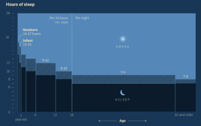
Reuters dug in to the science of sleep and how paying attention to…
This chart shows the shifts since 1960.
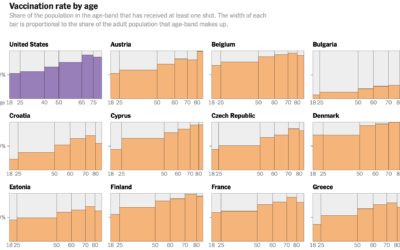
Elian Peltier and Josh Holder for The New York Times highlight the vaccination…
First comes love, then comes marriage, then comes baby in the baby carriage. Sometimes.
Researchers at the University of Chicago’s Energy Policy Institute estimated the number of…
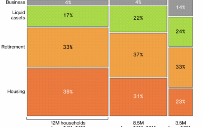
After living expenses, where does the money go, and how does it change when you have more cash available?